You and your team have delivered good results over the last few years. But due to financial uncertainty, you have been let go. Your upcoming job interview includes a short presentation where they want you to show how you can improve the results at their company.
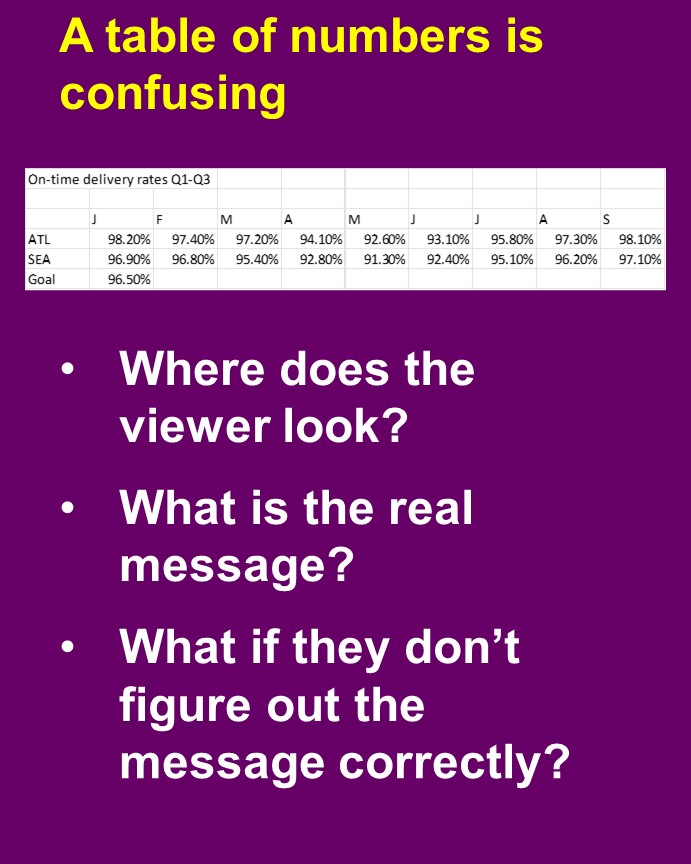
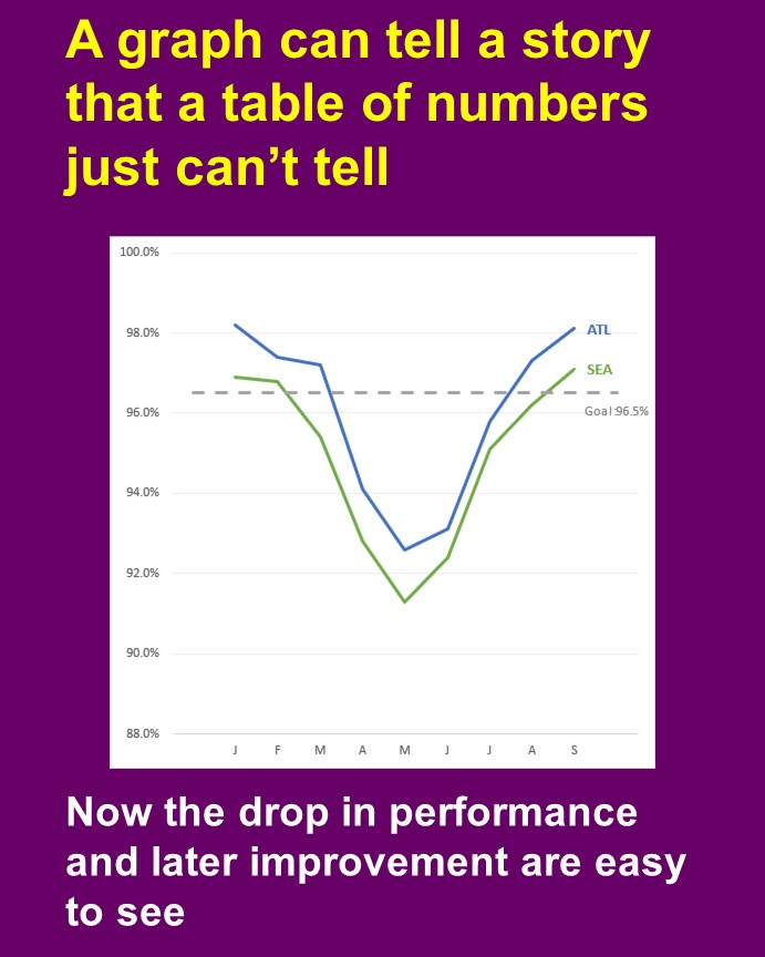
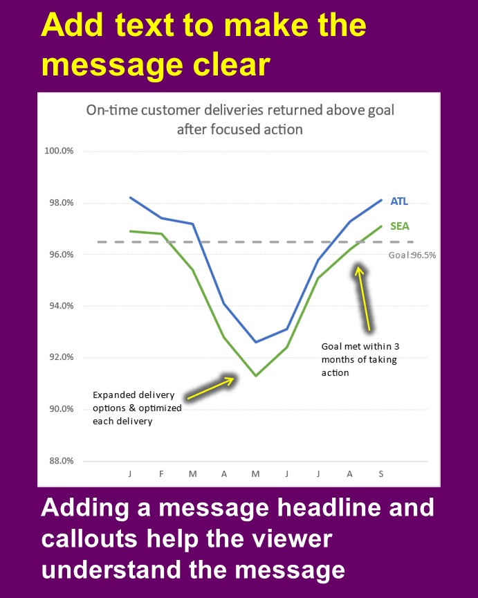
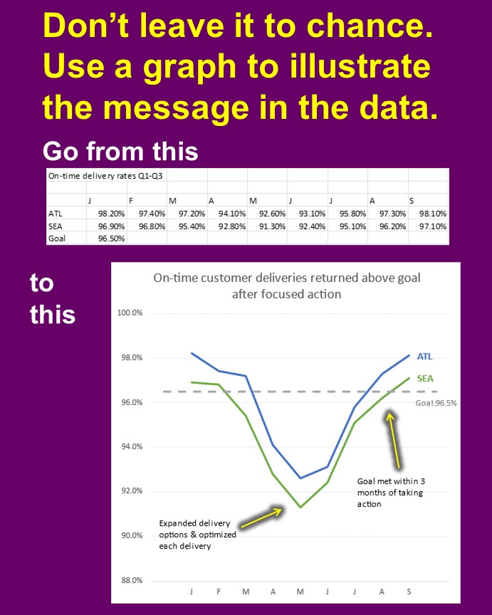
You have the numbers to prove what you and your team did in the past. Instead of a table of numbers or just a few large numbers on a slide, communicate the positive impact you can make visually by using graphs.
Here is an example of how you can turn a table of numbers into a graph and make the message clear.

Dave Paradi has over twenty-two years of experience delivering customized training workshops to help business professionals improve their presentations. He has written ten books and over 600 articles on the topic of effective presentations and his ideas have appeared in publications around the world. His focus is on helping corporate professionals visually communicate the messages in their data so they don’t overwhelm and confuse executives. Dave is one of fewer than ten people in North America recognized by Microsoft with the Most Valuable Professional Award for his contributions to the Excel, PowerPoint, and Teams communities. His articles and videos on virtual presenting have been viewed over 4.8 million times and liked over 17,000 times on YouTube.