The problem with long axis labels and the common solution
If you have long axis labels in a column chart, Excel will rotate them to fit the full labels in if the chart is not wide enough.

This is hard for the viewer to read. The common approach to solving this issue is to add a New Line character at the start of every second axis label by pressing Alt+Enter at the start of the label text or by using a formula to add CHAR(10) [the New Line character] at the start of the text (described well by Excel MVP Jon Peltier here). The method also involves forcing Excel to use every label and trick it by rotating the labels and then rotating them back. If all you need to do is to stagger the labels, use this method. If you want to make one label stand out by changing the font size or color, you need to use a different approach because Excel does not allow individual axis labels to be formatted.
The more complicated solution
The solution involves using the modified labels but adding them as custom data labels to an invisible set of columns below the axis or lowest value. Because individual data labels can have different font sizes or colors, this method allows you to make one label stand out from the others.
Adding space for the modified labels
Add a new data series to the chart to hold the modified labels as follows.
This data series will be invisible and positions the modified label text below the axis if all values are positive and below the lowest value if any values are negative. To calculate the value for these cells, the formula used in cell C2 is =IF(MIN($B$2:$B$6)<0,1.1*MIN($B$2:$B$6),-0.1). If there is one or more negative values in the chart, the invisible columns to position the labels will be 10% lower than the lowest value column, which gives enough space between the column and the labels.
Creating the label text
For every second row, we want the label to have a New Line character added before the text. We add the formula

to cells E2 to E6 to create the modified labels. The worksheet now looks like this.
Notice that the added New Line character does not change the way the text is displayed by default.
Creating and formatting the chart
With all of the content for the chart now available, we can create the chart. Select cells A1 to C6 (notice that the modified label cells are not selected when we create the chart; they will be added later). On the Insert ribbon insert a standard 2D clustered column chart.
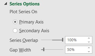
Select any column and press Ctrl+1 to open the Format Data Series task pane. In the Series Options, set the Series Overlap to 100%. You can also set the Gap Width to 50% to give the columns more presence on the chart.
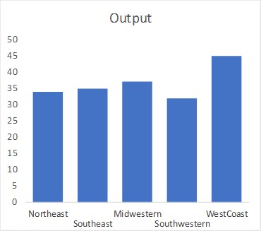
Use the “+” chart skittle to remove the legend and gridlines. Add a chart title if desired. The chart will now look like this.

Replacing the default axis labels with the new label text
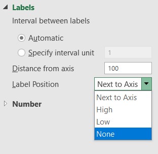
Click on the horizontal axis and click Ctrl+1 to open the Format Axis task pane if it is not already open.
In the Axis Options section, under Labels, select the Label Position as None.
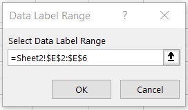
Using the drop down list on the left side of the Chart Format ribbon, select the Label spacer series. Set the Shape Fill to No Fill. Add Data Labels using the “+” chart skittle and navigate to the More Options selection to open the Format Data Labels task pane. In the Label Options section, check the Value From Cells checkbox and select cells E2:E6.
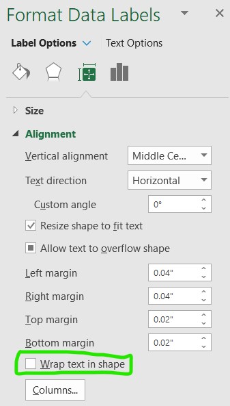
Uncheck the Value checkbox. Select the Outside End label position.
On the Size and Properties section of the Format Data Labels task pane, in the Alignment section, uncheck the Wrap text in shape checkbox.
The chart should now look like this.

Removing negative values from the measurement axis if needed
If all the values of the columns are positive, the negative value on the vertical axis is confusing. It is displayed because the value of the invisible columns for the modified labels is negative. If you want to remove the negative value from the vertical axis to make it look cleaner and be less confusing, you can do so by applying a custom number format to the values on the vertical axis.
Click on the vertical axis and press Ctrl+1 to display the Axis Format task pane if it is not already displayed. In the Axis Options section, in the Number format section, select the Custom number format. In the Format Code, enter “#,##0;;0” (without the quotes). This code displays the zero but does not display negative numbers. You can adjust this format code depending on whether you want to add currency symbols, percentages, or other formatting. Click the Add button to use this code for the vertical axis labels.
The chart will now look like this.
Make one label stand out
Click on the label you want to stand out. This selects all the labels. Click again on the label you want to change to just select this label. On the Home ribbon, use the font tools to change the font size, color, or other attributes. You can combine this with changing the color of the column corresponding to the label as well. If I wanted to make the fourth column and label stand out, it could look like this.

If the axis labels on your column chart are too long and you want them staggered with one standing out, use this method.

Dave Paradi has over twenty-two years of experience delivering customized training workshops to help business professionals improve their presentations. He has written ten books and over 600 articles on the topic of effective presentations and his ideas have appeared in publications around the world. His focus is on helping corporate professionals visually communicate the messages in their data so they don’t overwhelm and confuse executives. Dave is one of fewer than ten people in North America recognized by Microsoft with the Most Valuable Professional Award for his contributions to the Excel, PowerPoint, and Teams communities. His articles and videos on virtual presenting have been viewed over 4.8 million times and liked over 17,000 times on YouTube.