If you work for a government affiliated agency you do not report profit-focused metrics because profit is not your objective. You report on metrics that are important to your organization but are often not financial in nature. You have goals or targets to meet and you measure progress against them.
In this article I want to share some ways to make this reporting more visual. It draws on my experience helping many financial professions improve their reporting by making it more visual.
Makeover #1: Executive Summary
At the start of your annual report of performance, you will likely include a summary of how the organization did on the different metrics you measure (you may have a different term for metrics, such as indicators or performance measures). Here is a typical summary table.
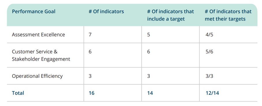
The figures provided are accurate, but the viewer or reader has to do work to figure out how well the organization really did. Here’s my makeover.
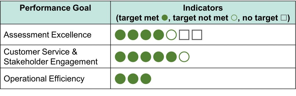
I converted all the numbers into a visual using characters in PowerPoint. Now the viewer can easily see the summary and conclude that the organization has done a good job meeting or exceeding the targets in most areas.
Makeover #2: Comparing one result to the target and previous year
Comparing how well you did to the target is important and many people also want to see how the organization did compared to the previous year. The original table does provide all the figures.
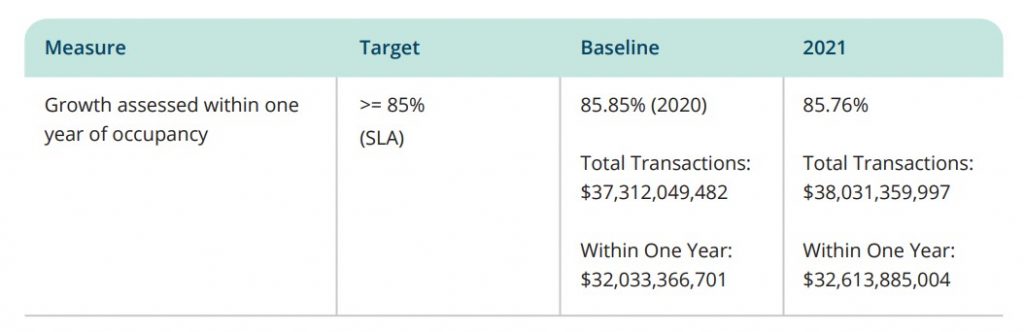
Not only does the table provide the percentage, which is the metric that is compared to the target, but it also provides the raw numbers that the percentages are calculated from. This is too much information and these four additional eleven-digit numbers overwhelm the viewer. Here’s how I made the comparison more visual.
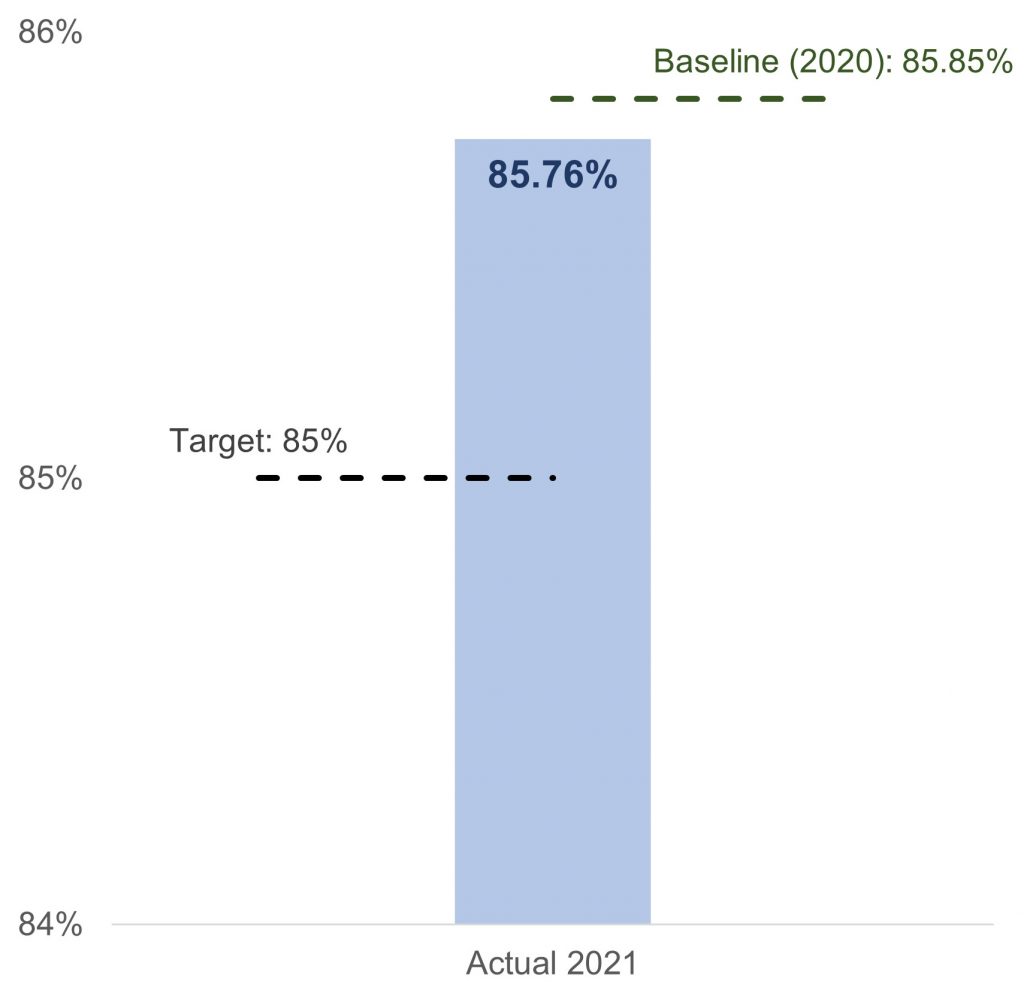
This visual makes it easy to see that the performance is above the target but did not meet the previous year’s performance. The viewer is not overwhelmed with information and can quickly understand the message.
Makeover #3: Comparing related metrics to the same goal
Some metrics are related and should be shown together so that the viewer has a better picture of the performance in that area. This example comes from the customer service area.
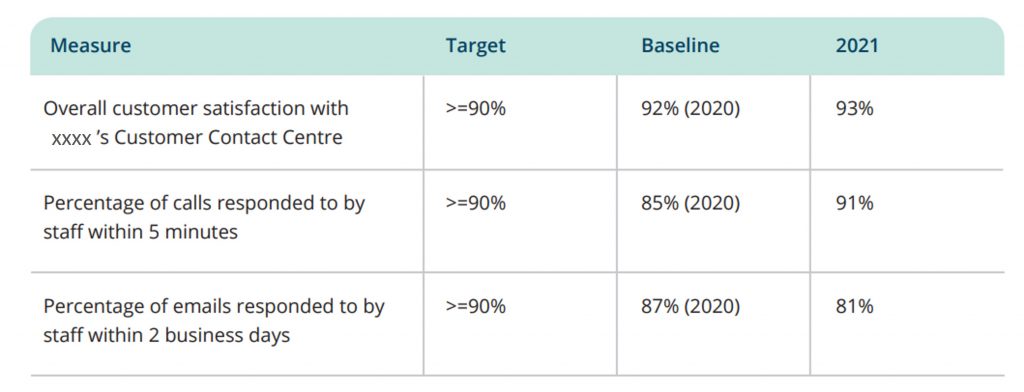
The table forces the viewer to move between the cells many times in order to understand how the organization did on its customer service metrics. The visual I created makes the performance clear.
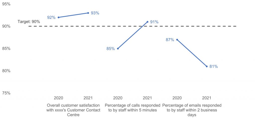
Since the metrics are related and have the same target, it makes sense to put them in one graph. Using short lines makes it easy for the viewer to see the trend in each metric and how the performance compares to the target. It is immediately clear that the performance on replies by email is an area that needs attention.
Non-financial metrics can still be reported visually
Just because your organization doesn’t report financial performance doesn’t mean that metrics are not important. Reporting those metrics in a clear way using visuals will enhance your presentations and reports.

Dave Paradi has over twenty-two years of experience delivering customized training workshops to help business professionals improve their presentations. He has written ten books and over 600 articles on the topic of effective presentations and his ideas have appeared in publications around the world. His focus is on helping corporate professionals visually communicate the messages in their data so they don’t overwhelm and confuse executives. Dave is one of fewer than ten people in North America recognized by Microsoft with the Most Valuable Professional Award for his contributions to the Excel, PowerPoint, and Teams communities. His articles and videos on virtual presenting have been viewed over 4.8 million times and liked over 17,000 times on YouTube.