After I released the results of the latest survey on what annoys audiences about PowerPoint presentations, I was asked if there were more insights from a deeper examination of the results. I had already reported on all the results from the latest survey, so I looked back over the last ten years to see if there were any significant trends. I looked at the percentage of respondents in each survey who selected each of the twelve possible annoying elements. I graphed the trends, with four standing out as making important moves up or down over the last ten years.
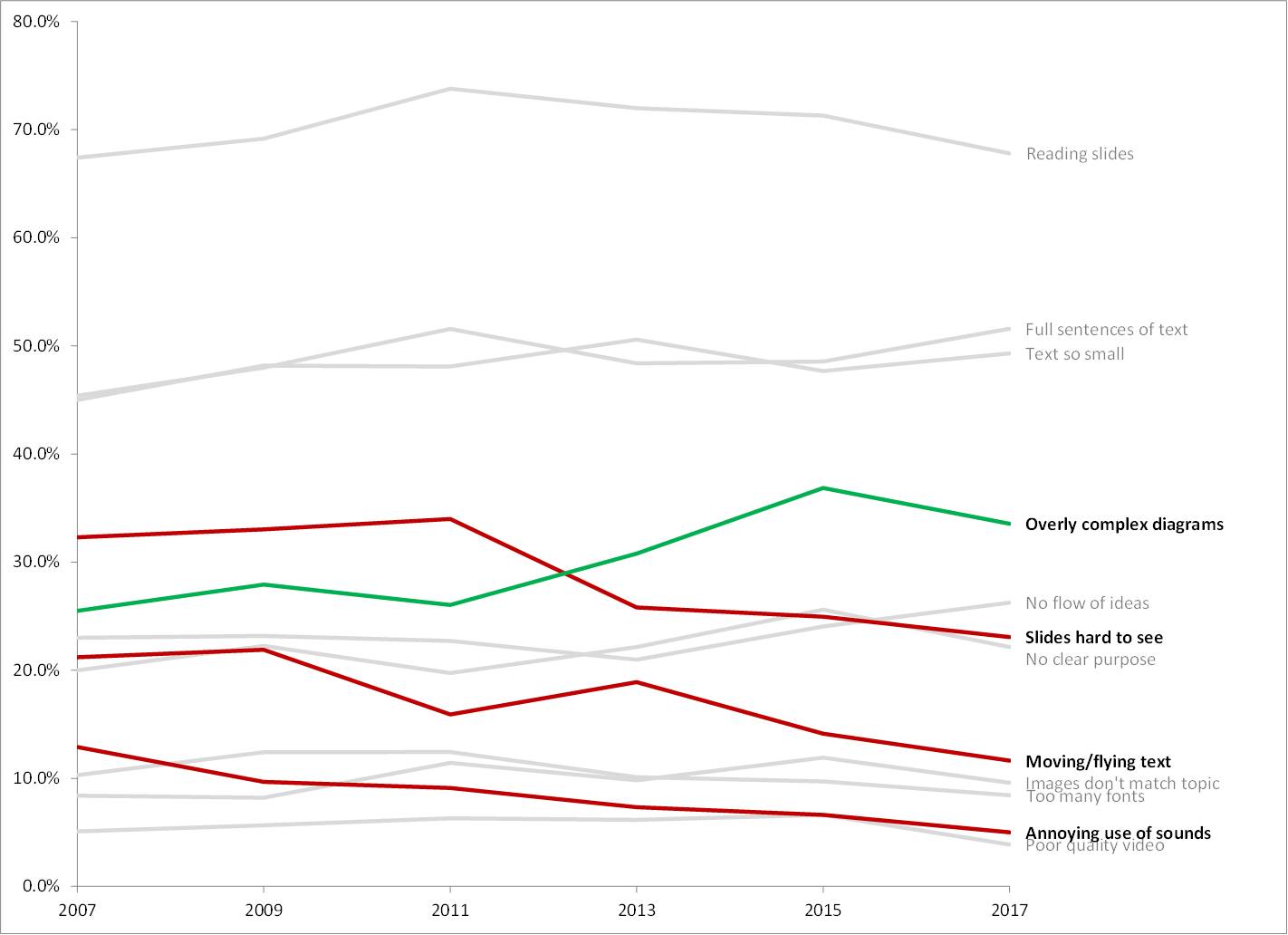
Annoying use of sounds
In 2007 it was the 9th most common answer and its popularity has dropped steadily to 11th place in 2017. This is a positive result for audiences because it shows that the annoying screeching tires and other sounds have steadily been removed from presentations. Audio should only be used when it adds to the message the presenter is sharing, such as a testimonial to support a product or service or a machine sound to indicate when a part needs to replaced.
Moving/flying text or graphics
There has been a steady drop in this annoyance over the ten years, indicating that most presenters have recognized that the crazy animations are annoying and presenters have reduced their use of these types of animation effects. As I suggest in my book Select Effective Visuals, the animation feature in PowerPoint should only be used for the purpose of building the elements of a slide one at a time to allow the presenter to give context before the audience comes to a conclusion. When using the animation feature, only use the simple effects such as Appear or Fade unless there is a compelling reason for one of the effects that involves movement.
Slides that are hard to see because of color choice
After staying steady at the start of the ten year time period, this annoyance has dropped in popularity in the last three surveys. More organizations have adopted professionally designed PowerPoint templates and the designers make sure that the colors set in the template have enough contrast to be seen. If you or your designer needs help testing if colors have enough contrast, use my Color Contrast Calculator tool.
Overly complex diagrams or charts
This annoyance has seen a significant increase in the last three surveys. As presenters have moved away from almost all text slides to the use of some visuals, this increase shows that those visuals have not always been effective. Just substituting any visual as a replacement for text will not improve a presentation. Visuals can be much more effective than text or a table of numbers but only if the visual is well thought out and created to clearly communicate the message.
In looking at these trends, the results from each survey, and the comments in the survey responses, it is clear that presenters have made some improvements over the last decade but there is still much more work to be done.

Dave Paradi has over twenty-two years of experience delivering customized training workshops to help business professionals improve their presentations. He has written ten books and over 600 articles on the topic of effective presentations and his ideas have appeared in publications around the world. His focus is on helping corporate professionals visually communicate the messages in their data so they don’t overwhelm and confuse executives. Dave is one of fewer than ten people in North America recognized by Microsoft with the Most Valuable Professional Award for his contributions to the Excel, PowerPoint, and Teams communities. His articles and videos on virtual presenting have been viewed over 4.8 million times and liked over 17,000 times on YouTube.