A proportional object collection compares two (or more) values by using the area of shapes, usually squares, rectangles, or circles. They are popular because they instantly communicate the difference in the values to a viewer, especially when the values are different by an order of magnitude or more. We see more and more of these diagrams used in newspapers and magazines. Here is an example of one I used recently for a client.
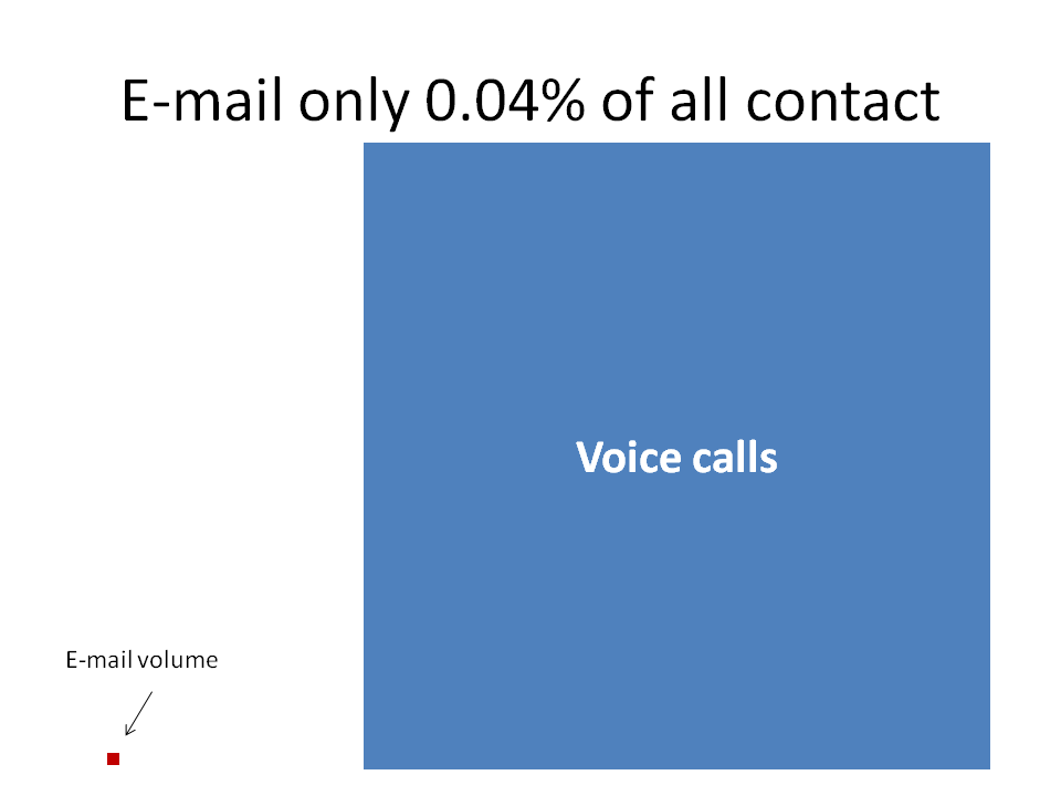
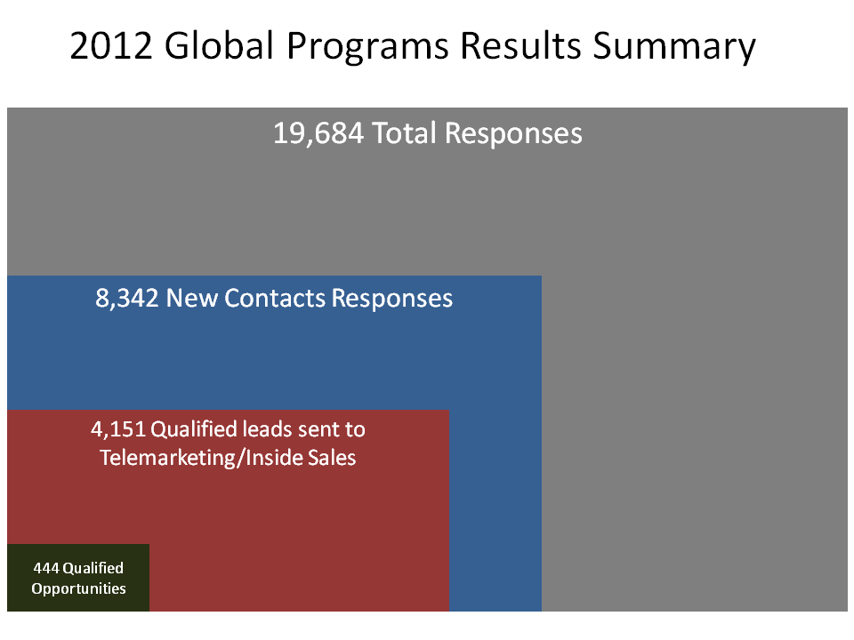
You can easily see how much smaller the number of e-mails is compared to voice calls and this representation is more effective than a column chart would be in this case. You can also use this type of diagram to compare multiple values that are related. Here is an example from a recent presentation.
It is important that the shapes be exact to the proportions of the numbers being compared, or else the audience is being misled. To make the calculations easier, I have created a calculator that does the calculations for you. It is part of my Calculators For Visuals Excel file that you can download.
Right-click on this link and select to Save the file to your computer. Then open the file you have downloaded in Excel.
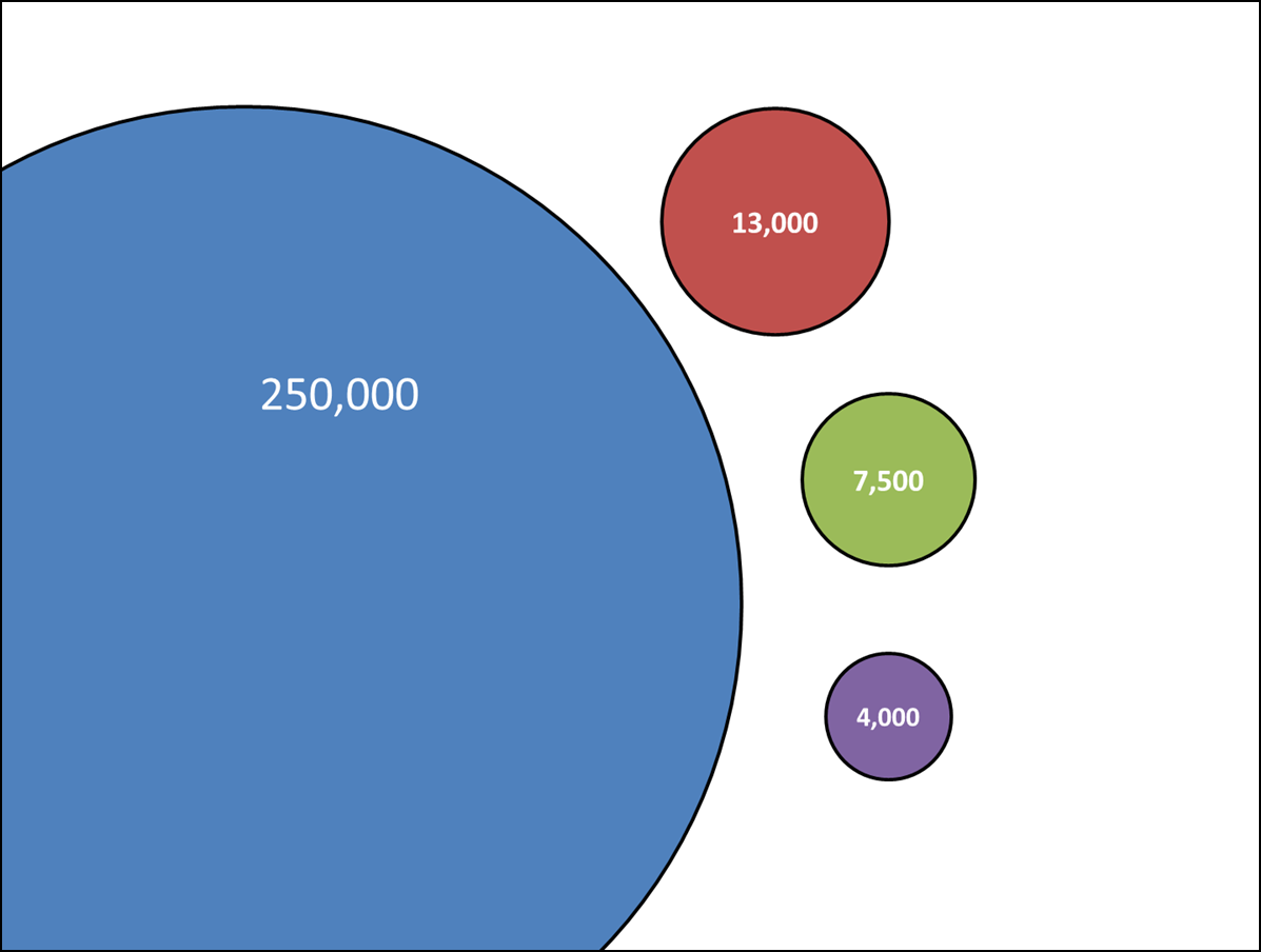
By adjusting the size of the largest object to be larger than what will fit on a slide, you can create a slide that looks like the following example.
Thanks to Glenna Shaw of visualology.net for the inspiration to create this calculator.