The start of a new year is a common time to evaluate where you are and what you want to improve to make this year better than the previous year. If you are looking to make more effective PowerPoint presentations in 2020, I suggest you start with my Effective PowerPoint Presentation Audit.
In this audit you rate how often you follow 30 best practices divided into five areas: Planning Your Presentation, Planning Your Slides, Creating Graphs/Charts, Creating Visuals in PowerPoint, and Delivering the Presentation. Once you submit your responses, you will see which areas you can focus on for 2020.
Often business professionals may score low in an area because they are not familiar with the best practices. This is common because best practices for effective PowerPoint presentations are not taught in school, college/university, graduate school, or professional designations. It’s not that professionals don’t want to follow best practices, it’s just that they aren’t aware of what they should be doing.
I have a number of videos on my YouTube site that can help presenters learn some of these best practices (tip: subscribe to my YouTube channel to find out about new videos as they get posted).
When planning the content of your presentation, I suggest you use the GPS approach. I wrote a book with all the details and this video gives you an overview.

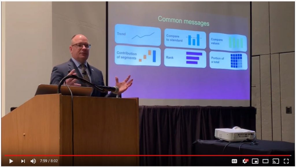
How do you decide what visual will work best? When it comes to financial data, this video shares the six categories I use when deciding which visual will communicate the message effectively.
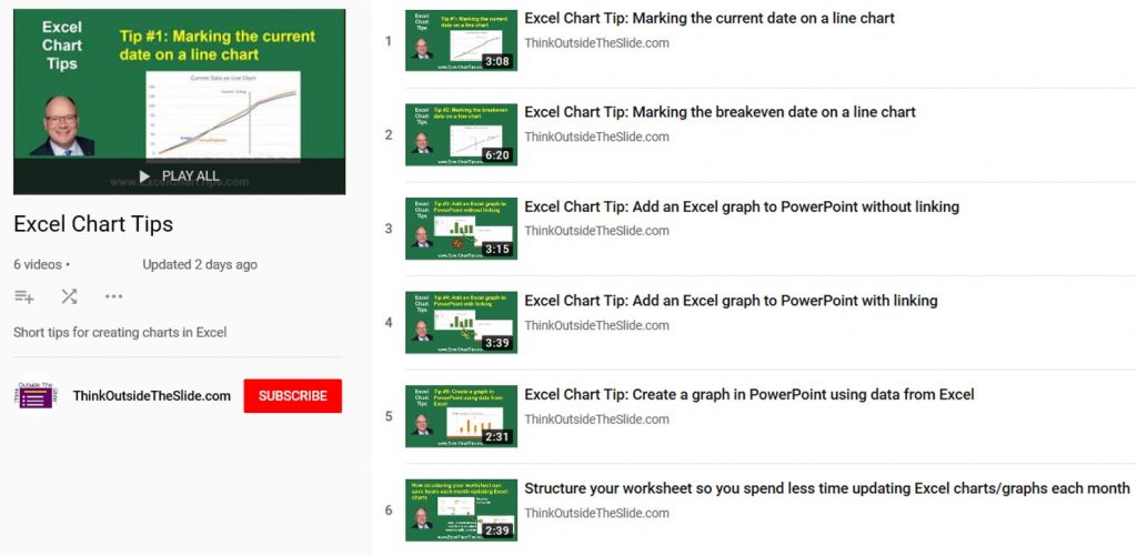
Most business professionals will use Excel to create charts or graphs. I have a playlist of videos with tips for creating Excel charts, including some advanced charts and different techniques for copying an Excel chart into PowerPoint.
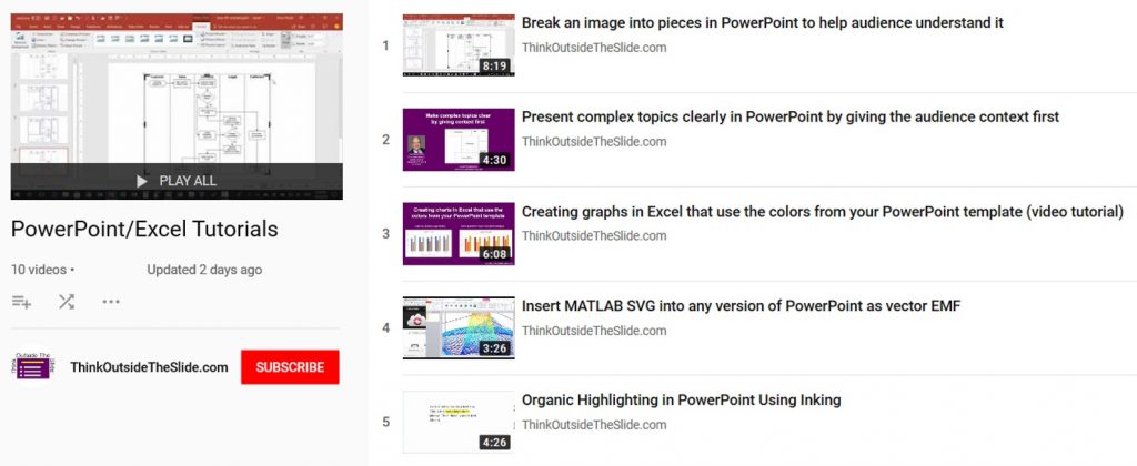
PowerPoint has great tools to create effective visuals for messages such as sequences and relationships. I have a playlist with tutorials on PowerPoint techniques such as breaking an image into pieces to animate it piece by piece when presenting.
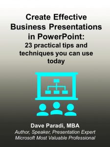
If you want a resource that pulls together a lot of my best advice, check out my new ebook titled Create Effective Business Presentations in PowerPoint: 23 practical tips and techniques you can use today. Click here or on the book cover below to learn more and get your copy today.
If you lead a group that has to present financial data to executives, my in-house customized workshops are ideal for learning how to select the right visual and how to create effective visuals in Excel. Click here to see how my sessions are different from most of the “dataviz” workshops out there.

Dave Paradi has over twenty-two years of experience delivering customized training workshops to help business professionals improve their presentations. He has written ten books and over 600 articles on the topic of effective presentations and his ideas have appeared in publications around the world. His focus is on helping corporate professionals visually communicate the messages in their data so they don’t overwhelm and confuse executives. Dave is one of fewer than ten people in North America recognized by Microsoft with the Most Valuable Professional Award for his contributions to the Excel, PowerPoint, and Teams communities. His articles and videos on virtual presenting have been viewed over 4.8 million times and liked over 17,000 times on YouTube.