Every year when I speak at and attend the Presentation Summit conference I come back with great ideas from other presentation experts that I can adapt or use in my own presentations. Last month the conference was in Ft. Lauderdale, FL and in this article I want to share three ideas I picked up at the conference.
The first idea came from Nolan Haims (www.PresentYourStory.com). He showed us a bullet graph, a type of graph created by noted visual expert Stephen Few. This is what a bullet graph looks like. 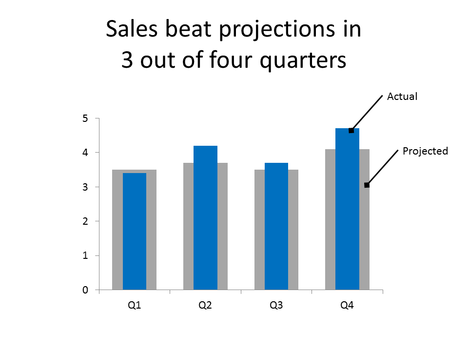
What I liked about this type of graph is that it is a good substitute for a two series column graph when you want to compare values that are related. The example above is a good illustration of this as the projected value and actual value are related information. Instead of two columns side by side where the audience has to work to determine the difference, the bullet graph shows the comparison on top of each other. This makes it easier for the audience to instantly understand whether the actual value is greater than or less than the projected value. While this is not a built-in graph type in PowerPoint, it is possible to create this graph in PowerPoint by placing the second series on a second axis and making each column a different width.
The second idea came from an Entrepreneur’s roundtable session that I moderated. One of the big issues for people trying to make a change to the presentation culture in an organization is the phrase, “It’s good enough.” Change doesn’t happen unless someone recognizes the value of that change. If the decision makers don’t see the problem as big enough, they won’t pay for a solution. When it comes to presentations, we need to look at the cost of presentations in organizations. There are costs of people spending more time creating presentations than they should because they haven’t been given the training they need. There is the cost of poor presentations that result in rework to get a decision made. I created an online calculator as part of this article that will quantify the dollar cost of presentations that require rework. And there are the hidden costs of sales not made or productivity gains not realized because the audience was confused or not convinced to take action. When totalled, these costs can easily run into the hundreds of thousands of dollars. If you want to change the presentation culture in your organization, quantify these costs and present that large dollar figure to your boss. Now they may be willing to solve the problem with the type of customized training and other resources I provide to my clients.
The third idea came from the now annual Pecha Kucha session hosted by Ric Bretschneider. Two of the participants giving example presentations used slides that were full screen images. One participant had a headline on each slide, and one did not. What I found fascinating while watching the two presentations, is how the slides without headlines kept me more intrigued as to what the presenter was going to talk about. I advocate using a headline for your slides, but this observation got me thinking in a new direction. I still think that having headlines is important in corporate presentations, especially those that will be distributed later via e-mail. I am now thinking that in certain cases where you really need to grab attention with a full screen image, consider revealing the headline after you have explained the key point. You continue to talk about the point after the headline appears on the slide, but you have taken advantage of the intrigue the audience feels before you r eveal the key point. This isn’t something that you will use in every presentation, but it is another tool to put in your presentation toolbox.
I so appreciate those of you who attended the Presentation Summit and came up to me with kind words about this newsletter and the work that I do. If you want to learn more about the conference and join us next year in San Diego, check out www.PresentationSummit.com.

Dave Paradi has over twenty-two years of experience delivering customized training workshops to help business professionals improve their presentations. He has written ten books and over 600 articles on the topic of effective presentations and his ideas have appeared in publications around the world. His focus is on helping corporate professionals visually communicate the messages in their data so they don’t overwhelm and confuse executives. Dave is one of fewer than ten people in North America recognized by Microsoft with the Most Valuable Professional Award for his contributions to the Excel, PowerPoint, and Teams communities. His articles and videos on virtual presenting have been viewed over 4.8 million times and liked over 17,000 times on YouTube.