Graphs are a great way to show numeric information visually. They aren’t the best visual in every situation, but I find that more presenters could use graphs instead of copying tables from Excel on to a slide. In today’s lesson I want to cover some best practices when using graphs in PowerPoint.
Create graphs in PowerPoint, not Excel
The first practice is one that many people find a bit shocking. I suggest you always create your graph in PowerPoint, not in Excel and copy it into PowerPoint. This comes as a shock to some. If the analysis is done in Excel, shouldn’t the graph be created there? I don’t recommend this for a number of reasons. First, when you copy a graph from Excel, you lose the ability to animate it, which is one technique that presenters should use to walk an audience through a graph. Second, you lose the full set of editing features that PowerPoint offers, since the different formats you can use to paste the graph limit what can be done with it on the slide. And third, and most important in my mind, is that the default paste exposes all the data in the entire spreadsheet to anyone who opens the file. This could expose confidential information that would be damaging to your organization.
When I suggest creating graphs in PowerPoint, some people think that they will be forced to use a tool that has less features than Excel. While that was the case eight to ten years ago, that is certainly not the case now. PowerPoint’s graphing tool is the same as the one in Excel, so you have all the same options and features. You don’t have to retype any numbers either if you have done the analysis in Excel. Just copy and paste the numbers for the graph in PowerPoint. If you have never created a graph in PowerPoint, just download and watch this video and you will see how easy it is.
Select the right graph for the message
The second practice is to make sure you have selected the right type of graph for the data and message you are delivering. Column graphs work well to show the comparison of measured values when you have seven or fewer data points. If you have more data points, you are likely showing a trend, which is best done using a line graph. Survey results are shown using a bar graph, which is what the audience will be familiar with for surveys reported in newspapers and magazines. The other common type of graph is a pie chart, which is good for showing the proportion of each segment that makes up a whole.
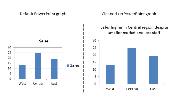
Clean up the default graph
When you create a graph in PowerPoint, it unfortunately adds a lot of elements that end up distracting the audience from the real point of your message. The third best practice is to clean up the graph to make the data the star of the visual. Replace the default graph title with the slide headline (we discussed headlines for your slides in lesson 3). Research shows that it is easier for the audience to understand if we replace the legend with text labels that are part of the graph. Finally, get rid of any gridlines that take the focus away from the data. If the value of each point is important for the audience to see, use data labels instead of gridlines.
Here is what a default graph looks like when cleaned up:
Here are some additional resources for creating effective graphs on your slides:
Editing old graphs in PowerPoint 2007 and above
How animating a graph makes it easier to understand
A method for effectively presenting a graph image from another program
This is one of the lessons in my free seven day e-course that will help you create more effective PowerPoint presentations. If you reached this page from a web search, you can sign up to get all seven e-mails delivered to your Inbox by filling in the information in the form located at the top right of this page.

Dave Paradi has over twenty-two years of experience delivering customized training workshops to help business professionals improve their presentations. He has written ten books and over 600 articles on the topic of effective presentations and his ideas have appeared in publications around the world. His focus is on helping corporate professionals visually communicate the messages in their data so they don’t overwhelm and confuse executives. Dave is one of fewer than ten people in North America recognized by Microsoft with the Most Valuable Professional Award for his contributions to the Excel, PowerPoint, and Teams communities. His articles and videos on virtual presenting have been viewed over 4.8 million times and liked over 17,000 times on YouTube.