In my recent sessions at regional AFP conferences I spoke about the issue of spreadsheets on slides in presentations of financial results and analysis. Business professionals copy these large tables of numbers on to slides because they think you need to have design skills to select the right visual and it takes a lot of time to create visuals. This doesn’t have to be the case.
Presentation designers and many other professionals struggle with selecting visuals for data. The most common approach is to select a chart or graph because it looks cool or pretty. This is not a great approach. To make it easier, some dataviz experts have published chart chooser diagrams or infographics to help people select charts.
When I look at these resources I know a lot of work has gone into them. I just find that they aren’t that helpful for most business professionals. These diagrams are academic, research, and survey focused. This means they include a lot of graphs that business professionals will never use. And they may miss some graphs that executives would find very helpful because those graphs don’t apply in academic settings.
Second, the way the charts are organized in the chooser isn’t helpful for most business professionals. The diagrams organize the charts by data type or relationship of the data. In an academic setting, these matter more than business data that is not so neatly organized. As a result it may be hard to figure out how to use the chooser diagram for visualizing financial or operational data.
Third, most choosers include many graphs that require tools other than those most business professionals have available on their computer. In the academic world, they use complex graphing tools or programming languages to create many graphs. It is the way they work. Business professionals don’t have time to learn programming tools to create graphs and the organization doesn’t want important data locked into code that only one person knows how to use. Online chart tools aren’t a solution either as they require confidential data to be entered on an external website, violating information security and privacy policies.
Ever since I published my book Select Effective Visuals I have been promoting the idea of selecting all visuals, dataviz and others, based on the message you want to communicate. This makes much more sense because in a business presentation you identify the key messages you need the audience to understand. I believe that data visuals should be selected based on the message you want to communicate. In the video below from one of my sessions this year, I introduce the six categories of financial and operational data messages.
Once you know what message you want to communicate from the analysis you have done, you can summarize it in a headline for the slide and select the visual that will communicate that message. I have many examples of visuals on my website but I have recently gone the next step to make it easier for business professionals to choose the right dataviz for their presentations.
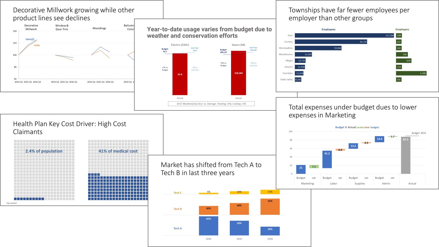
I have recently launched the FinancialViz Message-based Dataviz Chooser. This paid resource breaks down the six categories into 41 specific messages and shows 90 examples from real-world business presentations. New examples are added every quarter. You can learn more here. Below are some examples of the visuals included in the chooser.
When you choose a visual to communicate the message from financial results or analysis, select a graph based on the message, not on whether it looks cool. Your audience will appreciate it and your presentation will be more effective.

Dave Paradi has over twenty-two years of experience delivering customized training workshops to help business professionals improve their presentations. He has written ten books and over 600 articles on the topic of effective presentations and his ideas have appeared in publications around the world. His focus is on helping corporate professionals visually communicate the messages in their data so they don’t overwhelm and confuse executives. Dave is one of fewer than ten people in North America recognized by Microsoft with the Most Valuable Professional Award for his contributions to the Excel, PowerPoint, and Teams communities. His articles and videos on virtual presenting have been viewed over 4.8 million times and liked over 17,000 times on YouTube.