The latest FinancialViz makeover video I posted illustrates a situation we can often find ourselves in. We are comparing items to each other and we want to show multiple characteristics of the items to make our point. In this example from the November 2018 issue of the Globe and Mail Report on Business magazine, the visual compares three population characteristics of Canadian cities.
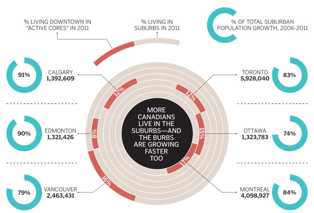
The visual looks cool, but there are two significant issues I have with it. First, it is a very busy visual. There are three characteristics of each city but each uses a different type of visual to illustrate the value. The values for each characteristic are not close to each other making the viewer scan all over the visual to try to compare the values for each characteristic.
Second, the concentric donuts make it impossible to compare the values that are important for that characteristic, % of people who live in the suburbs. The concentric donuts have different scales, so the segment for 16% in the lower left is larger than the segment for 17% in the center lower right. Viewers expect that a visual will show accurate comparisons and the concentric donuts do not do this. More importantly, the orange segments in the concentric donuts do not measure the important characteristic of % of people living in the suburbs, they measure the opposite of that, the % of people living in the downtown core. Don’t make the audience do math to figure out your visual.
In the makeover I focused on creating a visual that allowed easy comparison of the values for each characteristic (population, % in suburbs, and suburb growth rate) across the group of cities selected. Here is the visual I created.
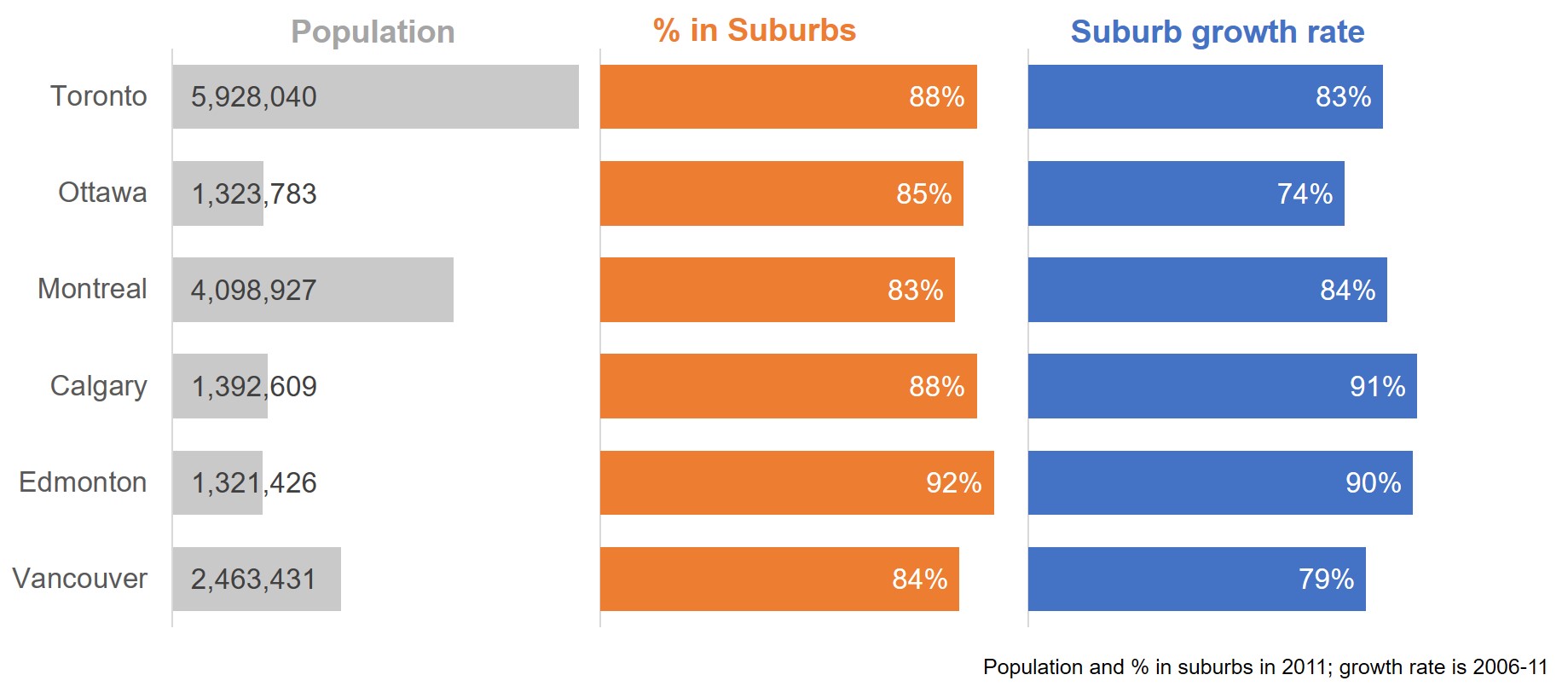
I used bar charts because they allow the viewer to easily compare values. Arranging the bar charts side-by-side allows for an easy comparison of multiple characteristics. The multiple bar charts are created using a single stacked bar chart with invisible segments to space out the visible bars. This makes sure the bars align properly with the city names.
The three characteristics have different measurement units so I scaled the bar values so they fit reasonably within the space for the chart. This is a good technique to use when the values are different by orders of magnitude. I used a feature introduced in Office 2013 to draw the population bar data labels from another set of cells since the scaled values used to create the chart would not be correct labels.
In the full makeover video I discuss how to add the baselines for each graph and a technique to use when the labels are longer than the bars as in the case for half of the values in the population bars.
When you want to compare a set of items on multiple characteristics, use multiple bar or column graphs arranged side-by-side to make it easier for the viewer to compare the values across the items.

Dave Paradi has over twenty-two years of experience delivering customized training workshops to help business professionals improve their presentations. He has written ten books and over 600 articles on the topic of effective presentations and his ideas have appeared in publications around the world. His focus is on helping corporate professionals visually communicate the messages in their data so they don’t overwhelm and confuse executives. Dave is one of fewer than ten people in North America recognized by Microsoft with the Most Valuable Professional Award for his contributions to the Excel, PowerPoint, and Teams communities. His articles and videos on virtual presenting have been viewed over 4.8 million times and liked over 17,000 times on YouTube.