Last week I was working with an organization who has a library of graphics that they encourage their staff to use. This gives a consistency to the look of their presentations. Each graphic represents a specific role, service, or element of their business. When I was reviewing the graphics, I noticed that the graphics did not have any alt text associated with them. I encouraged the organization to add descriptive alt text to each graphic in order to make the presentations more accessible to audience members with different abilities.
Making presentations more accessible has been a big focus of Microsoft in the last two years. They have added a feature in the latest versions of Office that uses AI to automatically generate alt text for images inserted on a slide. Alt text is used by screen reader software to help those with vision impairment better understand the visuals on a slide. If your organization has a library of images or graphics, I recommend that you add alt text to those items so that you provide the best description and not have to rely on the automatically generated description.
Another element on the slide that can help is to have a clear summary of the point of the slide in the headline at the top of the slide. While this helps all audiences, it helps those with visual impairment even more by allowing their screen reader software to give them the most important summary first before interpreting the visual on the slide. Presenters often have the headline hidden in their slide as I discussed in this article earlier this year.
PowerPoint now has an accessibility checker built in that will identify each element on each slide that could be improved and what it suggests you improve. In using it on my slides I realized that shapes also allow alt text and this can help make diagrams or timelines more accessible. You can read more about many of the Office initiatives in accessibility in this article. The latest addition to these tools in PowerPoint was just announced and it will allow presenters to add live captions and subtitles during the delivery of the presentation. Read more in this article. You can also review this course on LinkedIn Learning by fellow MVP Glenna Shaw that covers many techniques for making accessible Office documents and presentations.
At the MVP Summit earlier this year I learned about a Windows 10 feature that can help presenters see how their slides look to someone who has color deficiency. It is in the Ease of Access section of the Windows 10 settings in the Color Filters area. You can turn on this feature and then select a colorblindness option to see what different colors look like to someone who has that type of colorblindness. I suggest you use this to test your organization’s standard colors on diagrams and graphs.
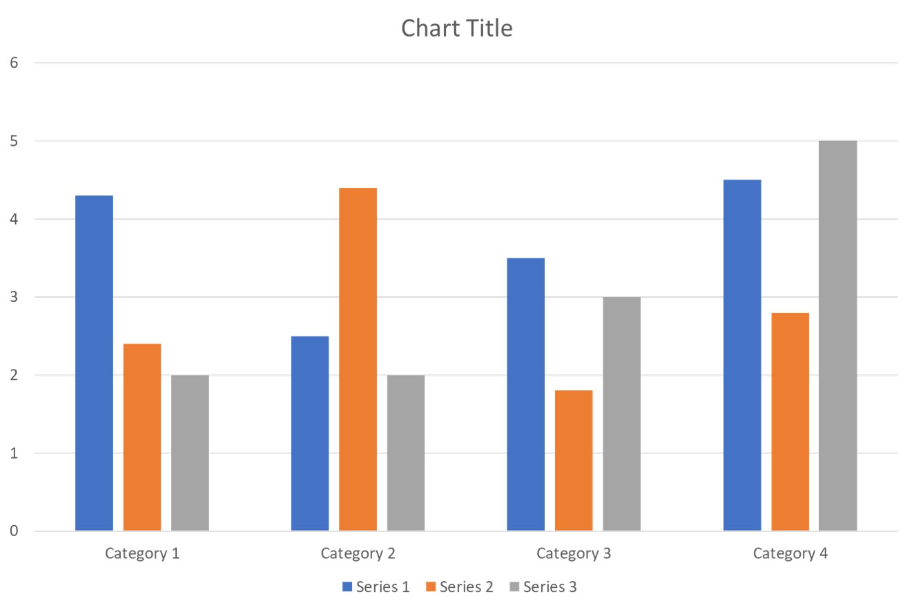
The latest standard colors in the default PowerPoint template were chosen to minimize the change in colors for those who have the two most common types of red-green colorblindness. Those with deuteranopia (green weak) will see almost no difference and those with protanopia (red weak) see only a slight difference. Here is a column graph using the default PowerPoint template colors.
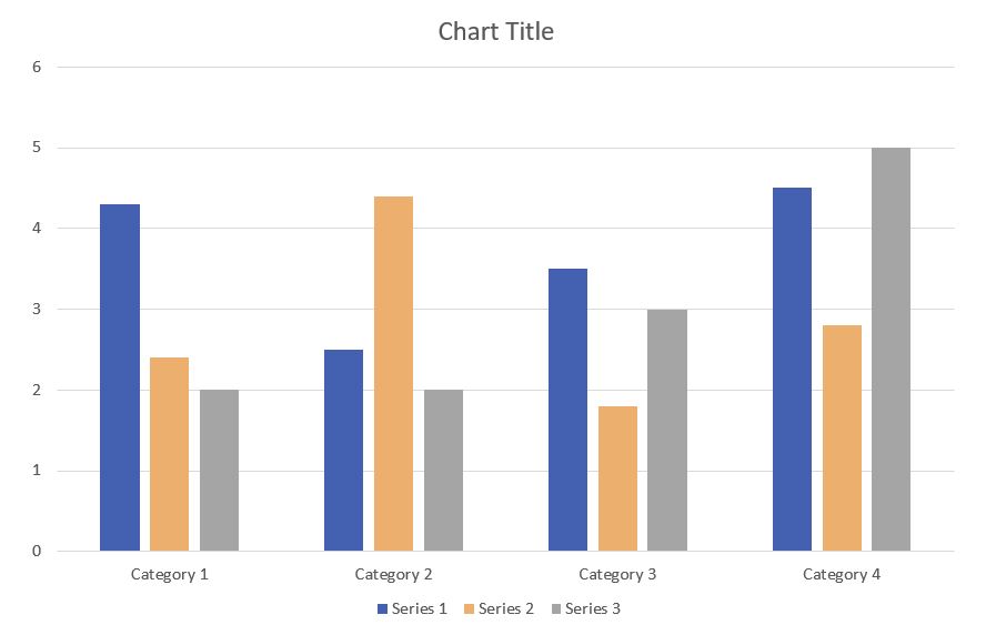
The same graph using the filter for protanopia (red weak) looks like this.
As we work towards making our presentations accessible to all audience members, use the tools that Office and Windows have built in to guide you and to add information to help those audience members with different abilities.

Dave Paradi has over twenty-two years of experience delivering customized training workshops to help business professionals improve their presentations. He has written ten books and over 600 articles on the topic of effective presentations and his ideas have appeared in publications around the world. His focus is on helping corporate professionals visually communicate the messages in their data so they don’t overwhelm and confuse executives. Dave is one of fewer than ten people in North America recognized by Microsoft with the Most Valuable Professional Award for his contributions to the Excel, PowerPoint, and Teams communities. His articles and videos on virtual presenting have been viewed over 4.8 million times and liked over 17,000 times on YouTube.