The difference between two numbers is a common element of many presentations. It could be the difference between actual and budget, this year and last year, industry average and our performance, or any two numbers that measure an important metric. Visually showing whether that difference is positive, negative, or neutral in a table is what this article is about.
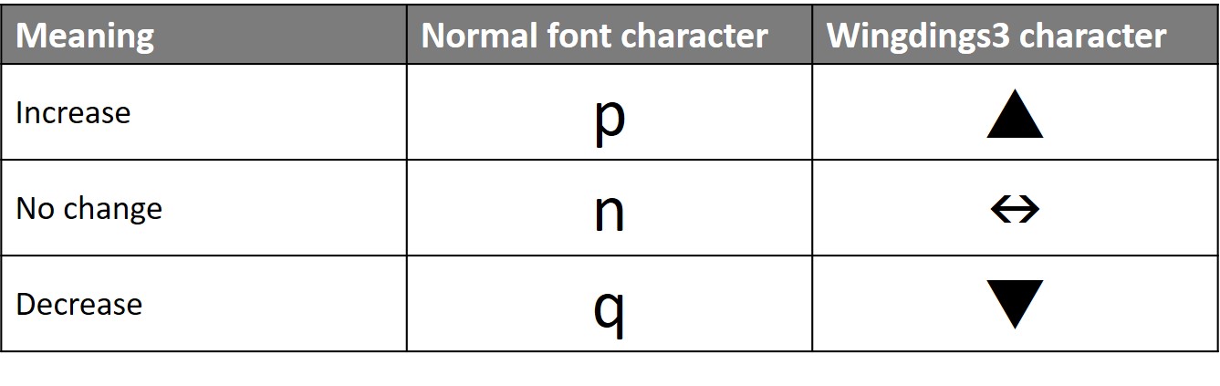
For the last few years I have been using formulas in Excel to create characters that can turn into visual indicators in the Wingdings3 font (you always wondered what that font was useful for). Here are the characters I use most often.
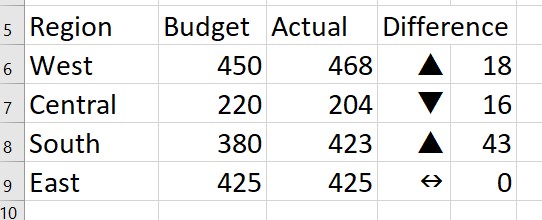
In Excel I set up cells that use a formula to calculate the character based on the values. Here is an example of a set of cells in Excel.
The formula to create the character to indicate the direction of the difference is:
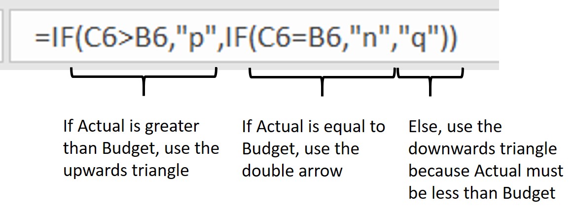
The character from the normal font is put into the cell and then the font for those cells is changed to Wingdings3.
I prefer this method to Excel’s conditional formatting because this allows you to copy the cells into PowerPoint and use the Wingdings3 font in the resulting PowerPoint table. Conditional formatting from Excel is not recognized in a PowerPoint table. The only way to have the conditional formatting show in PowerPoint is to copy the cells as an image, which means you cannot edit or format them in PowerPoint.
Using this method of selecting the visual indicator character in Excel based on a formula also ensures that the visual indicator characters are automatically updated when the data changes in the cells. This makes updating a table in PowerPoint much easier because the visual indicator characters are already correct when the cells are copied from Excel.
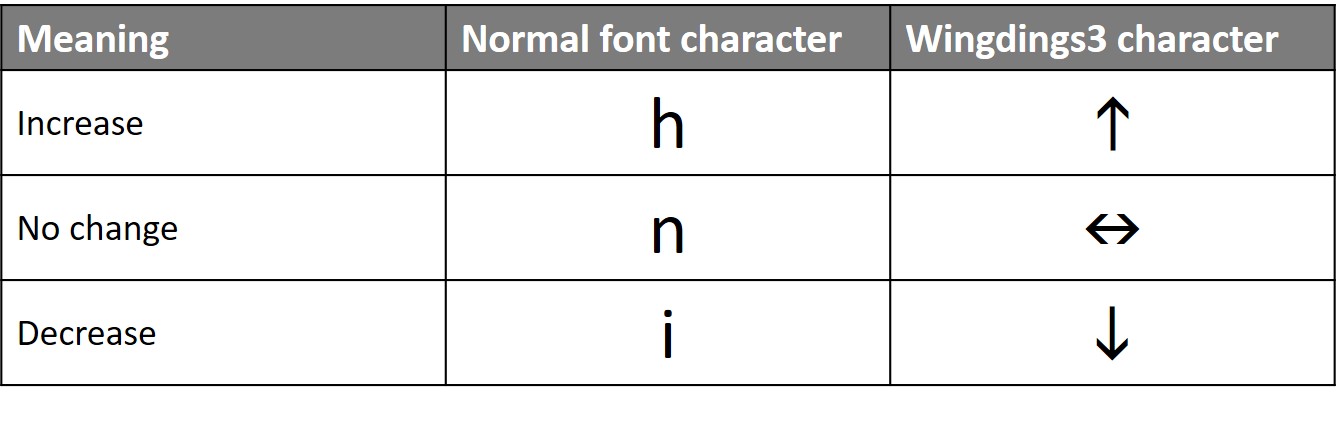
If you prefer arrows to triangles, you can use these characters.
 If you want characters to represent two levels of change in addition to no change you can use these characters.

If you regularly copy cells from Excel to communicate a message of the difference between numbers, consider whether making the table in PowerPoint more visual would help your audience understand your message, especially those not as familiar with numbers. The visual indicator characters can make the message more visual and by using formulas in Excel, you can keep the indicators updated as the data changes.

Dave Paradi has over twenty-two years of experience delivering customized training workshops to help business professionals improve their presentations. He has written ten books and over 600 articles on the topic of effective presentations and his ideas have appeared in publications around the world. His focus is on helping corporate professionals visually communicate the messages in their data so they don’t overwhelm and confuse executives. Dave is one of fewer than ten people in North America recognized by Microsoft with the Most Valuable Professional Award for his contributions to the Excel, PowerPoint, and Teams communities. His articles and videos on virtual presenting have been viewed over 4.8 million times and liked over 17,000 times on YouTube.