The latest FinancialViz makeover I posted illustrates a better way to show change in values over time. The original visual was published in the July 2018 issue of the Globe and Mail ROB magazine. Here is the original visual.
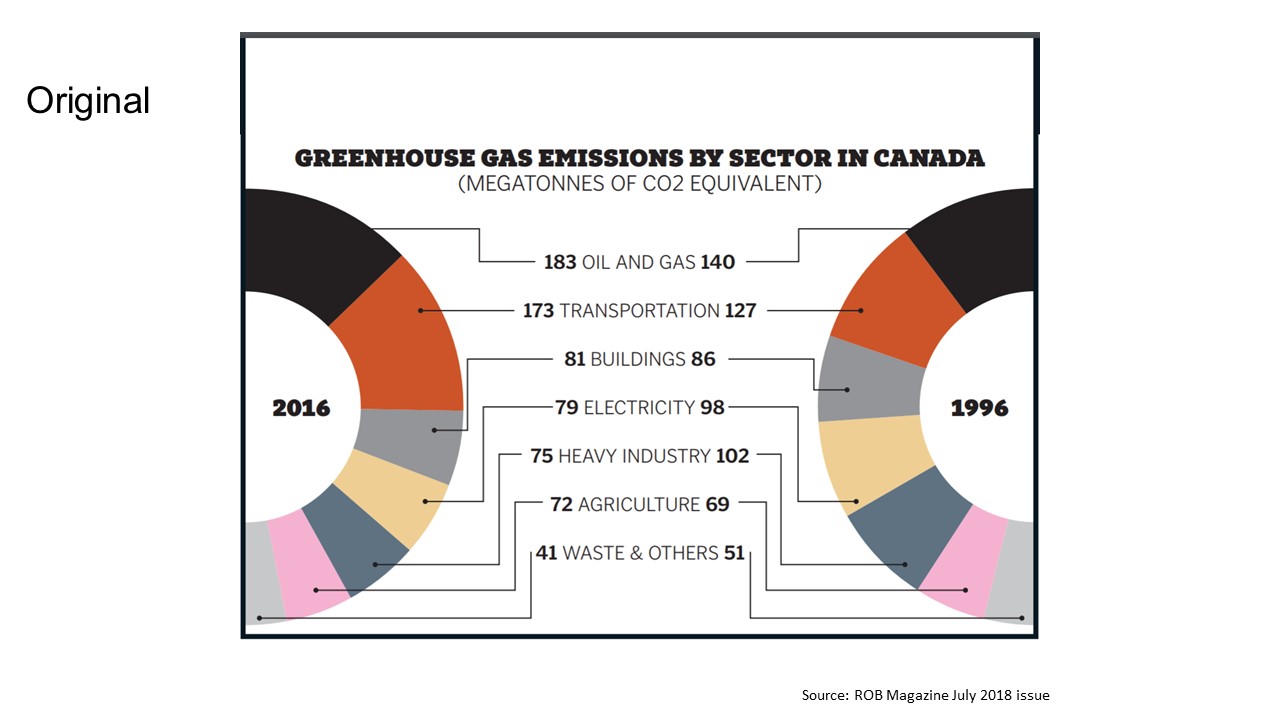
I selected this visual because it illustrates two issues that lead to audiences misinterpreting the meaning of a visual that illustrates values. The first issue is time sequence. Most people expect a visual to show time in a sequence from left to right. In this visual, the direction is from right to left, which is opposite to what people are expecting and can lead to misinterpretation.
The second issue is the more significant issue. It is the selection of a half-donut graph for the comparison of the values between the two time periods. A donut style visual should not be used to compare values to each other, it should be used to compare one segment to a total. In this situation it is even worse because the total of the segments in 1996 and 2016 are different, meaning that the size of each segment represents only the proportion of that segment in the total for that year, not the actual value. This makes it impossible for the audience to have an accurate understanding of the comparison that the visual is supposed to make.
In the makeover visual I focused on illustrating the message, which was to show how the greenhouse gas emissions rose or fell between 1996 and 2016. Here is the makeover slide.
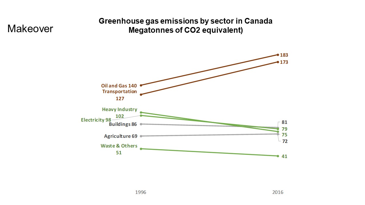
I used a simple line graph to show the change between the two time periods. The earlier date values are on the left as viewers would expect. The line graph also makes it easier to see which sectors contribute more or less emissions in each year, an insight that is almost impossible to see in the original visual. This visual is sometimes referred to as a slopegraph because the slope of the lines is important in showing the magnitude of the change in values.
I added data driven labels for each line so that the labelling is part of the visual. This is much better that using a legend. By making the labels driven by the data in the table, if the values change, the graph will automatically update. Building graphs this way is a strategy presenters can use to save time in the future.
I made a deliberate use of color to draw the audience’s attention to certain lines. The red lines indicate sectors that did worse over time, generating more emissions in 2016 than in 1996. The green lines indicate those sectors that improved their performance by decreasing their emissions significantly. The grey lines indicate the sectors that had little change in emissions over time. By matching the labels to the line color it makes it easier for the audience to interpret the visual.
In the full makeover video I discuss the specific method I used to insert the Excel graph into PowerPoint and why presenters may want to choose that method. You can view the full makeover here.
When you are comparing the change in sector performance over time, use a simple line graph and incorporate data driven labels to make it easier for the audience to interpret and easier for you to update later.

Dave Paradi has over twenty-two years of experience delivering customized training workshops to help business professionals improve their presentations. He has written ten books and over 600 articles on the topic of effective presentations and his ideas have appeared in publications around the world. His focus is on helping corporate professionals visually communicate the messages in their data so they don’t overwhelm and confuse executives. Dave is one of fewer than ten people in North America recognized by Microsoft with the Most Valuable Professional Award for his contributions to the Excel, PowerPoint, and Teams communities. His articles and videos on virtual presenting have been viewed over 4.8 million times and liked over 17,000 times on YouTube.