I recently posted a new FinancialViz makeover that illustrates a better way to compare common elements using color and position. The original visual was published in the May 2018 issue of the Globe and Mail ROB magazine and looked like this.
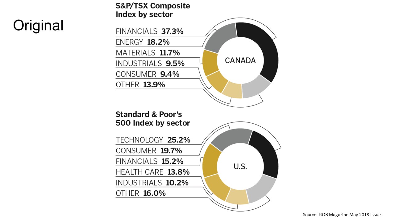
One reason I selected this visual is because it is a good example of how donut and pie charts are often misused. As I discussed in this article, a pie or donut chart should not be used to compare values to each other. In order to compare the size of the segments the audience has to compare wedge sizes or arc lengths, which is virtually impossible to do.
Another significant issue is with the order of the segments. The segments seem to be ordered by larger segments at the top and right of the donuts, with smaller segments in the lower left of the donuts. This organization causes the same sector to have different colors in the two donuts. The Financials sector is in black in the top donut and dark gold in the bottom donut. It is much harder for the audience to compare the same sector in the two donuts when they are different colors.
When I considered how to improve this visual, I started with determining what message I wanted the audience to understand from the slide. I think that one of the key messages is to compare the common sectors that are found in both indices. When comparing common elements in two data series, a small multiples graph can be a good option. Here is the visual I created to show this message.
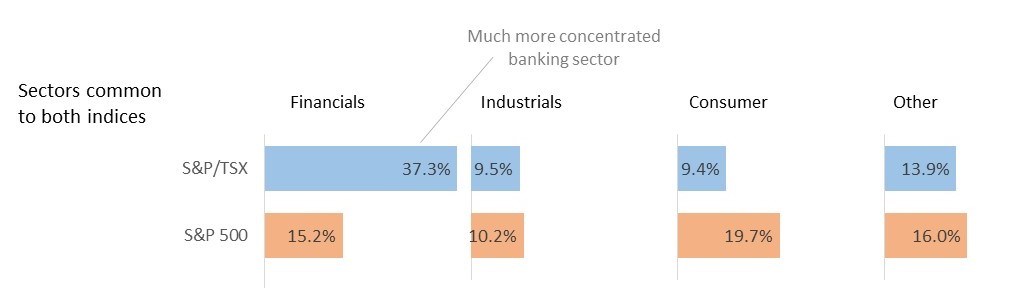
In this visual I placed the bars representing each sector in the two indices above/below each other so it is much easier to compare them. Each sector for an index is the same color so it is easy to identify the sectors in each index. This visual is a single stacked bar graph. Invisible spacer segments are used to position each set of segments on a common baseline and gridlines are used to create the baselines. I created a calculator in Excel to make creating these types of graphs easier. You can download it as one of the seven calculators I offer here.
One of the principles that all presenters can apply from this makeover is to use color and position to help illustrate comparisons. Color can be used to indicate elements that are related, like the same color for each sector in an index. Color can also be used to differentiate elements, like the different colors for the different indices. Position is important because placing elements close to each other indicates relationship. Placing the sector segments above/below each other close together allows the audience to make the comparison easier.
In the full makeover video I also discuss a second message from the original visual that I think the audience should understand and some more observations about the original visual. You can view the full makeover here.
When you are comparing common elements in multiple data series, use color and position to make the comparison easier for the audience to understand.

Dave Paradi has over twenty-two years of experience delivering customized training workshops to help business professionals improve their presentations. He has written ten books and over 600 articles on the topic of effective presentations and his ideas have appeared in publications around the world. His focus is on helping corporate professionals visually communicate the messages in their data so they don’t overwhelm and confuse executives. Dave is one of fewer than ten people in North America recognized by Microsoft with the Most Valuable Professional Award for his contributions to the Excel, PowerPoint, and Teams communities. His articles and videos on virtual presenting have been viewed over 4.8 million times and liked over 17,000 times on YouTube.