No matter what area of an organization you work in, you are likely involved in projects. They may be called initiatives or some other term, but they have a clear goal, specific deliverables, and tasks that need to be done to complete the project.
You will have to report on your progress to a steering committee, executives, or stakeholders. One common topic you will need to discuss is the timeline of the project. A Gantt chart is a popular visual used to discuss timelines and all project management software features it as a primary view of the project.
When you are reporting on the timeline, please don’t just copy and paste the Gantt chart from project management software onto a slide. It will be too confusing for the audience. Instead, be deliberate about selecting and displaying the information you will show. In this article I want to suggest four areas you need to consider when selecting and displaying information from a project plan as a Gantt chart: the timeline, the tasks, the milestones, and the dependencies.
The timeline
Whether the total project timeline is short or long, you need to decide where to start and end the timeline for the Gantt chart. Most times your message will be about what needs to be done in the near future, not what has happened far in the past. You don’t want to show tasks that are too far in the future as many factors may influence the schedule and their timing will be uncertain. You also need to decide on how granular your timeline should be. You should use light lines to indicate each segment of the timeline and if you choose too granular of a timeline you will have too many lines that will take focus away from the tasks.
The tasks
When you select the tasks to show on the Gantt chart, make sure you select the right level for the audience. Too detailed and you will overwhelm the audience. Not enough detail and you will end up with a lot of questions. Select tasks from only the deliverables that you need to speak about. Don’t include tasks from deliverables that do not apply to the message you are communicating. When you do select tasks, decide what details you need to share and how precisely the tasks need to be positioned on the timeline. Precision of placement will influence how you construct the timeline, from shapes positioned roughly in the right places to tasks positioned using precise graphs.
The milestones
The biggest decision will be whether you need to show milestones at all. If they are not important to your message, you don’t need to include them. If you decide to include milestones, decide what type of milestones you need to show – approvals, sign off, handovers, etc. – depending on the message.
The dependencies
Dependencies are also an aspect of the plan that you may not need to include if they are not important to the message. If you include dependencies, only include those that are necessary for your message and at the right level based on the tasks you have selected. Dependencies are often shown using lines that connect one task to another. You don’t want to show too many dependencies because it will look too cluttered.
There are a number of different methods you can use to create a Gantt chart. Here are three:
- Use a pre-made timeline from TimeSlides.com as the base and then add rectangles and text boxes to create the Gantt chart.
- Use shading in a table to create the bars. This video shows you how.
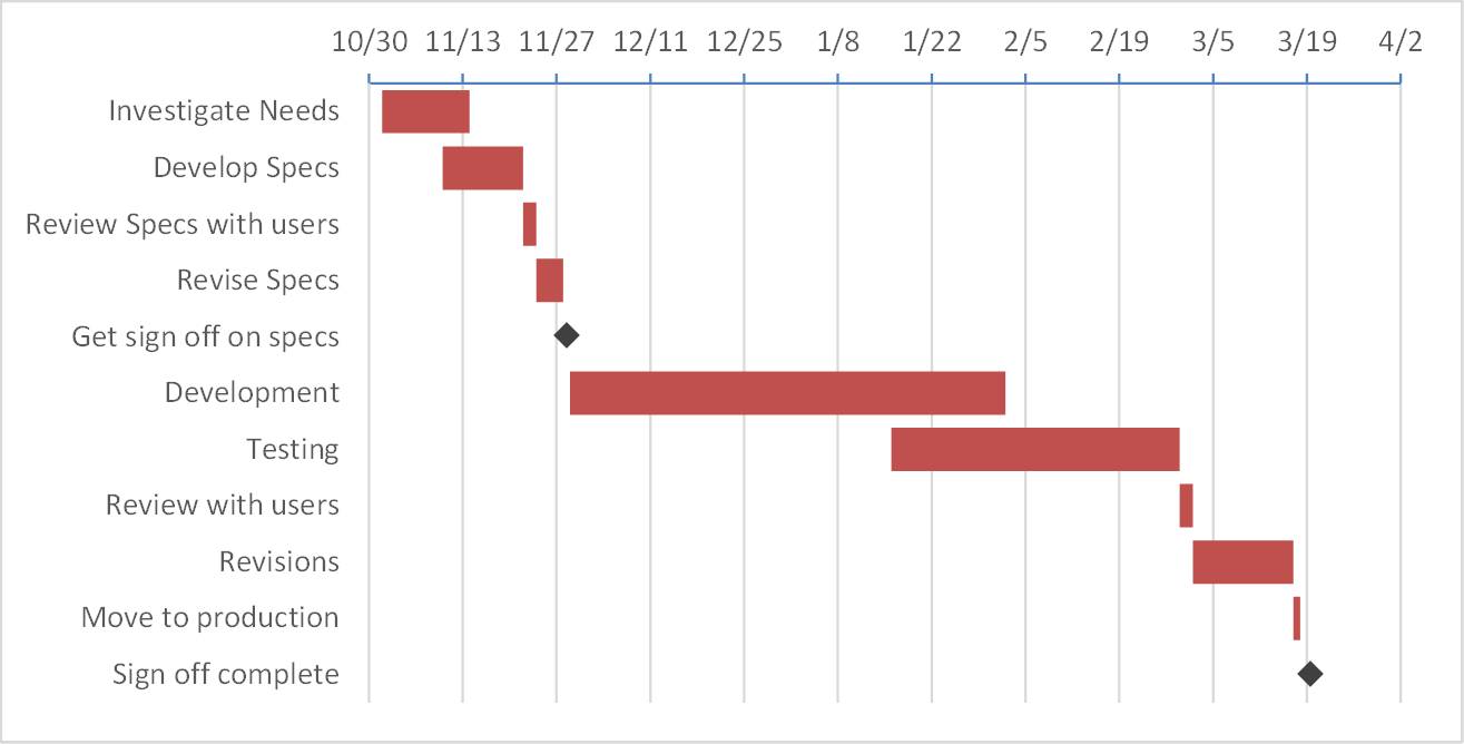
- Use a stacked bar chart in Excel to create the Gantt chart when you need high precision of position and length of the bars. This article shows how to use this method and was used to create the example below.
Gantt charts are an important visual in many project presentations. Consider the four areas, timeline, tasks, milestones, and dependencies, when you create the visual for your presentation.
Advanced solution video & sample file
I’ve taken the idea in this article and created a new video and sample file. It allows you to use either a list of dates or a list of task linkages and durations to create a Gantt chart. It teaches you the specific functions, formulas, and techniques to build your own flexible Gantt chart that is easy to update. It also gives you the flexibility to change the start date of the chart and the timeline automatically adjusts. Check it out if you want to learn how to build your own Gantt charts in Excel or PowerPoint.

Dave Paradi has over twenty-two years of experience delivering customized training workshops to help business professionals improve their presentations. He has written ten books and over 600 articles on the topic of effective presentations and his ideas have appeared in publications around the world. His focus is on helping corporate professionals visually communicate the messages in their data so they don’t overwhelm and confuse executives. Dave is one of fewer than ten people in North America recognized by Microsoft with the Most Valuable Professional Award for his contributions to the Excel, PowerPoint, and Teams communities. His articles and videos on virtual presenting have been viewed over 4.8 million times and liked over 17,000 times on YouTube.