Too often financial results or analysis are reported using spreadsheets or paragraphs of text. I have worked for a number of years helping professionals in finance, treasury, and other areas use visuals to effectively communicate important messages. Often the most impactful part of my customized workshops or conference sessions are the real-world examples I show.
I’ve now taken the many examples I have and organized them on a new part of my website called FinancialViz.com. The examples are organized by the message they communicate because I believe that the correct visual is based on the message, not on how nice it looks. I have organized the examples into nine categories of messages based on my years of working with financial professionals and the messages they communicate.
My hope is the financial professionals and others who deal with operational data can use the examples as inspiration for transforming their own presentations and reports. For each example I provide commentary on the original visual and the makeover visual so you can learn what to look for in your own situation.
Here are the three latest examples so you get an idea of what you can learn.
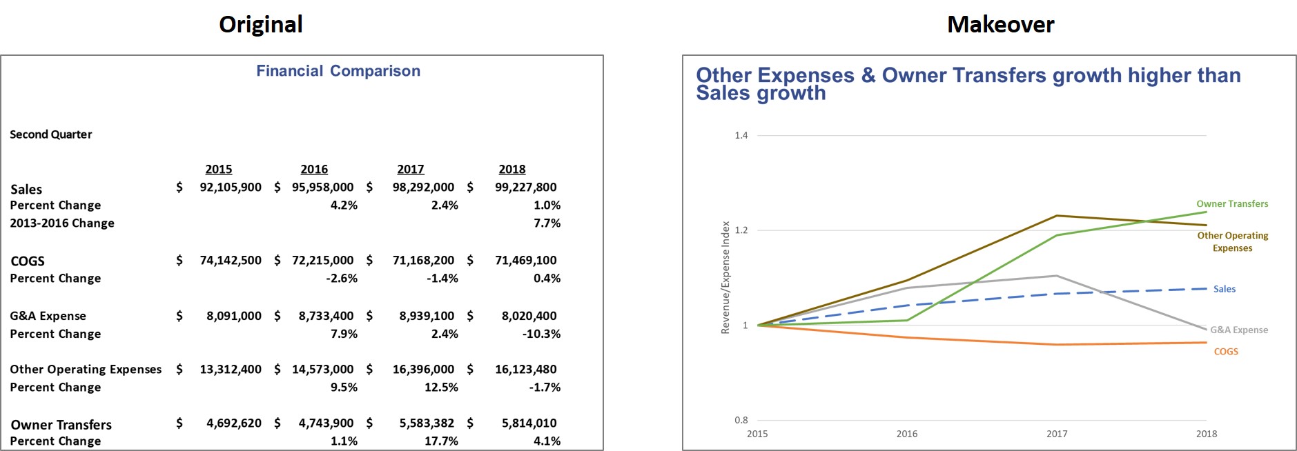
Comparing growth in Sales and Expense categories over time
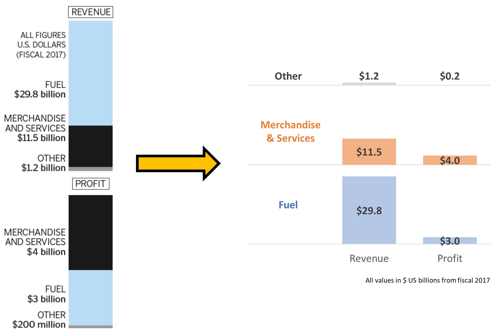
Comparing Revenue and Profit in lines of business
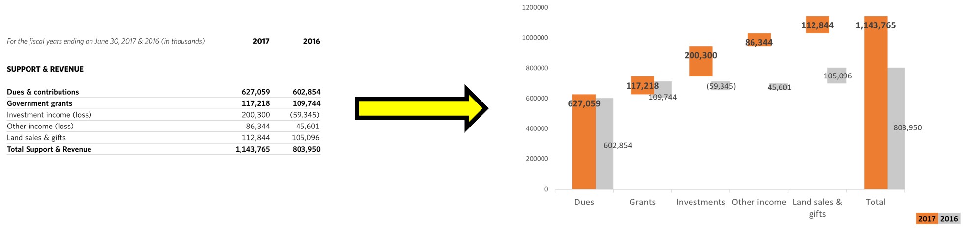
Comparing Revenue components to previous year
I have many more examples that I will be sharing in the newsletter and on this area of my site. If you have a financial slide you are looking to improve, remove the confidential information and send it to me. I might use it in a future FinancialViz makeover.

Dave Paradi has over twenty-two years of experience delivering customized training workshops to help business professionals improve their presentations. He has written ten books and over 600 articles on the topic of effective presentations and his ideas have appeared in publications around the world. His focus is on helping corporate professionals visually communicate the messages in their data so they don’t overwhelm and confuse executives. Dave is one of fewer than ten people in North America recognized by Microsoft with the Most Valuable Professional Award for his contributions to the Excel, PowerPoint, and Teams communities. His articles and videos on virtual presenting have been viewed over 4.8 million times and liked over 17,000 times on YouTube.