Last year data viz expert Andy Kirk created a useful resource called the Chartmaker Directory. It is a collection of resources on how to create charts in different tools. The tools vary from programming languages to big data analysis tools to common Office tools like Excel and PowerPoint. The resources have been crowd sourced with people contributing links to examples and solutions every month. Andy reviews each submission to ensure that it is appropriate. In this article I want to explain how you can use the Chartmaker Directory to help create effective charts in your presentations.
The directory is arranged as a large grid. The rows are the different types of charts and the columns are the different tools. At the intersection of a row and column you will find resources related to creating that chart in that tool. There are two types of resources that may be listed. There are examples of that chart being created in that tool (the unfilled circles) and there are solutions that give guidance on how to use that tool to create that chart (the filled circles).
As you explore the tool, I encourage you to look at the list of charts on the left side of the grid. The charts are grouped by families with a legend at the top right of the grid. There will be some charts you have never heard of before. If you are wondering what that chart is and whether it may be useful for your situation, scroll across that row and find some examples to view. It doesn’t matter what tool they were created in, you are just learning about that type of chart. You may discover one or more new chart types you can use in your presentations.
The second way to explore the grid is to scroll over to the right until you see the columns for Microsoft Excel and Microsoft PowerPoint. Since the graphing engine is the same in both programs, any examples or tutorials you find in these columns will apply to both tools. Scroll down the grid and click on the links in these columns to find examples of graphs you can create and tutorials on how to create the graphs (I have contributed a number of solutions in the PowerPoint column).
For example, near the top of the grid you will find a chart called a dot plot. It can be a good way to show how values have changed between two points in time. You will find four solution resources (the filled circles) in the cell for Microsoft Excel.
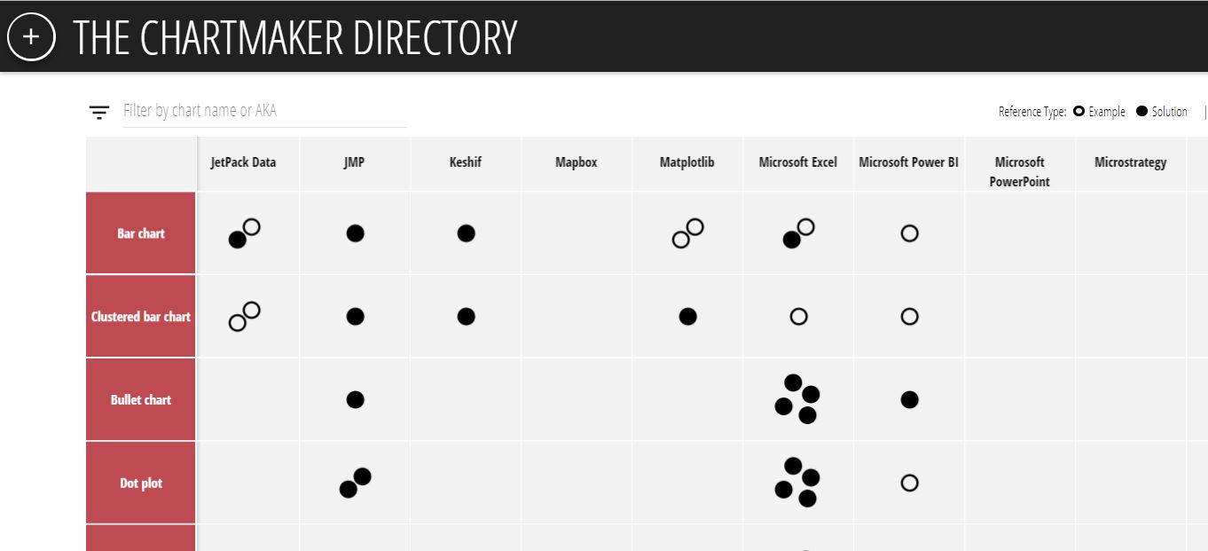
When you click on the lower left solution circle in this cell, you go to a page by data viz expert Stephanie Evergreen that shows you how to create this type of chart in Excel.
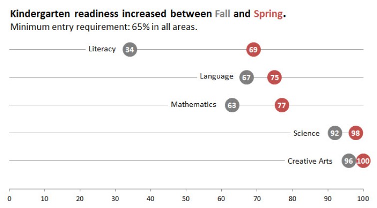
Once you read her step-by-step instructions, you can create your own dot plot and you may see a way to modify the instructions to make it easier or more meaningful in your situation. At least now you have a solid starting point for creating this type of chart.
When you want to improve your use of charts for representing data, spend some time exploring the Chartmaker Directory. Discover new charts and learn techniques for the tools you already use. If you have a solution or example to contribute, use the “+” button at the top left of the grid to submit resources for everyone to learn from. Thanks to Andy for setting up and maintaining this resource.

Dave Paradi has over twenty-two years of experience delivering customized training workshops to help business professionals improve their presentations. He has written ten books and over 600 articles on the topic of effective presentations and his ideas have appeared in publications around the world. His focus is on helping corporate professionals visually communicate the messages in their data so they don’t overwhelm and confuse executives. Dave is one of fewer than ten people in North America recognized by Microsoft with the Most Valuable Professional Award for his contributions to the Excel, PowerPoint, and Teams communities. His articles and videos on virtual presenting have been viewed over 4.8 million times and liked over 17,000 times on YouTube.