Twice in the past few months I have seen column charts with axis breaks. Some software makes it easy to create these types of charts. In this article I want to recommend against using this type of chart and offer some alternatives.
To start with, what is an axis break chart and why would it be created? If the values you are comparing are different by an order of magnitude, a regular column chart makes it difficult to see the smaller value. Here is an example of a broken axis chart.
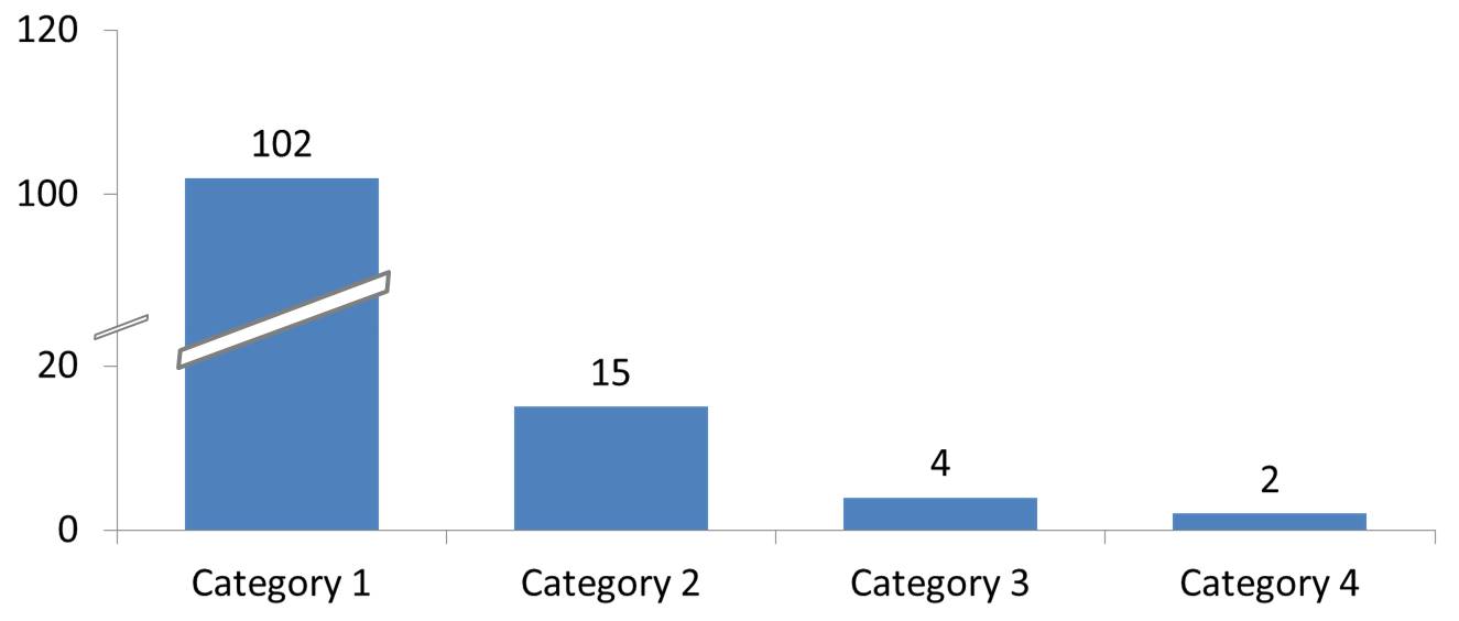
These charts are very hard to create in Excel or PowerPoint, usually involving manually adding the break shape or splitting a graph image into two pieces. They are misleading to the audience because they don’t allow an accurate comparison of the height of the columns. The indicator for the missing section is seen, but almost everyone will find it difficult to take the gap into account when visually comparing the columns.
One problem is that some software uses axis breaks as a default. Unless you change the default setting, all column charts will include an axis break. The missing section will be different each time, making the graphs not consistent. Make sure that this is not the case in software you are using.
What alternatives do you have if the values you are comparing are different by an order of magnitude or more?
My first choice when values are different by orders of magnitude is to use a proportional shapes visual instead of a column graph. A proportional shapes visual uses the area of shapes to represent the values so you have two measurement dimensions instead of one as a column chart does. Here is an example used in a customized workshop.

Since this is not a built-in chart type in PowerPoint or Excel, I have a calculator that calculates the area of the shapes and a video that shows you how to create the exact sized shapes in PowerPoint. You can access both here.
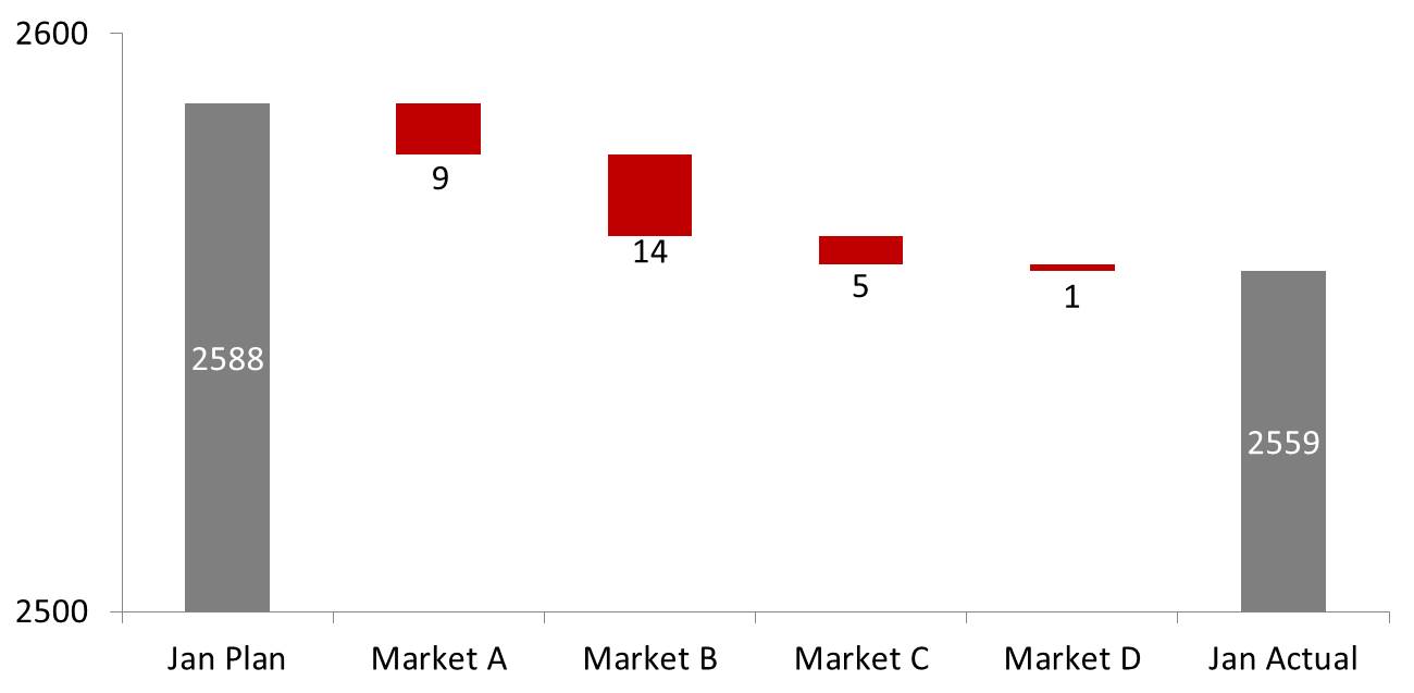
Another approach that is useful for waterfall charts that have small difference components compared to the starting and ending values is built on the article I wrote earlier this year on non-zero based axis charts. Start with a waterfall chart that has a true zero base so the audience sees that the differences are very small compared to the starting and ending values. Then show a zoomed in version where the axis starts at a value that allows the audience to compare the change segments to each other, like this example.
A third alternative is when you want to primarily focus on the smaller values. Start with a graph that includes the large value so the audience has the overall context. Then show a graph of just the smaller values so those differences are easily visible.
Visually showing values that are different by orders of magnitude is a challenge, but I encourage you to consider using one of the three approaches in this article instead of a broken axis chart.

Dave Paradi has over twenty-two years of experience delivering customized training workshops to help business professionals improve their presentations. He has written ten books and over 600 articles on the topic of effective presentations and his ideas have appeared in publications around the world. His focus is on helping corporate professionals visually communicate the messages in their data so they don’t overwhelm and confuse executives. Dave is one of fewer than ten people in North America recognized by Microsoft with the Most Valuable Professional Award for his contributions to the Excel, PowerPoint, and Teams communities. His articles and videos on virtual presenting have been viewed over 4.8 million times and liked over 17,000 times on YouTube.