Recently I wrote about how I think presenters should replace stacked column or bar graphs with better visuals (see the entire article here). In my customized workshops I have participants who need to create a stacked graph because the boss wants it or the audience expects to see the data presented that way. Often they need to show each segment, as well as the total of the segments.
In this article I want to explain two methods for adding the total to a stacked column or bar graph. One method works for both graphs and the other method works only for stacked column graphs. These methods are driven by data, not adding text box labels. This means they are easier to update when the values are copied from Excel.
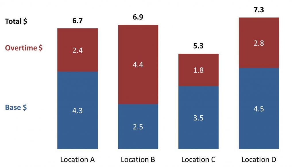
I will start with the method that only works for stacked column graphs. Here is an example of the total added to segments that break down the total spending on staff into regular and overtime pay.
The method used to add the totals to the top of each column is to add an extra data series with the totals as the values. Change the graph type of this series to a line graph. Set the line to no color and add data labels of the values above each data point. This positions the totals above the segments in the column.
As I have done in the example above, I suggest adding data labels to each segment since those values are also important for the audience (if the segments were not important, you would use a simple column graph of the total values). I also added text box labels to indicate what each segment and number represent. This is more effective than the default legend (see this article on replacing the default legends).
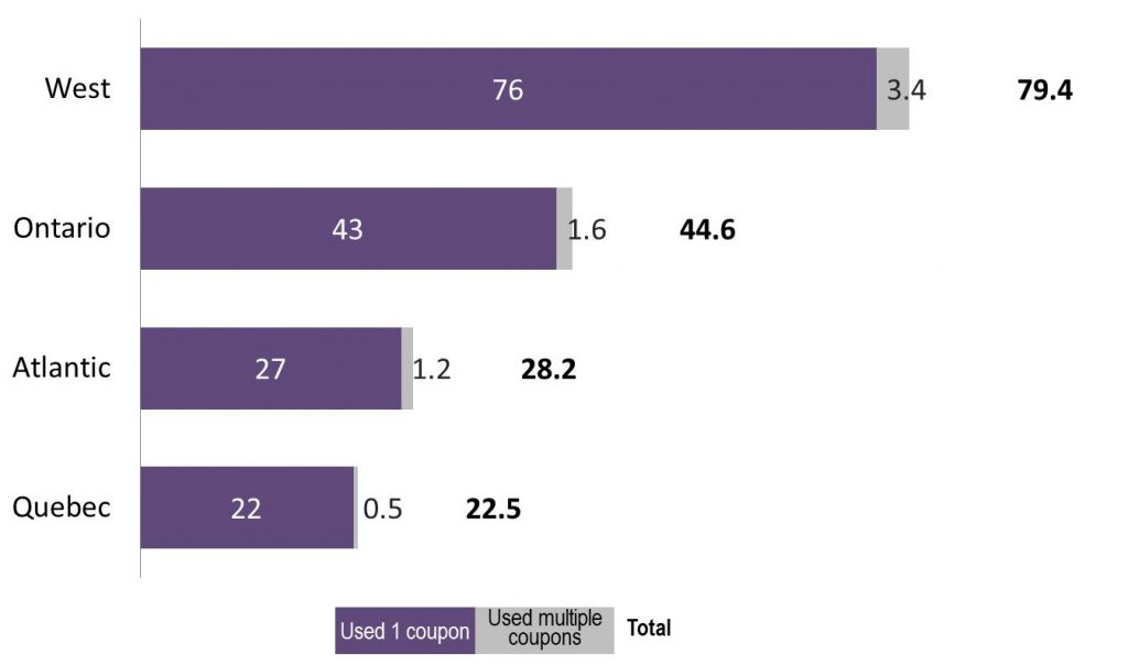
Changing one data series to a line graph doesn’t work for stacked bars, so a different method must be used to add totals to the end of the bars as this example shows.
This method is a little more involved. You add two data series to the stacked bar graph. The first is a spacer segment that adds some distance between the end of the last segment and the total value. This is especially important when the data label for a segment runs outside of the segment (as shown in the example above). The second added data series contains the total values. Set the spacer segments to have no fill or outline color, making it invisible. Set the total data series to also have no fill or outline color because we don’t want that segment to show on the graph. Add data labels to the total segment at the Inside Base position so they are at the far left side of the segment.
Using the default horizontal axis you will notice that there is a lot of blank space to the right of the segments. This is space for the total segment, which is not visible. To remove the extra space, change the maximum on the horizontal axis to approximately 10-20% more than the highest total value. This gives enough room for the spacer and totals to be shown while removing the extra space that is not needed. Again I have added a visual legend instead of the default legend (the article referenced above has tips on creating these legends).
This method of adding a spacer and total segment to the graph also works for a stacked column graph. The total series as a line graph method is usually easier for stacked columns.
When you have to add a total to a stacked column or bar graph, consider one of these methods.

Dave Paradi has over twenty-two years of experience delivering customized training workshops to help business professionals improve their presentations. He has written ten books and over 600 articles on the topic of effective presentations and his ideas have appeared in publications around the world. His focus is on helping corporate professionals visually communicate the messages in their data so they don’t overwhelm and confuse executives. Dave is one of fewer than ten people in North America recognized by Microsoft with the Most Valuable Professional Award for his contributions to the Excel, PowerPoint, and Teams communities. His articles and videos on virtual presenting have been viewed over 4.8 million times and liked over 17,000 times on YouTube.


