In the past I have written about why I think text slides play an important role in business presentations and will continue to do so (see this article for more of my thoughts on this issue). If your text is grouped into related areas, take the opportunity to present the text more visually on the slide.
I first discussed this idea a couple of years ago when I wrote about some ideas for visualizing text by presentation designer Johanna Rehnvall in newsletters here and here. When I show these types of makeovers in my customized workshops people always appreciate them because it gives ways to break up the typical bullet point formatted slides.
Here is a typical heading and bullet point slide based on a makeover from a recent session:
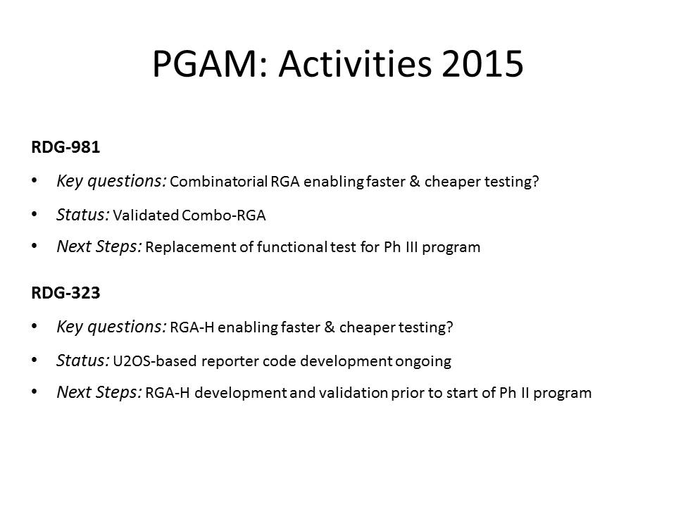
All of the information is accurate, but it doesn’t have any visual appeal. Here is the slide after applying the idea of grouping text into shapes to show how it is organized.
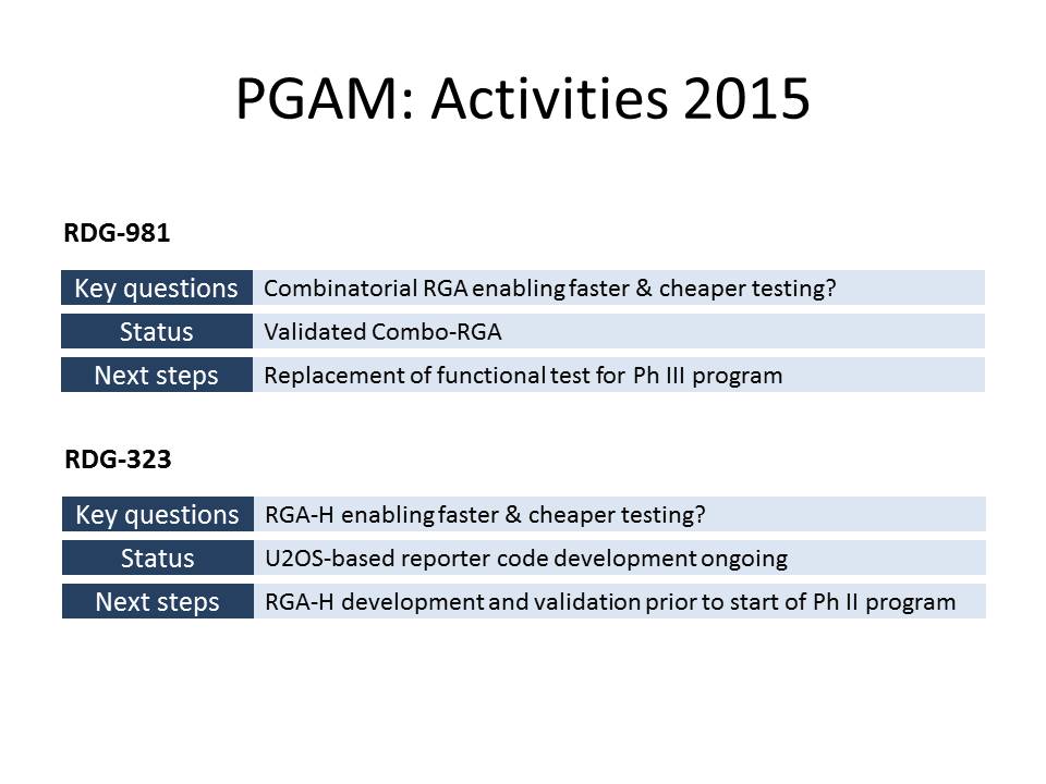
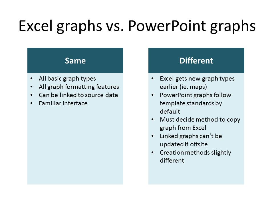
The groups here are oriented horizontally. You can also orient them vertically as in this example.
When I am considering whether to orient a slide with text in shapes horizontally or vertically, here is what I think about. If the text is grouped by related topic, I will usually choose a horizontal orientation. This works especially well when you will have multiple slides that show the same groupings for different projects, departments, etc., as in the first example above.
If the message is one where the groups are being compared or contrasted, then I will usually choose a vertical arrangement, as in the second example. This could be options, approaches, advantages/disadvantages, pros/cons, or same/different. The side-by-side arrangement gives a visual cue to the audience of the relationship between the groups.
If you are interested in learning more about ways to arrange text visually, I have an ecourse that shows you seven ways to transform a typical bullet point slide into a more visual text slide. The details are here and I encourage you to scroll down the page and look at the Introduction & Lesson Overview to see all the visuals covered in the videos.
Text slides will always be part of business presentations. Don’t just use the default bullet and sub-bullet formatting. Make your text slides more visual so you communicate your message more effectively.

Dave Paradi has over twenty-two years of experience delivering customized training workshops to help business professionals improve their presentations. He has written ten books and over 600 articles on the topic of effective presentations and his ideas have appeared in publications around the world. His focus is on helping corporate professionals visually communicate the messages in their data so they don’t overwhelm and confuse executives. Dave is one of fewer than ten people in North America recognized by Microsoft with the Most Valuable Professional Award for his contributions to the Excel, PowerPoint, and Teams communities. His articles and videos on virtual presenting have been viewed over 4.8 million times and liked over 17,000 times on YouTube.