One of the messages you may want to communicate in a presentation is a length of time measured in minutes or seconds. It may be the time it takes for a step in a process, it may be the time it takes for processing a request, or the goal for answering customer service calls. While you can state the time using a number on a slide, it can be more impactful to create a visual like this:
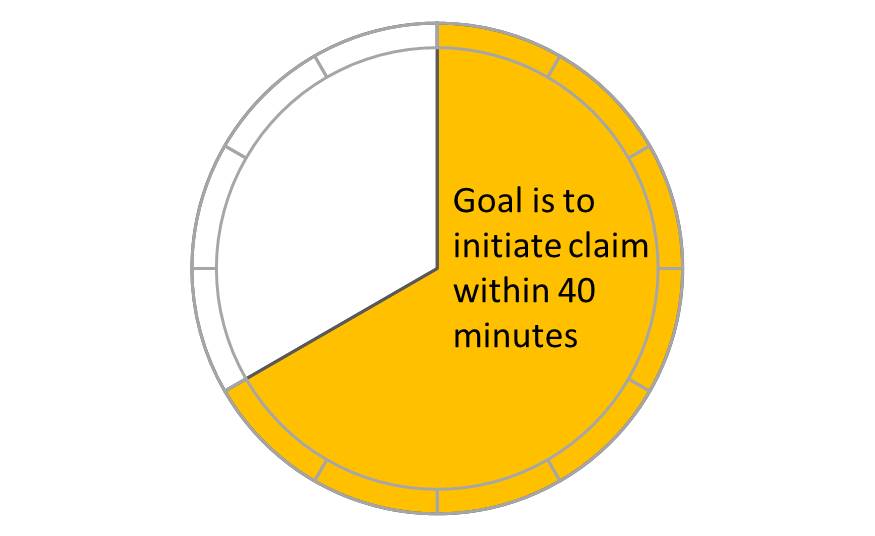
Whenever you create a visual that represents a clock, whether it represents 60 minutes or 60 seconds, it is important to make it accurate. One of the best ways to ensure accuracy is to use a graph because it allows you to control the size of each segment precisely. The visual above is created by using a pie chart and a donut chart. I created a video that shows you how it was done.
(If playing video above does not work, the video is at https://youtu.be/WTch5_NbGRU)
The next time you have to communicate a message that involves seconds in a minute or minutes in an hour, consider showing it visually using graphs.

Dave Paradi has over twenty-two years of experience delivering customized training workshops to help business professionals improve their presentations. He has written ten books and over 600 articles on the topic of effective presentations and his ideas have appeared in publications around the world. His focus is on helping corporate professionals visually communicate the messages in their data so they don’t overwhelm and confuse executives. Dave is one of fewer than ten people in North America recognized by Microsoft with the Most Valuable Professional Award for his contributions to the Excel, PowerPoint, and Teams communities. His articles and videos on virtual presenting have been viewed over 4.8 million times and liked over 17,000 times on YouTube.