One of the most powerful pieces of supporting information you can use to provide proof of a point you are making is to use a visual created as part of research from a government agency, industry group, or private research firm. These qualified, independent sources provide third-party support to the point we want to make and lend credibility to our message. When using this type of visual, it is important to do it properly.
It starts with making sure you have permission to use the visual. Respecting the intellectual property of others is important, so make sure to check the copyright and license information related to what you want to use. Sometimes this will be listed on the website if the visual you want to use is online, and sometimes the way you can use the visual will be printed in the document. If the usage rights are not clearly stated, contact the organization for permission.
When you have permission to use the research, make sure you cite the source on your slide. Many organizations have required or preferred ways that you should cite usage. This is what Statistics Canada says on their website:
On the bottom of your slide, include a citation using the preferred method. Unless otherwise required, I suggest you use a smaller italics font (perhaps 8 or 10 point) and a font color that is not as high contrast as your body text (a medium gray instead of black for example). The idea is to properly cite the research as requested, but not make the citation the focus of the slide.
Just because an organization has created a visual doesn’t mean that you have to use the entire visual as they created it. Often the visual will have a title, subtitle, and contain all the data that was in the study. Make a decision about what portion of the visual you need to make your point. In a workshop last year, one example was a bar chart that contained eight bars with a title and subtitle. The message we wanted to convey was about the top reasons cited in the research. We cropped the visual to show just the top four bars, without the title text. Then the visual could be made larger and have more impact on the slide.
If the visual is provided as an image file, that is ideal. Often this is not the case. You will have to use a screen capture of the visual instead. The best looking screen captures will come when you make the image as large as possible before doing the capture. If enlarging the image makes it look fuzzy, you may have to go with the original size. One option is to see if a PDF version of the report exists. If so, you can usually get a high resolution screen capture by zooming in on the visual in the PDF.
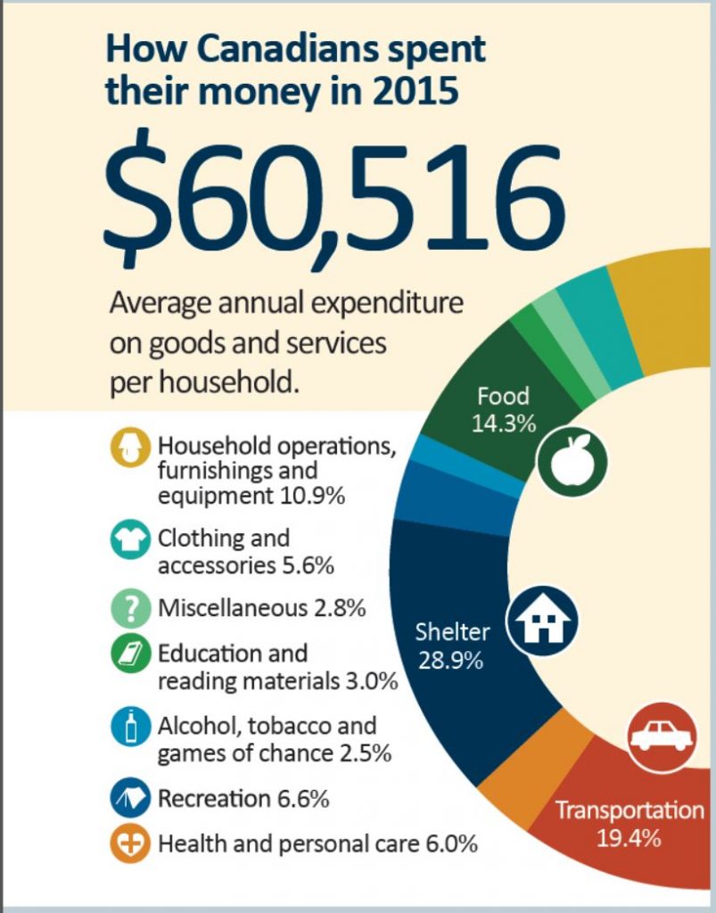
Just because a report shows the visual in a particular way doesn’t mean you have to use the visual as is if it does not clearly communicate the message you want. This visual is from the 2015 Household spending in Canada infographic.
Source: Statistics Canada, 2015 Household spending in Canada infographic, January 27, 2017. Reproduced and distributed on an “as is” basis with the permission of Statistics Canada.
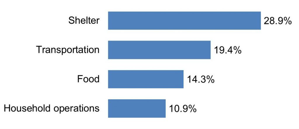
The designer has used a rotated speedometer chart where the expenditure areas are ordered by color chosen instead of by largest to smallest. If the message we wanted to discuss are the top four areas of spending, we would want to recreate the visual into a bar chart like the following.
Adapted from Statistics Canada, 2015 Household spending in Canada infographic, January 27, 2017. This does not constitute an endorsement by Statistics Canada of this product.
Note how the citation is slightly different because Statistics Canada requests a different citation when using the image as is versus creating a derivative work, which our redesigned visual would be considered.
Published research results can be a powerful way to support a message. When you find a visual that supports your point, use the suggestions in this article to incorporate that visual in an appropriate manner.

Dave Paradi has over twenty-two years of experience delivering customized training workshops to help business professionals improve their presentations. He has written ten books and over 600 articles on the topic of effective presentations and his ideas have appeared in publications around the world. His focus is on helping corporate professionals visually communicate the messages in their data so they don’t overwhelm and confuse executives. Dave is one of fewer than ten people in North America recognized by Microsoft with the Most Valuable Professional Award for his contributions to the Excel, PowerPoint, and Teams communities. His articles and videos on virtual presenting have been viewed over 4.8 million times and liked over 17,000 times on YouTube.


