In my customized workshops I show makeovers of slides the participants have provided to show how cutting the information overload makes the message much clearer for the audience. I often hear someone say that this is an example of the “less is more” approach. In this article, I want to explain why I don’t think that less is more.
By definition, less can’t be more. They are two opposite ideas. If less was truly more in presenting, we could just stop talking mid-sentence half-way through our time and the audience would jump to their feet in a thunderous standing ovation. The CEO would rush over and immediately promote us to a senior executive position. See how ridiculous that is.
Just presenting less won’t help the audience. What will help is selecting the few key messages they need to hear and presenting those well. I think “Clear is More” is a better statement to use. Clear communication of key messages is better understood, more often acted upon, and more appreciated by the audience.
Selecting the most important messages for your audience is not easy. It requires effort to identify the needs of this audience, understand how to move them to the goal you have set for the presentation, and the ability to emotionally let go of some of the information you have worked on that isn’t as important as the key messages. This is much harder than just cutting half the presentation to create “less”.
Clear communication also means creating visuals that the audience immediately understands. Start with a headline for each slide that summarizes the message you want the audience to remember. Then use a visual to illustrate that message. Use graphs to clearly communicate comparisons, rankings, or contributions of numeric data. Use diagrams to communicate sequences, relationships over time, or relationships between entities. Use images to show people, places, or objects. When the slide is clear, the audience understands your point immediately.
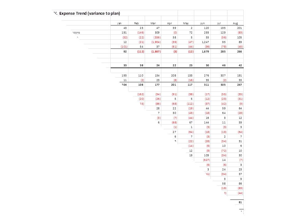
Here is an example of just cutting half the data in a spreadsheet slide.
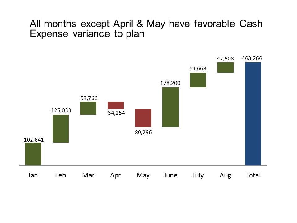
And here is the clear version of the key message that cash variance has been positive most months so far in the year.
Could most presentations benefit from less information in them? Yes. My audience surveys indicate that information overload is the biggest issue in presentations today. But don’t just chop out half the content as the “less is more” approach would suggest. Make deliberate decisions on what content will be most valuable to your audience and communicate those messages clearly. Switch to a “Clear is More” approach and your presentations will be more effective.

Dave Paradi has over twenty-two years of experience delivering customized training workshops to help business professionals improve their presentations. He has written ten books and over 600 articles on the topic of effective presentations and his ideas have appeared in publications around the world. His focus is on helping corporate professionals visually communicate the messages in their data so they don’t overwhelm and confuse executives. Dave is one of fewer than ten people in North America recognized by Microsoft with the Most Valuable Professional Award for his contributions to the Excel, PowerPoint, and Teams communities. His articles and videos on virtual presenting have been viewed over 4.8 million times and liked over 17,000 times on YouTube.