Office 365, Microsoft’s subscription method for getting Office, has a big advantage over the standalone method we used in the past, where we bought a new version every few years. Every month Microsoft adds new features to the Office programs if you are on the subscription model. These new features don’t get added to the standalone version of Office 2016 and they don’t get added to older versions of Office.
You may see some of these new features mentioned in the press or online. Of interest to many business professionals are the new graphs that have been added to Office 365 in the last few months. Today I want to show you how to create some of the new graphs in older versions of Office, since most of you, my clients and subscribers, do not use Office 365 yet. My methods don’t include every feature of the new graphs, but likely all the ones you really need. The images shown are the default versions of the new graphs in PowerPoint.
Waterfall Chart
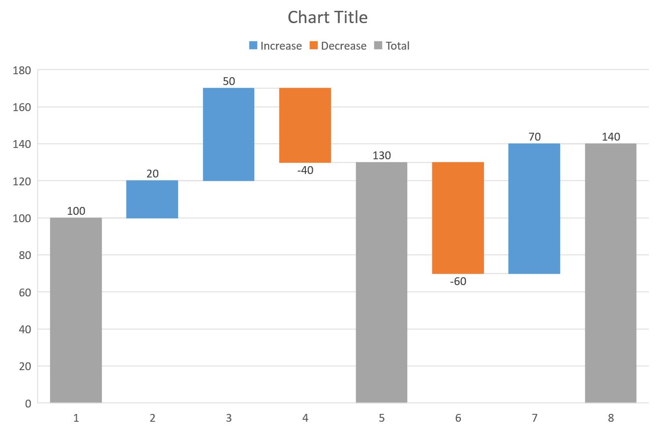
This is a very common chart in financial presentations. I’ve had presenters ask about how to create this chart for years. The new Waterfall Chart in Office is, like all of the new charts, still evolving in its features, so even if you have Office 365 it may not fit your needs. A couple of years ago I created a Waterfall Chart Calculator that does the calculations for you to be able to use the Stacked Column Chart to create a Waterfall Chart. This method works in all versions of Office. This calculator is part of seven calculators you can get for free from my website. You even get videos that show you exactly how to use the calculators to create the visuals.
Histogram
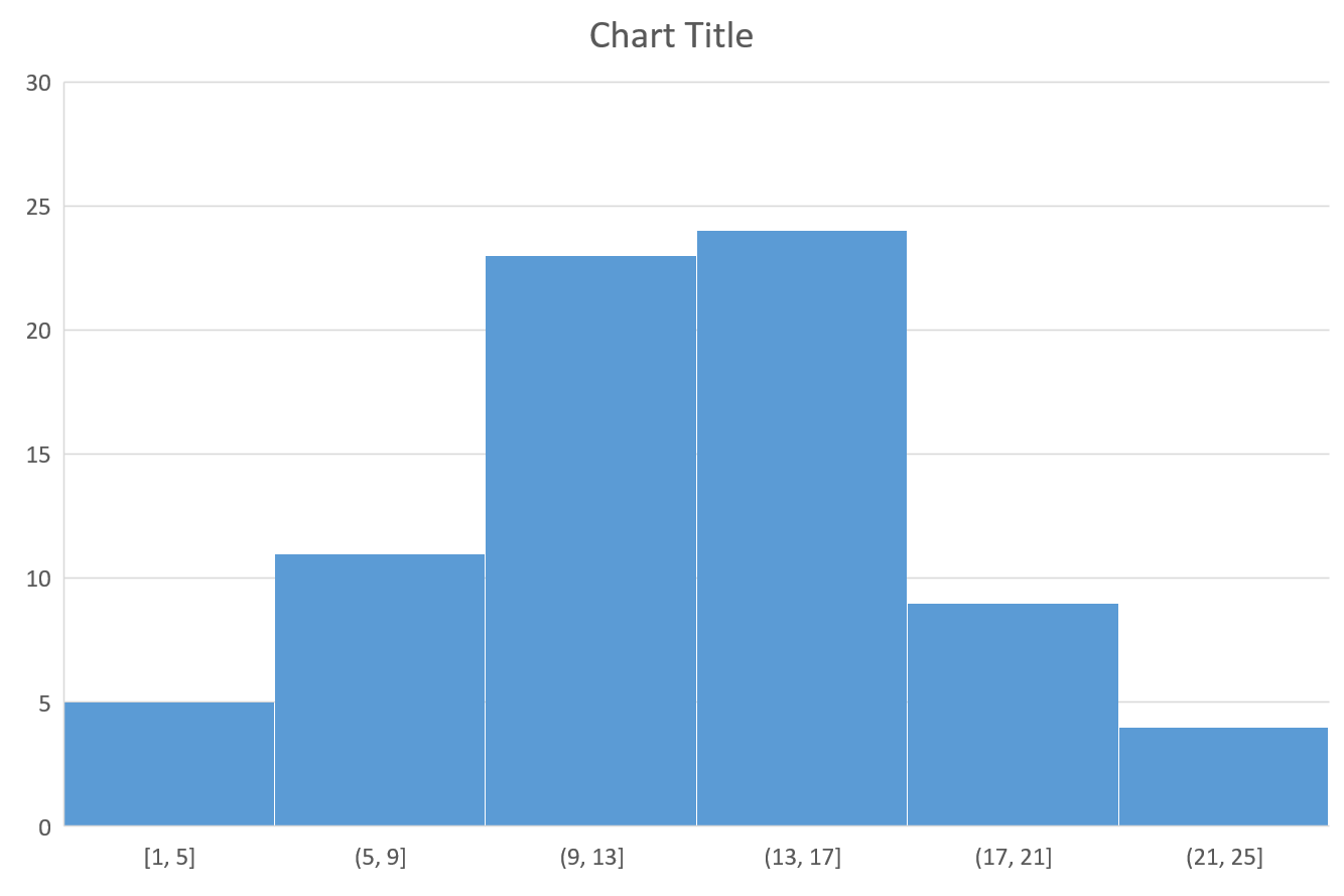
The new Histogram chart in Office 365 takes a long list of values and groups them into a column chart with the columns right beside each other. The benefit of the new chart is that is does the grouping for you automatically. You can easily create this chart by grouping the data yourself in Excel (using the COUNTIFS function is one way to do this quite easily). Create a column chart of the data and set the Gap Width to 1% to get the columns to be right beside each other.
Treemap
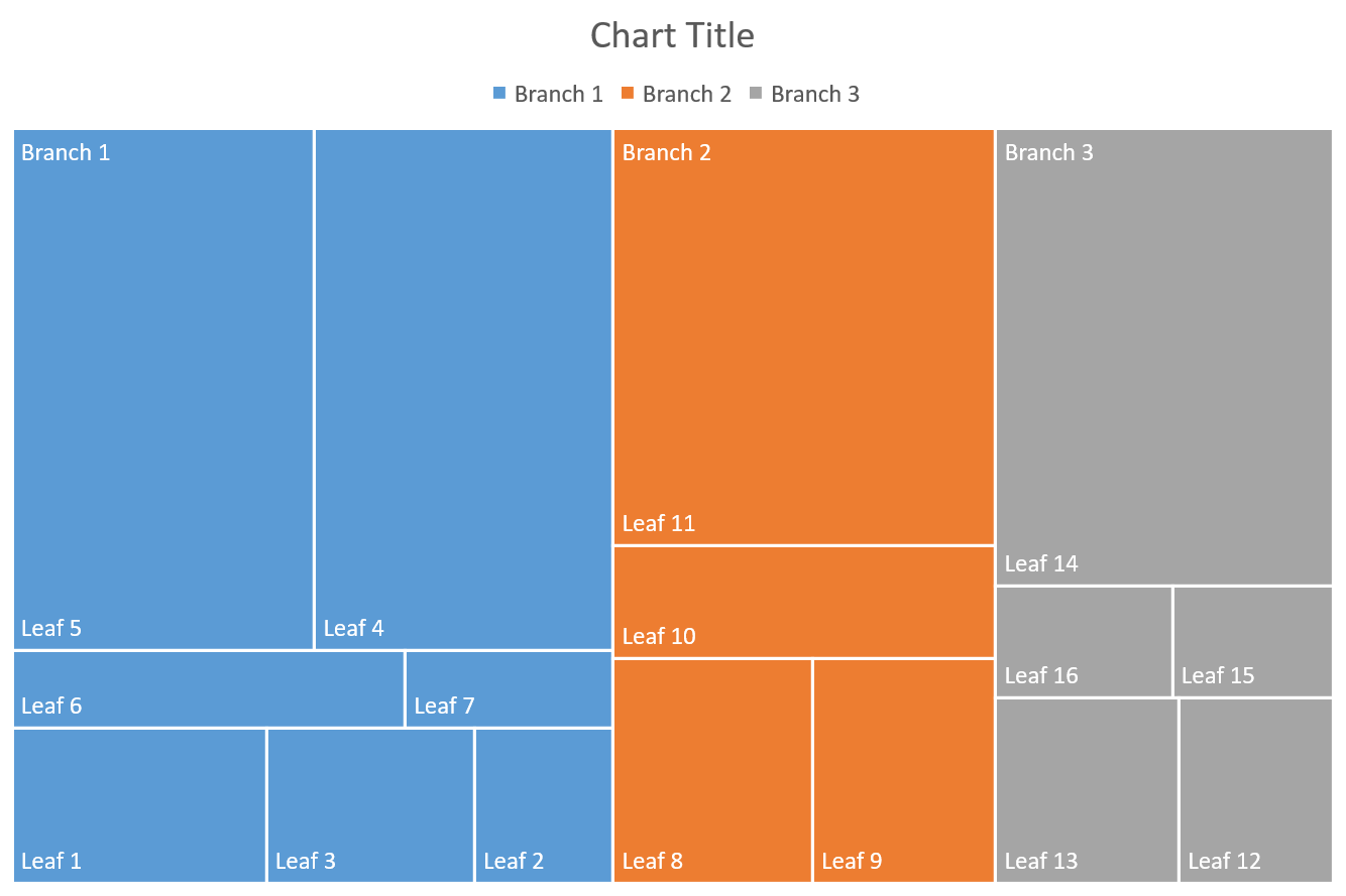
A treemap is a way to show proportions with rectangles that fit together into a larger rectangle. The Office 365 treemap allows for multiple branches (sections of the same color) and leaves (individual sections) in the same treemap. I find that business professionals don’t need such a complex version of a treemap. I created a calculator for a simple treemap that allows for multiple leaves in one branch only. Since this type of visual should really be used to show the comparison of one section to the whole, a simple treemap is all most business presenters actually need. This calculator is part of the Calculators for Visuals I mentioned earlier.
Funnel
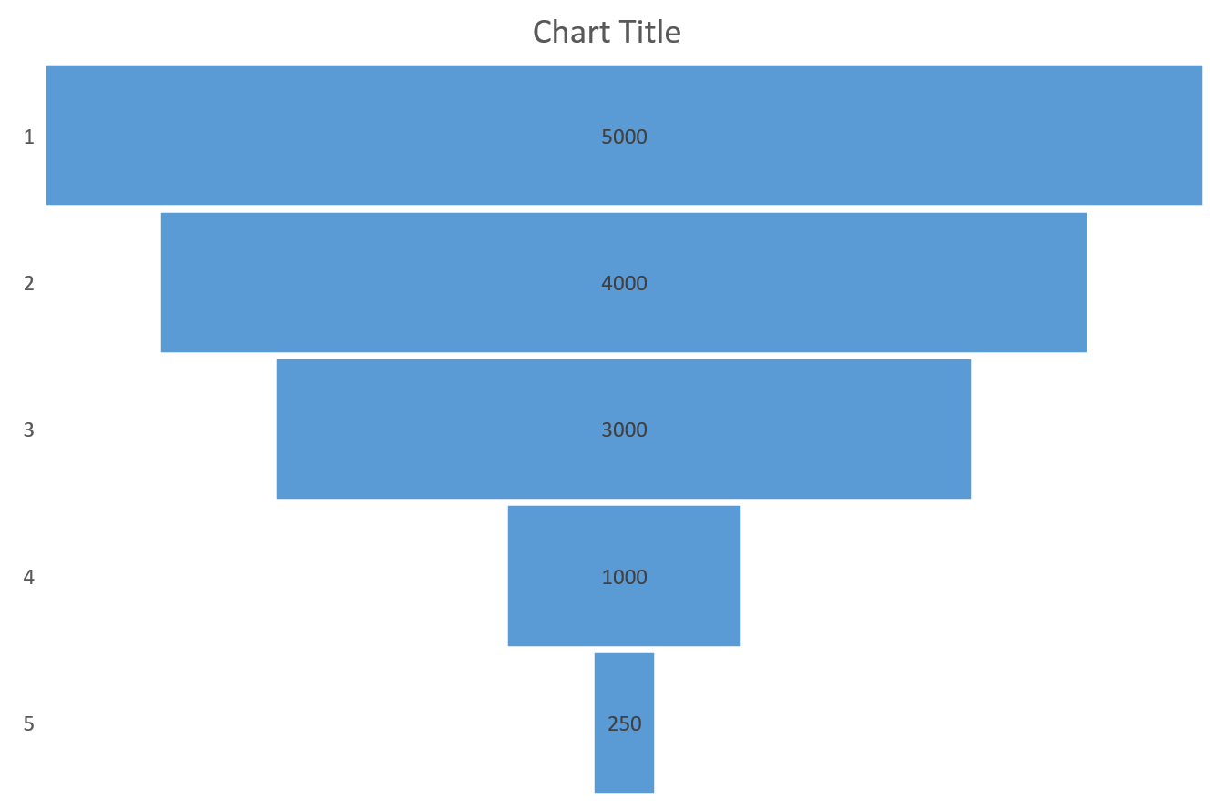
The funnel chart is a way to show how a starting amount is reduced (or grows) at each step in a process. To create this chart in previous versions of Office, you can use a stacked bar chart where the position of each bar is calculated so that the bars are center aligned. I created a calculator to make this easy for you and it is another one of the calculators you can get from my website. I also suggest considering a Proportional Object Collection as an alternative to a funnel chart when you are showing subsets of a larger value.
There are a few other new graph types, such as Sunburst and Box & Whisker, but they are not ones that most business professionals will use. It is likely that other new chart types will be added to Office 365 in the future. In most cases, you will be able to create close enough versions of these charts by being creative with the existing charts in older versions of Office.

Dave Paradi has over twenty-two years of experience delivering customized training workshops to help business professionals improve their presentations. He has written ten books and over 600 articles on the topic of effective presentations and his ideas have appeared in publications around the world. His focus is on helping corporate professionals visually communicate the messages in their data so they don’t overwhelm and confuse executives. Dave is one of fewer than ten people in North America recognized by Microsoft with the Most Valuable Professional Award for his contributions to the Excel, PowerPoint, and Teams communities. His articles and videos on virtual presenting have been viewed over 4.8 million times and liked over 17,000 times on YouTube.