In my book Select Effective Visuals, I discuss that a line graph is the best visual to use when your message is to show the trend in a series of data. I also wrote a newsletter earlier this year on why line graphs are better than column graphs to show trends (click here to read that article). In this article I want to share a few tips on formatting line graphs so that the message of the trend is clear.
The first tip is to make the lines longer by changing where the line starts and ends on the graph. This is actually done by changing a setting on the horizontal axis called Position Axis (in 2007/10 versions of PowerPoint) or Axis Position (in 2013/16 versions). Double-click on the horizontal axis and change this setting to On tick marks. Here is what the setting looks like:
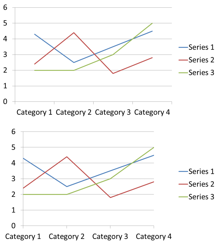
What this setting does is move the categories at the bottom of the slide so they start at the vertical axis and end at the end of the graph instead of being indented from each end. Here is what it looks like comparing the default position of Between tick marks (top graph below) with the setting of On tick marks (Bottom graph below):
This also makes it easier for the audience to determine the starting value of the line because the line now starts at the vertical axis.
The second tip is to remove the horizontal gridlines. In most cases, these do not help the audience because they distract from the trends you want them to focus on. The one exception is when the trend you are showing is very close to horizontal. In this situation, you may want to include light gridlines so that the audience can determine if the trend is slightly increasing or decreasing by comparing it to a known horizontal line.
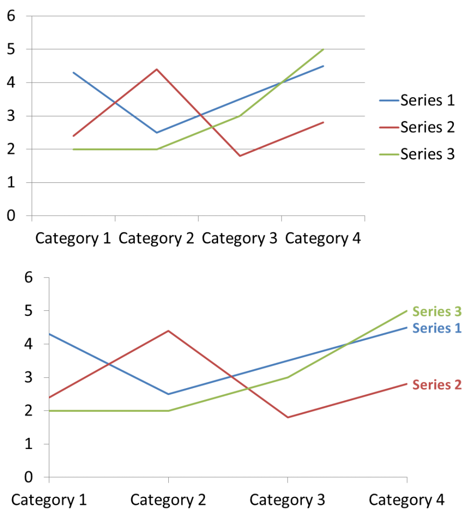
The third tip is one I discussed in an earlier newsletter article on labelling techniques. It is to replace the legend with data labels of the series names at the end of the line. This gives more space for the lines and makes the trend easier to see. You may need to adjust the width of plot area of the graph depending on the length of text in each label. Here is the comparison of the original graph to the version with gridlines removed and labels to the right of the lines instead of a legend.
When you look at the above comparison, you can see how applying these three tips can make a line graph easier for your audience to understand.
P.S. In case you are wondering, each of the graphs shown above are the same size object on the slide. You can see how using that space to focus on the message of the trend instead of the distracting default lines and legend make the graph much clearer.

Dave Paradi has over twenty-two years of experience delivering customized training workshops to help business professionals improve their presentations. He has written ten books and over 600 articles on the topic of effective presentations and his ideas have appeared in publications around the world. His focus is on helping corporate professionals visually communicate the messages in their data so they don’t overwhelm and confuse executives. Dave is one of fewer than ten people in North America recognized by Microsoft with the Most Valuable Professional Award for his contributions to the Excel, PowerPoint, and Teams communities. His articles and videos on virtual presenting have been viewed over 4.8 million times and liked over 17,000 times on YouTube.


