For those of you not familiar with the term “quad chart”, it is a slide divided into four quadrants, as this example from NASA illustrates.
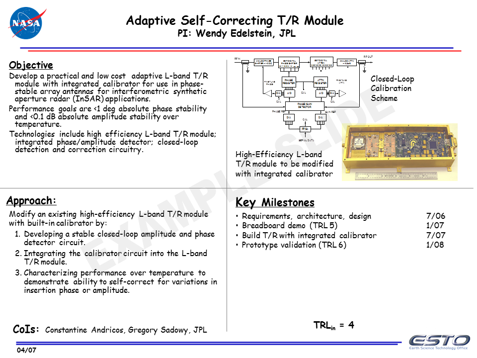
(in case you are wondering, yes, that is the Comic Sans font because the template they use says that it should be the default for text in their quad charts)
It was developed in the US government and military organizations as a one page briefing on a project, invention, initiative, process, etc. It is intended to provide a quick overview that leads to faster decision making than long reports. It divides the relevant information into four groups, each well defined in the template, so that viewers have consistent information to look at. It is intended to be a printed document that is then discussed in a meeting.
How did these get into presentations? Most of these quad charts are now created in PowerPoint, so someone made the mistake of thinking everything created in PowerPoint is a presentation. PowerPoint is only a tool and it can be used for many outputs, including one-page documents, which is what a quad chart is intended to be.
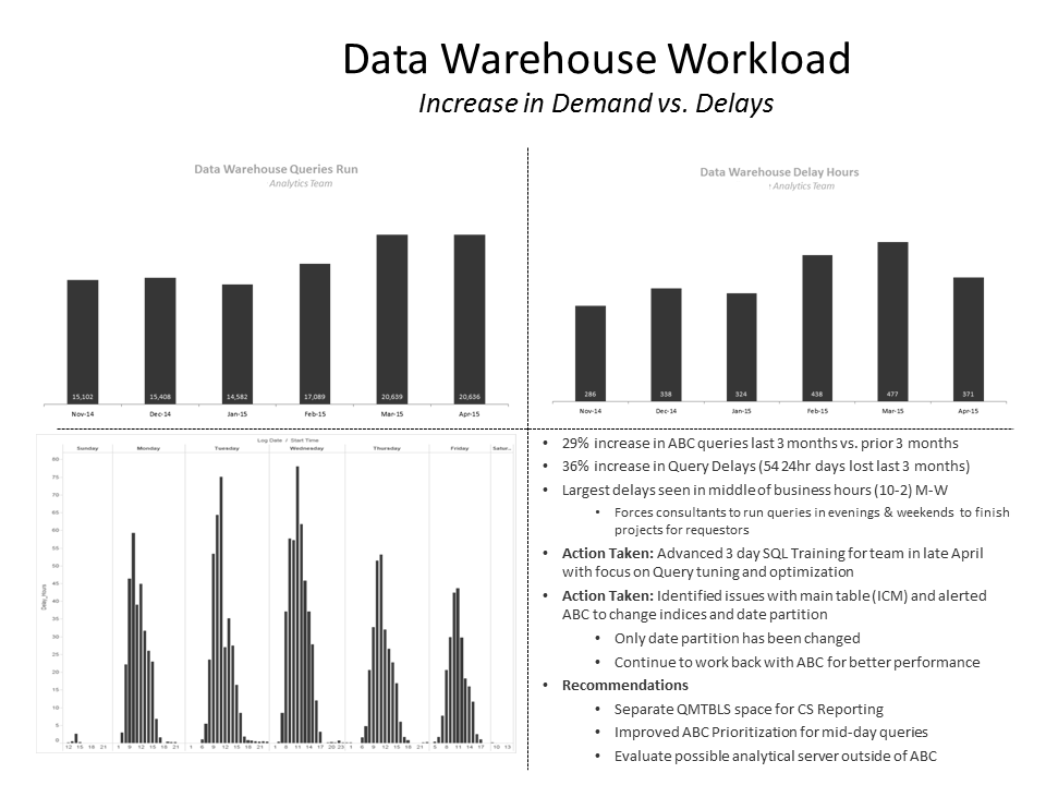
This type of slide is now found in many organizations other than the US government and military. And those organizations have changed the purpose of the quad chart. It is now often used to simply cram four messages onto one slide. The messages may be about the same area of work, but there is no consistent layout of information about similar topics, eliminating the advantage of ease of viewing for audiences. Here is an example of a quad chart I was sent earlier this year.
When these quad charts are projected instead of printed, they suffer from many problems that cause audiences to cringe. The font size you need to use is far too small to see, and with so much of it on the slide, the audience spends their time trying to read the slide instead of paying attention to the presenter. There is way too much information on the slide with multiple messages, so the audience gets lost trying to figure it all out. And the visuals that are used, like graphs, are so small and the labels that help an audience understand the graph are so tiny that the visual becomes impossible to figure out.
The obvious suggestion is to break the quad chart slide into four slides, each with their own headline and a visual that is easy to see. If the four messages are related to each other, then consider a slide before these four that outlines the four areas to be discussed and how they are related to each other. This gives the audience context before you dive into the four messages.
Some of you are forced by your boss to produce quad charts. I want you to keep your job, so if you are forced to cram four messages on one slide, here is how I suggest you make the most of a poor situation. Think of each quadrant as its own slide. Have a headline for each quadrant and an appropriate visual. Use the biggest font you can, but realize that the font you use will be smaller than what would be recommended for the screen and room size. Build the slide one quadrant at a time so you can tell the story without the rest of the quadrants distracting the audience. It is certainly not ideal, but it is the best you can do when you are forced into using quad charts.
Quad charts are an example of a type of output from PowerPoint being misused as a presentation. If you work in an organization addicted to the misuse of quad charts, I hope this article will help you start to change the mindset and produce more effective presentations.

Dave Paradi has over twenty-two years of experience delivering customized training workshops to help business professionals improve their presentations. He has written ten books and over 600 articles on the topic of effective presentations and his ideas have appeared in publications around the world. His focus is on helping corporate professionals visually communicate the messages in their data so they don’t overwhelm and confuse executives. Dave is one of fewer than ten people in North America recognized by Microsoft with the Most Valuable Professional Award for his contributions to the Excel, PowerPoint, and Teams communities. His articles and videos on virtual presenting have been viewed over 4.8 million times and liked over 17,000 times on YouTube.