On a graph that uses a measurement axis, like column, bar, and line graphs, one question that comes up is how the graph should be labelled. The default is to have the axis only. In my workshops I often show how data labels can help the audience more than the axis.
One thing you don’t want to do is have both the axis and data labels, like this example.
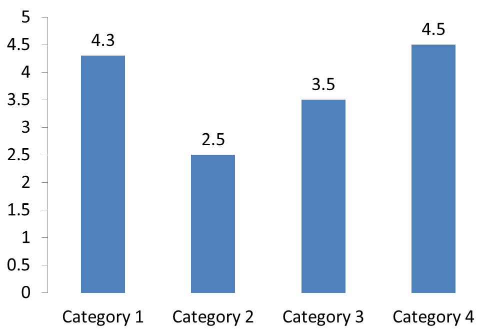
I refer to this as a “belt and suspenders” situation. You only need one to hold your pants up. Pick one, but don’t use both. On a graph, use either the measurement axis or data labels, but not both.
I usually suggest using data labels when the audience needs to know the exact values. As I explain in my latest book, Select Effective Visuals, two of the most common visuals when comparing values to each other are a column or a bar graph. I find data labels work well for these graphs. I tend to suggest placing the data labels inside the end or just outside the columns or bars, as shown in these two examples.
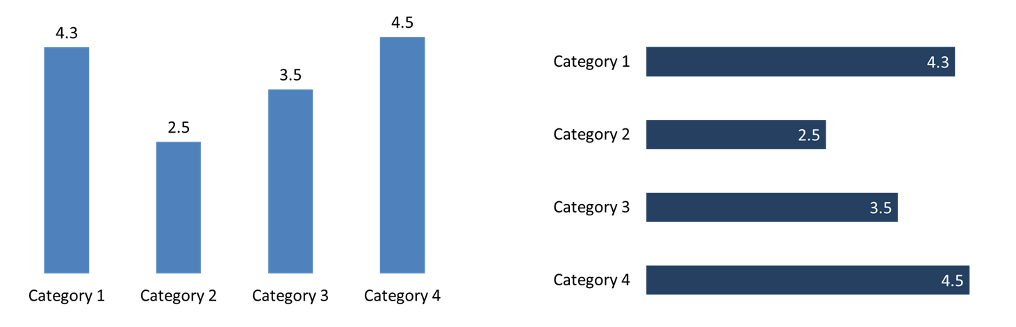
See how much cleaner the graph looks when you don’t have both an axis and data labels.
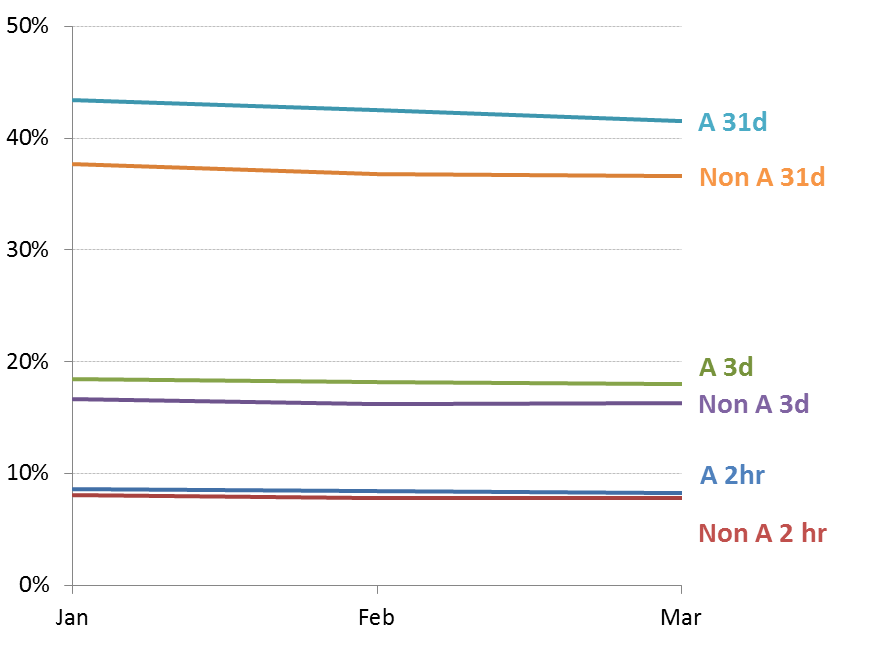
An axis is better when the message is about the trend of data. The trend is more important than the individual values. The most common visual for showing a trend is a line graph. If the trend is small, it can be useful to add gridlines in a muted color to give the audience a known straight line to compare the trend to. That is what I did in this graph from a client workshop.
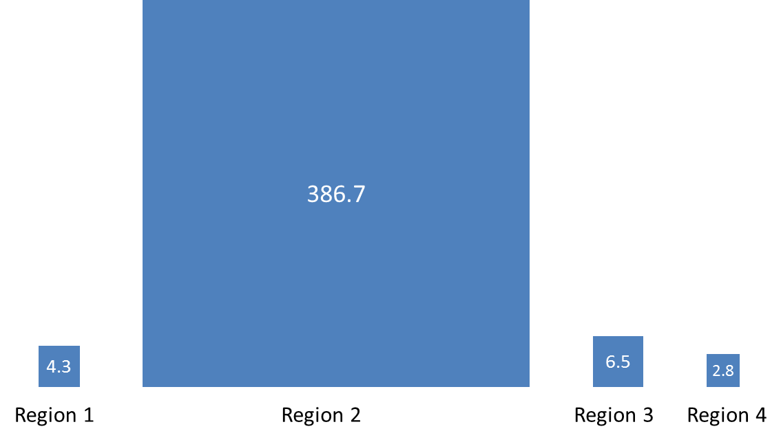
There are two situations where presenters can make a mistake in manipulating the axis in an effort to make the graph look better. The first is when one value is much larger than the rest of the values. That large value dwarfs all the other values, like this example.
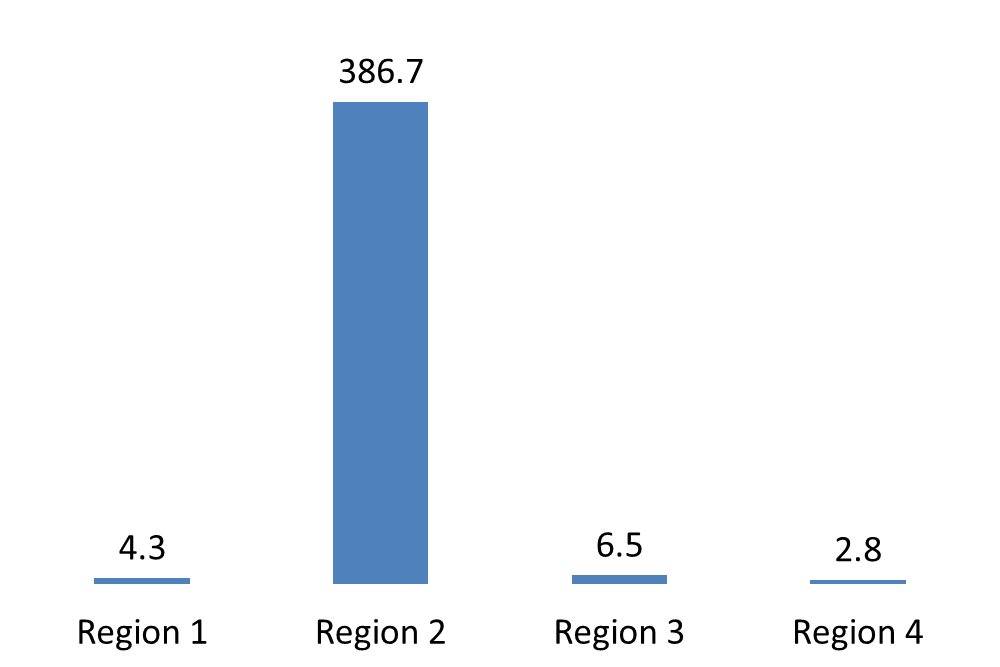
The temptation is to use a broken axis, where a section of the values is removed so that the smaller values look bigger. In my opinion this is misleading the audience. Most people won’t easily recognize that the axis has been manipulated and draw an incorrect conclusion about the relationship between the data points. Instead, use a different visual. A proportional object collection works well to show values that have a great difference between them. Here is an example using the data from the graph above.
To create this type of visual, use my Proportional Object Collection Calculator.
The second situation is when the difference in the values is difficult to see because the difference is small compared to the values. Here is an example.
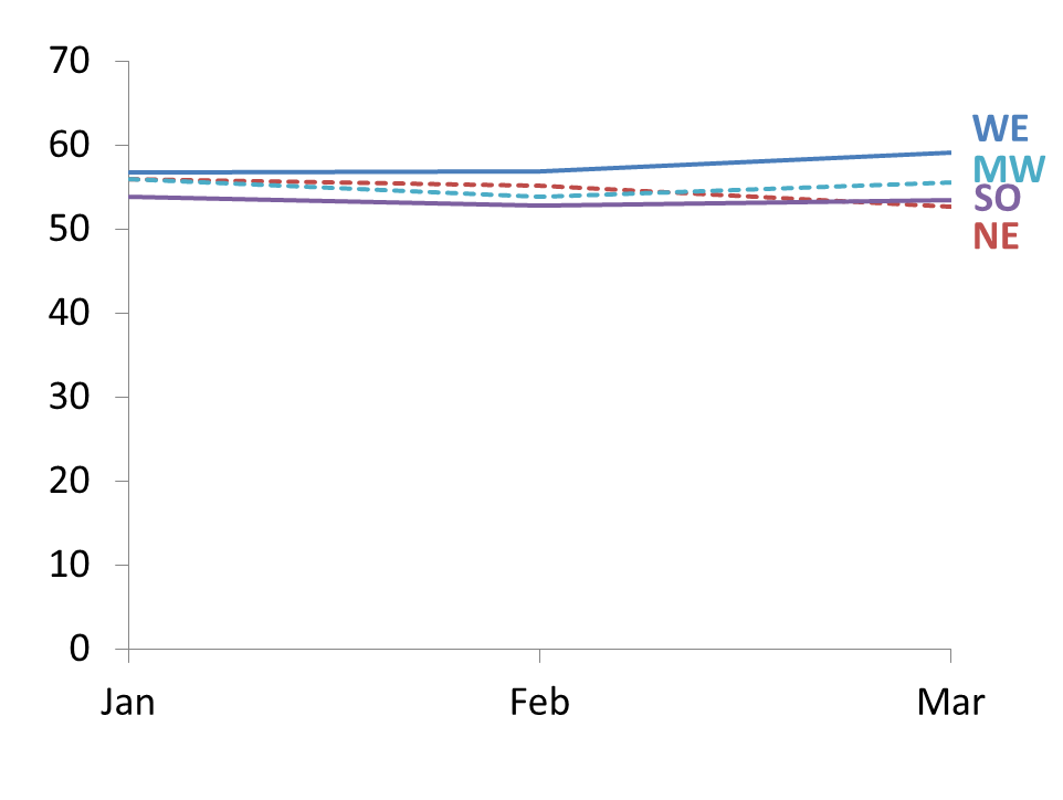
What many presenters do in this situation is to start the measurement axis, the vertical axis in this case, at a non-zero value. That way, the difference between the values is easier to see. Again I think this misleads the audience. Most won’t take the time to look at the axis labels to see that the difference in values is being magnified. I see the value in making the differences easier to see, but I don’t want the audience to lose context. I suggest you consider an inset graph that shows the differences as a zoomed in view on top of the original data to give it context. Here is an example using the graph above.
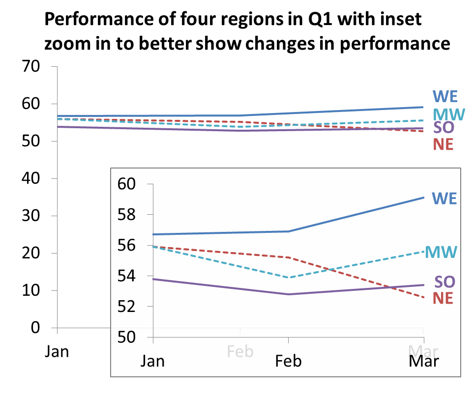
Notice that I used a white fill for the inset graph but made the fill 15% transparent so you can still have the context of the underlying graph. By placing a border around the inset graph it further separates it visually from the underlying graph. If you can use build animation in your presentation, you can show the overall graph first, then display the inset graph.
Both an axis and data labels can be useful in helping your audience understand your graph. Make a conscious choice of which approach will help your audience best in each situation and avoid the mistakes that can mislead audiences.

Dave Paradi has over twenty-two years of experience delivering customized training workshops to help business professionals improve their presentations. He has written ten books and over 600 articles on the topic of effective presentations and his ideas have appeared in publications around the world. His focus is on helping corporate professionals visually communicate the messages in their data so they don’t overwhelm and confuse executives. Dave is one of fewer than ten people in North America recognized by Microsoft with the Most Valuable Professional Award for his contributions to the Excel, PowerPoint, and Teams communities. His articles and videos on virtual presenting have been viewed over 4.8 million times and liked over 17,000 times on YouTube.