For many years in my workshops I have been discussing the importance of considering how colors look to people who have color deficiency. The term many people commonly use is color blindness, but that is not accurate. Some people truly can’t see the colors red and green, but more commonly the colors don’t look the same as they do to someone with unaffected sight. In this article I want to share a tool I recently discovered that will help presenters see what their slides look like to someone with color deficiency.
The tool is at http://www.color-blindness.com/coblis-color-blindness-simulator/ and it was created by someone who has red-green color deficiency. It allows you to upload an image then use the tool to see what it would look like to someone with the different types of color deficiency. Here’s how you can use it for slides.
Step 1a: Save your slide as an image
If you want to test your entire slide, including any branding, logos, etc., you need to save your slide as an image. The tool allows JPG or PNG images, both of which are relatively easy to create from PowerPoint. Select the slide you want to save as an image. On the File ribbon, select Save As. Enter the file name you want to save it as and in the dialog box, select the PNG or JPG file type option. Click the Save button. When the dialog box asks you whether you want to save the entire presentation or just the current slide only, select the current slide only.
Step 1b: Save part of the slide as an image
If you want to test just part of the slide, for example a graph and a callout, you can save just those elements as a PNG image. Select the elements on the slide you want to save as an image. You can draw a rectangle around all the elements if there are many, or select the few you need. Right click on any of the elements and select the Save As Picture option in the pop-up menu that appears. Enter the file name, select the PNG or JPG file format, and save the image file.
Step 2: Upload your file
Use the link above to go to the online tool. Click on the Select button to select the image you saved in step 1a or 1b on your computer. Click on the Upload button once the file name is shown in the Image box. The image will be uploaded and displayed. Don’t be concerned if the image background looks black in the default Normal Color Vision mode. I have found that images saved using Step 1b will often have a black background because it does not interpret the slide background color properly in this display. The tool will still work properly.
Step 3: View the image in different display modes
In the tool, you can click on the radio buttons to see what the image would look like to someone with that type of deficiency. The four most common types to test are Red-Weak, Green-Weak, Red-Blind, and Green-Blind. With this information, you can adjust the colors used on the slide to be more accommodating to people with these types of color deficiencies. If you know a senior decision maker in your audience has one of these types of deficiencies, you can use this tool to help them properly see your slides.
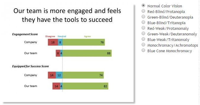
Here is an example to show you how this tool works. This is the tool showing the original slide in Normal Color Vision mode:
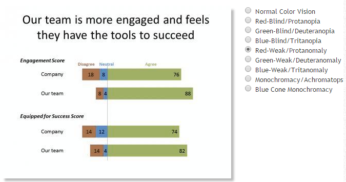
Here is the slide in Red-Weak mode. Notice that weakness in red or green affects any color that has a component of red or green in it, like the blue in the graph.
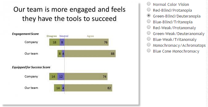
Here is the slide in Green Blind mode:
This tool will help presenters be more sensitive to audience members with color deficiencies and create slides that are easier for them to see. You can learn much more about color deficiencies at the website where this tool is located www.color-blindness.com.

Dave Paradi has over twenty-two years of experience delivering customized training workshops to help business professionals improve their presentations. He has written ten books and over 600 articles on the topic of effective presentations and his ideas have appeared in publications around the world. His focus is on helping corporate professionals visually communicate the messages in their data so they don’t overwhelm and confuse executives. Dave is one of fewer than ten people in North America recognized by Microsoft with the Most Valuable Professional Award for his contributions to the Excel, PowerPoint, and Teams communities. His articles and videos on virtual presenting have been viewed over 4.8 million times and liked over 17,000 times on YouTube.