At my workshops I suggest that people not use the SmartArt feature of PowerPoint. Example slides I reviewed at a recent workshop reinforced how this feature is often misused. The big issue is that most people pick SmartArt based on how nice it looks vs. whether it effectively communicates the correct message.
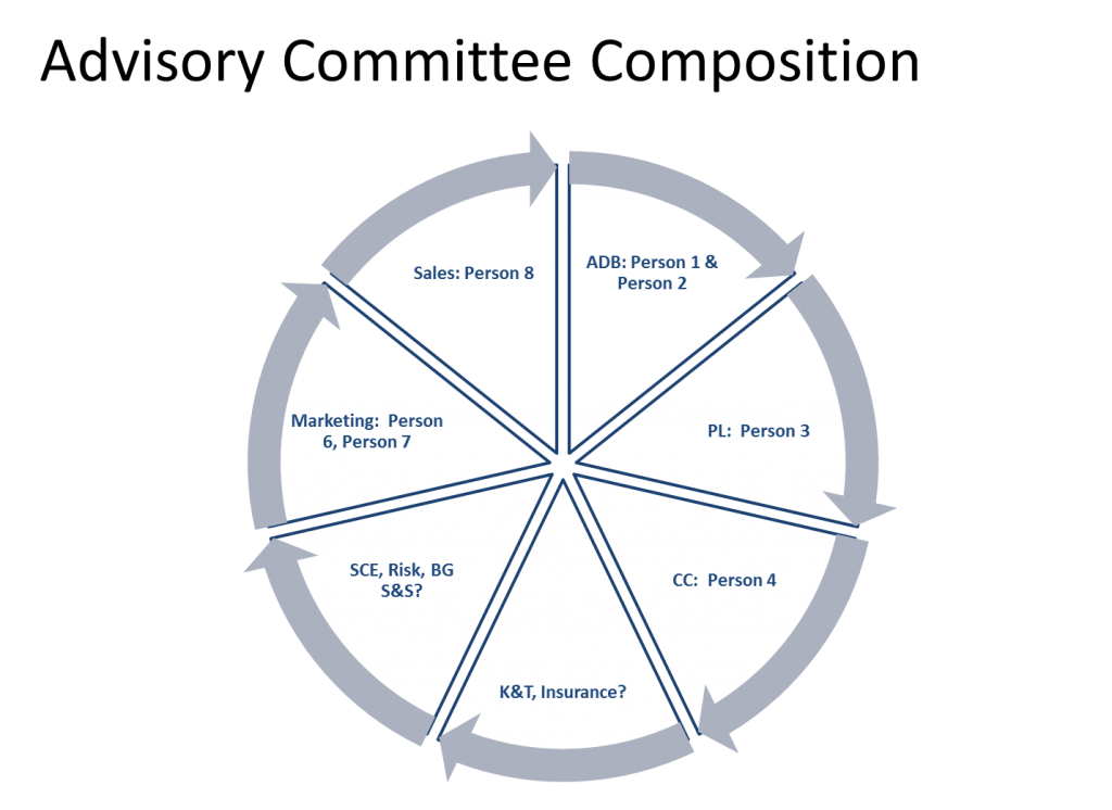
Let’s start with one of the slides I saw in that workshop.
The presenter was trying to show who would be involved in the oversight of an initiative. There are a number of representatives for the different departments or areas involved in the work. The problem is that the SmartArt diagram they selected is for a cyclical flow. There is no flow between the people in this group, so the diagram indicates the wrong message. When asked, the presenter said they picked it because it looked like a neat diagram.
SmartArt was created in an attempt to make it easy for presenters to use visuals instead bullet points. The issue is that, like many lists of visuals, it is organized by type of diagram, not by what message you are communicating. When most presenters are selecting SmartArt, they just scroll through the examples and find one they like based on how it looks. Rarely do they look at what message it is communicating.
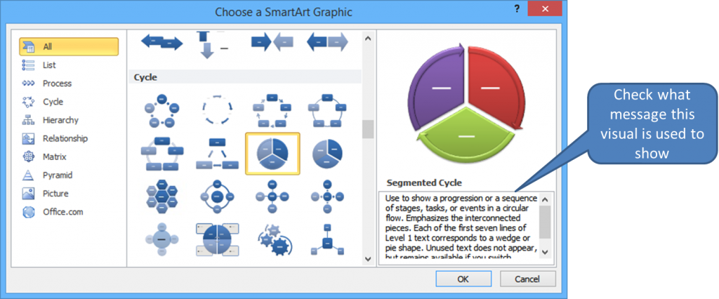
PowerPoint does tell you what message the SmartArt diagram should be used for, but most presenters never look at it. The participants in my workshop didn’t even know the description of the diagram exists. Here’s where you find it when you select a SmartArt diagram.
I also find SmartArt hard to customize, hard to animate, and it does not give options that are data driven (the graphing feature does). So what do I suggest you do instead? First, start selecting a visual based on what message you are trying to communicate instead of how nice a visual looks. In my workshops I teach that there are six categories of messages. Presenters need to determine which category their message fits into. Then select a visual that works for that type of message. My SlideShare on selecting a visual explains more about this approach.
You can create almost any diagram you want using the drawing tools in PowerPoint, so you don’t really need the pre-made diagrams that SmartArt provides. If you do want to select a pre-made diagram for a flow or relationship diagram, I suggest you use one from Diagrammer.com. I wrote about how to use this site earlier this year.
Remember the correct sequence for selecting a visual: First, be clear on the message you are communicating, then, select a visual that will illustrate that message (use the six categories of messages to make the selection easier). Don’t just go to SmartArt, Diagrammer.com, or any other site simply to find a visual that looks nice.

Dave Paradi has over twenty-two years of experience delivering customized training workshops to help business professionals improve their presentations. He has written ten books and over 600 articles on the topic of effective presentations and his ideas have appeared in publications around the world. His focus is on helping corporate professionals visually communicate the messages in their data so they don’t overwhelm and confuse executives. Dave is one of fewer than ten people in North America recognized by Microsoft with the Most Valuable Professional Award for his contributions to the Excel, PowerPoint, and Teams communities. His articles and videos on virtual presenting have been viewed over 4.8 million times and liked over 17,000 times on YouTube.


