In the last six to nine months I have been paying more attention to the world of data visualization. This is the practice of showing data in a visual way that clearly communicates the message. This is important to presenters of financial, operational, and technical information. I have found this industry a good source of ideas that stretch my thinking. My Diverging Stacked Bar Chart Calculator originated in a blog post I read from one of the data visualization specialists who created the tool I am reviewing today.
The tools data visualization practitioners use are more complex than what most corporate presenters will have or ever want to use. So I have been looking at what visuals or ideas from this industry can be incorporated using the basic tools of Excel and PowerPoint. Making the message clear with the visual is important regardless of what tool is used.
A Data Visualization Checklist
Stephanie Evergreen writes a great blog and together with Ann K. Emery, they published a Data Visualization Checklist in May. I was intrigued and today I want to share how I think presenters can apply it to slides they create. Go ahead and download the checklist using the link before you read the rest of my comments. I will wait while you download it. OK? Let’s begin.
First of all, I want to say that I think Stephanie and Ann have done a great job with this checklist. When I first read it, I connected because so many of their points echo the best practices I have been teaching presenters for years. I would point out that this checklist is really for graphs and does not cover other types of visuals used in presentations, such as timelines, diagrams, images, etc. Some of the points they make do apply to other visuals, but the focus is clearly on graphs.
Guidelines for Text
The first section in the checklist is about the text used in a visual. I agree with their suggestion of having a summary statement at the top of the visual that describes the point you want the viewer to understand. I call this a headline. I would probably combine their idea of a subtitle into the headline and allow it to be aligned left or center based on your organization’s template (they suggest left only). Their point about annotations I think should be given more emphasis. Using callouts to direct attention is a great technique to focus viewers on the key part of the visual.
It was great to see them focus on placing labels for data close to the data instead of in legends. I have been teaching this for years as well. In Excel or PowerPoint, use the built-in data labels or add your own with text boxes. When you use data labels for the values, it often allows you to remove an axis, eliminating even more text from the slide. Their suggestion of removing every other year on an axis may not be allowed in situations where financial results require it or where it could alter the meaning of the message.
Arrangement and Color
Their item about making sure proportions are accurate is important. Don’t manipulate the axis in Excel or PowerPoint to make a difference bigger or smaller than it really is. Deception will significantly harm your credibility with the audience. A few minor modifications I would make to some of the items in the Arrangement section: 1) ordering data alphabetically is rarely useful to the audience; it usually means you just copied the data from the database that way, 2) I find it helpful to add a blank column between groups of related data as in the first example below, where it shows the separation between the years easier, and 3) while they suggest to avoid bevels, I have found them useful when creating a grouped pie chart to separate the segments within each group as shown in the second example below.
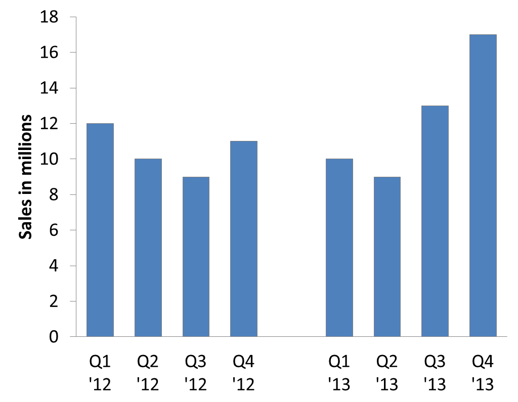

One item I would add in the Arrangement section is to make the columns or bars wider than the default used by Excel and PowerPoint. You may also need to make the default line thicker on a line graph. This makes the data the focus instead of the white space.
In their discussion of color, they give great suggestions. To add on to what is already in the checklist, I recently wrote about making slides easy to understand when printed in black and white and I recommend using the Color Contrast Calculator to ensure colors can be easily seen.
Lines and Overall Items
While Stephanie and Ann suggest that you should not add a second y-axis to a graph, I wrote recently about the one reason I see that a dual-axis graph could be used. In the Overall section, they ask you to check if the graph is appropriate for the data. What a great point. I see presenters make a poor choice so often. Likely it is because they don’t have a framework for selecting which visual works for which message. The SlideShare deck of my What Visual To Use approach will help. Their point on choosing a graph based on the precision required is a great insight I have not seen before. Re-read that point a few times so it sinks in.
Conclusion
Stephanie and Ann have done presenters everywhere a great service by sharing their Data Visualization Checklist. Use it, and my additions/modifications above, to make the graphs in your presentations more effective. In the future I will be sharing more insights and resources from the world of data visualization that help presenters create more effective presentations.

Dave Paradi has over twenty-two years of experience delivering customized training workshops to help business professionals improve their presentations. He has written ten books and over 600 articles on the topic of effective presentations and his ideas have appeared in publications around the world. His focus is on helping corporate professionals visually communicate the messages in their data so they don’t overwhelm and confuse executives. Dave is one of fewer than ten people in North America recognized by Microsoft with the Most Valuable Professional Award for his contributions to the Excel, PowerPoint, and Teams communities. His articles and videos on virtual presenting have been viewed over 4.8 million times and liked over 17,000 times on YouTube.