It is not uncommon to see a graph with two axes. But it is rare that the graph makes information easier to understand for the audience. It usually confuses the audience and obscures any message the presenter was trying to deliver. In this article I want to explain why dual-axis graphs are usually confusing and why, in my opinion, there is only one proper use for a dual-axis graph.
Don’t use a dual-axis graph to cram more information on a slide
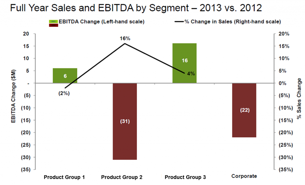
The typical reason a presenter creates a dual-axis graph is to fit two messages into one visual, saving space and therefore being able to put even more on a slide. Information overload is the biggest issue in presentations today. Putting two messages in one visual makes the problem even worse. Here is an example from some analysis I am doing on corporate financial reporting (name of the company and other identifying information have been removed).
The graph tries to show the change in earnings (EBIDTA) and the change in sales on the same graph. It uses green and red columns for change in earnings and a black line for sales. Here’s why this does not help the audience.
First, the sales measurement does not apply to all of the categories, so the black line does not extend to the Corporate category, making it look like something is missing. Second, the sales changes in the categories are not related, so a line, which indicates a trend in related data, is not the correct choice for this data series. Each of the sales changes should be a data point on its own. Third, and most importantly, the change in earnings is not related to the change in sales in that category. This is the big issue with most dual-axis graphs. They show two unrelated data series. By plotting them on the same graph, it implies that the data is related, a message that in most cases is not true.
Only use a dual-axis graph to show correlation
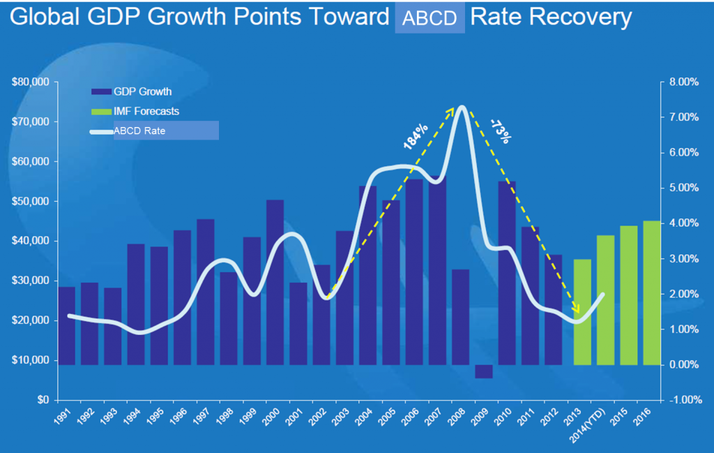
When can you use a dual-axis graph? In my opinion, the only purpose for a dual-axis graph is to show correlation (or lack of correlation) between two data series. It should only be used when you are trying to show that one data series moves in or out of sync with another data series. The reason that a second axis is required is that the measurement units for the two data series are different. If the measurement unit was the same, a simple line graph would be used. Here is an example of a dual-axis graph used well (from the corporate financial reporting analysis I am doing; identifying information changed).
In this graph the rate that the company can charge for its services is related to the overall health of the economy. The rate trend is shown in the white curved line, and the health of the economy, as represented by Gross Domestic Product (GDP) growth, is shown as the columns (blue for actual, green for forecast). If you study the graph for a bit, you can see that the rate the company charges rises or falls about a year after the growth in GDP rises or falls.
The only issue I have with this example is the use of columns with a line. I would caution presenters about using two different graph types in a dual-axis graph. It is hard for viewers to compare the two types of graphs quickly and easily. I would have preferred to see the GDP growth figures also shown as a line. It would have made it easier to see the matching trends.
Before you create a dual-axis graph, take time to consider why you want to create this type of graph. If it is because you want to save space and put two messages into one area of a slide, please don’t create a dual-axis graph. Use two graphs instead. If it is because you want to show the correlation (or lack of correlation) between two series of data, create the dual-axis graph, preferably using the same type of graph for both data series.

Dave Paradi has over twenty-two years of experience delivering customized training workshops to help business professionals improve their presentations. He has written ten books and over 600 articles on the topic of effective presentations and his ideas have appeared in publications around the world. His focus is on helping corporate professionals visually communicate the messages in their data so they don’t overwhelm and confuse executives. Dave is one of fewer than ten people in North America recognized by Microsoft with the Most Valuable Professional Award for his contributions to the Excel, PowerPoint, and Teams communities. His articles and videos on virtual presenting have been viewed over 4.8 million times and liked over 17,000 times on YouTube.


