Next week I am presenting a workshop to accountants in Vancouver. One of the points I will be making is that when you show a number that indicates the difference between a measured figure and a standard, you need to use an indicator so the audience knows whether this is a good number or not.
Accounting or mathematical conventions don’t convey meaning
When financial professionals use the output from Excel in their presentations, they often don’t pause to consider whether the audience will understand the default signs that Excel uses for numbers. A plus or minus sign indicates above or below zero, but does a plus sign always indicate a positive result? Not always. If there has been an increase in expenses, it is usually something to be concerned about, not celebrated.
More confusing is accounting notation, where round brackets around a number indicates a negative number. Non-accountants don’t usually associate round brackets with the sign of a number, they usually think it means the hierarchy of operations when doing math (ask a grade school student about the BEDMAS rule).
Universal indicators show meaning
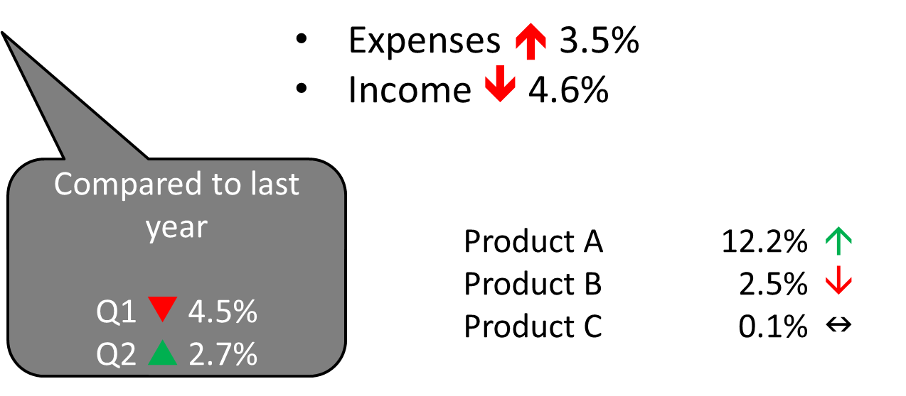
What presenters should do instead is use what I refer to as universal indicators: green and red symbols like arrows and triangles that indicate whether the audience should interpret the difference to be positive or negative. The audience is looking for the interpretation of the difference; what it means to them. Here are some examples of universal indicators.
You can use the arrow and triangle drawing shapes in PowerPoint to create these types of indicators, but I usually use a better method. PowerPoint allows you to add special characters, such as the arrows and triangle characters shown in the example above, as text. The Wingdings character sets in PowerPoint contain some good universal indicators. By using these special text characters instead of drawing shapes, it makes spacing easier because you don’t have to figure out how much space to leave for a drawing shape in the middle of the text. It makes building your points easier because everything is considered text, so there is only one element to animate.
Use text special characters
To add these special characters to the text in a shape or a text box, click on the Symbol button on the Insert ribbon. Scroll down to the Wingdings character set using the drop down list of character sets. In this character set, I like the thin and thick up and down arrows (character codes 225, 226, 233, and 234). In the Wingdings3 character set, I like the up and down triangles and the dual horizontal arrow characters (the dual arrow shows the message of no change visually) (character codes 110, 112, and 113).
One you have added the special characters as part of the text, set the color of the character to green or red to indicate the meaning of the number. Use the same process for setting the color of any text: select that one character and change the font color.
As a presenter, you want to deliver a clear message to your audience. When you are presenting the results of analysis, use universal indicators to make the meaning of the figures crystal clear.

Dave Paradi has over twenty-two years of experience delivering customized training workshops to help business professionals improve their presentations. He has written ten books and over 600 articles on the topic of effective presentations and his ideas have appeared in publications around the world. His focus is on helping corporate professionals visually communicate the messages in their data so they don’t overwhelm and confuse executives. Dave is one of fewer than ten people in North America recognized by Microsoft with the Most Valuable Professional Award for his contributions to the Excel, PowerPoint, and Teams communities. His articles and videos on virtual presenting have been viewed over 4.8 million times and liked over 17,000 times on YouTube.