When I first heard the name of this visual, diverging stacked bar chart, it seemed complex. As I learned more about it, I realized how valuable it is to know about this type of visual in business presentations. In this article I want to show you what this visual is and how you can use it in your presentations.
Let’s start with an example of this type of visual:
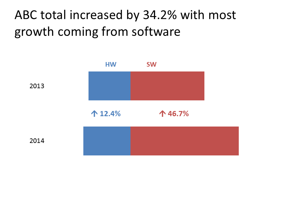
A diverging stacked bar chart is a bar chart that can have one or more segments on each side of a dividing line. The dividing line separates the two groups or categories of data. The above example has only one segment on each side of the dividing line (which is not explicitly shown) and the two groups of data are hardware sales (HW) and software sales (SW).
The reason that this type of graph works well is that it allows the viewer to compare the relative size of each group of related data. Each group starts at the dividing line and moves either right or left. In the above example, it is easy to see that in each year, software sales are much larger than hardware sales.
Here is another example. In this case, there are multiple segments on each side of the dividing line. The dividing line here represents the goal for customer service ratings (8 out of a possible perfect score of 10). To the left of the line are the ratings below the goal and to the right of the line are the ratings above the goal. The more the overall bar is to the right, the more that call center has ratings above the goal.
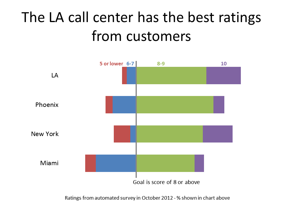
It is easy for the viewer to see how much of the bar is to the right of the dividing line, indicating performance above the goal. Because we wanted to also see the breakdown of scores on each side of the goal, the data is broken down into segments based on the score given by the customer (5 or lower, 6-7, 8-9, and 10). There are some more good examples in this article by Darkhorse Analytics.
It seems like this would be a complicated graph to create, but it is actually much easier due to an online calculator I created. You can use the Diverging Stacked Bar Chart Calculator to calculate the values you enter into the data table for a regular stacked bar chart in Excel or PowerPoint. The values to the left of the dividing line are negative and the calculator organizes them so that they appear correctly. The calculator page has additional ideas on formatting the chart and adding text labels to create the type of charts you see above.
When you want to communicate the values of two groups of data that are related, consider whether a diverging stacked bar chart would work for you.

Dave Paradi has over twenty-two years of experience delivering customized training workshops to help business professionals improve their presentations. He has written ten books and over 600 articles on the topic of effective presentations and his ideas have appeared in publications around the world. His focus is on helping corporate professionals visually communicate the messages in their data so they don’t overwhelm and confuse executives. Dave is one of fewer than ten people in North America recognized by Microsoft with the Most Valuable Professional Award for his contributions to the Excel, PowerPoint, and Teams communities. His articles and videos on virtual presenting have been viewed over 4.8 million times and liked over 17,000 times on YouTube.