For the last year or two I have noticed newspapers and magazines using donut graphs more often to show proportional data results. Donut graphs may look like they are hard to create, but they are actually built into PowerPoint, so any presenter can use them. Here is an example that shows how a donut graph can be used.
In this article I want to talk about when you may want to use this type of graph and how to use it effectively.
A donut graph is closely related to a pie graph. In fact, some people say a donut graph is just a pie graph with the center cut out. Both pie graphs and donut graphs show the proportional relationship of data. These types of graphs can show market share, responses to a question, proportional spending in a budget, or any data set where you want to show how much of the total each item represents. So a donut graph is a good substitute for a pie graph when you want visual variety in a presentation where there are many pie graphs.
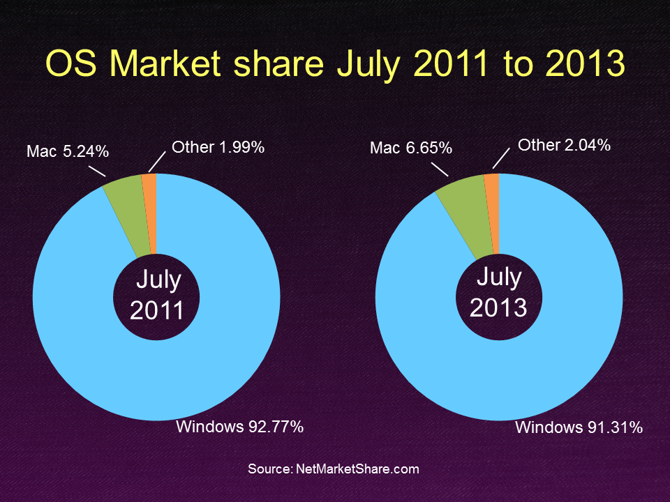
I also think that a donut graph is a good graph to use when showing a comparison, like the example above. It allows the identification of the two graphs to be placed in the center of the graph instead of a caption on each graph that can sometimes get lost.
When creating donut graphs, I have some suggestions to keep them clean and clear. First, a donut graph works best with very few wedges, usually three or less. More than three wedges gets a little harder to understand. Two wedges in a donut graph can work well when you are showing a comparison at two points in time and there is a dramatic change in the size of the two wedges.
Second, labelling a donut graph is much harder than a pie graph, Donut graph data labels don’t give you the option to automatically place them outside the segments the way a pie graph does. You will have to manually drag each label from inside the wedge to outside. Sometimes it is best to just leave the data labels off and add your own using text boxes. That way you can format and position them exactly the way you want to (as I did in the example above). You will also add a text box to indicate what each donut graph represents when you are using them in a comparison slide. There is no center title option for donut graphs in PowerPoint.
Third, I find it easier to understand a donut graph if the hole in the center is a little smaller than the default size. The default is to make the hole 50% of the diameter of the graph. By using the option to format the data series, you can reduce this value to around 35%, which looks better in my opinion because it makes each wedge bigger on the slide. Finally, you do have the option to animate the pieces of the donut using the regular animation feature. If you only have two wedges in the donut, animation is unnecessary.
If you use pie graphs in your presentations, why not consider a donut graph instead for some of the slides. It gives visual variety and works well for comparison slides.

Dave Paradi has over twenty-two years of experience delivering customized training workshops to help business professionals improve their presentations. He has written ten books and over 600 articles on the topic of effective presentations and his ideas have appeared in publications around the world. His focus is on helping corporate professionals visually communicate the messages in their data so they don’t overwhelm and confuse executives. Dave is one of fewer than ten people in North America recognized by Microsoft with the Most Valuable Professional Award for his contributions to the Excel, PowerPoint, and Teams communities. His articles and videos on virtual presenting have been viewed over 4.8 million times and liked over 17,000 times on YouTube.