Basic dynamic charts
A standard chart in Excel uses a defined set of cells for the category axis and the data values. This works for most charts.
But what if you want to create a chart where the data range gets bigger or smaller based on criteria? That is where you will want to create a chart with a dynamic range. The typical dynamic range chart advice is to use a table where the chart expands when more data is added to the table.
This article shows the table method as well as another method that involves using the OFFSET function to define the set of cells to be used in the chart. In both cases as more data is added, the chart uses the new data to expand the chart.
Dynamic charts where you select the data to be included
I want to extend this idea to create a chart where you can specify which data is used in the chart and the chart will expand or contract based on the data selected. Two requests I recently had led me to develop this method.
First, someone wanted a graph that only showed the quarterly results that were most current, with an ability to select which quarters were included. In the second request, someone needs to graph results for each of the five weeks in a month but the days included in each week changes each month. The method described below handles these situations and any situation where you select consecutive data points in a list of data.
Data setup in the worksheet
As an example, I will use the situation where the analyst wants to select which quarters appear in the chart. Here is the simple data table.
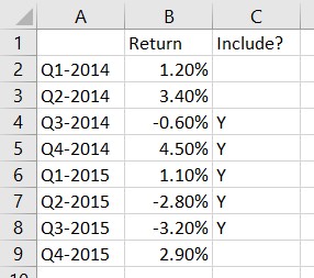
Column C is where the user indicates which quarters to include in the chart by entering a “Y” in the cell. Note that the method works only if the selected data points are consecutive, with no gaps.
Using named ranges to define the data to be charted
To define the data to be used in the chart, we need to create two named ranges.
The first named range is for the names of the quarters that will be the x-axis labels. In the Name Manager on the Formula ribbon, we define a range named ChartX using the following formula.
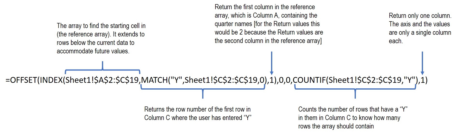
[The formula in text so you can copy and paste it for your own charts:
=OFFSET(INDEX(Sheet1!$A$2:$C$19,MATCH(“Y”,Sheet1!$C$2:$C$19,0),1),0,0,COUNTIF(Sheet1!$C$2:$C$19,”Y”),1) ]
This is a complex formula that uses a number of functions. You can find good explanations of the functions used in this formula on the Exceljet website using the links for each function name: OFFSET, INDEX, MATCH, and COUNTIF.
The main function is the OFFSET function that returns a reference to a range of cells. We need a reference for each of the two parts of a chart, the category axis and the data values. Of course we can extend this to multiple data series of values but we will keep this example simple.
The first argument for the OFFSET function is the starting cell for the range to be returned. To find this starting cell we use the INDEX and MATCH functions.
The INDEX function returns a cell reference from an array based on selection criteria. In the formula above, a reference array defined larger than the current range of cells has been used in order to account for future quarters and their results. The range includes Column C so the selection can be based on the “Y” values the user has entered in this column. The row number for the starting point is selected using the MATCH function. The MATCH function finds the first row in Column C where there is a value of “Y”.
The second and third arguments in the OFFSET function are the number of rows and columns below and to the right of the starting cell, which are both zero for our purposes because we want to start selecting at the first value.
The fourth argument of the OFFSET function is the height, in number of rows, of the range. To calculate this we use the COUNTIF function. This function counts how many rows in the range in Column C contain the value “Y”. Since we know that the “Y”s are in consecutive rows, this will be the number of rows we want in the chart.
The fifth argument of the OFFSET function is the width, in number of columns, of the range. This is 1 since we only want one column in the range.
When this complex formula is evaluated, it returns the range of cells for the x-axis labels.
We use the same formula, changing the column number in the INDEX function to 2 to define the ChartValues named range.
Creating a chart with named ranges
With our two named ranges defined (ChartX and ChartValues), we can create a chart using these two named ranges. The above mentioned article on creating a simple dynamic range chart has a good step-by-step explanation of using named ranges to create a chart. You can jump to the steps using this link. Remember to include the sheet name when using the named ranges in defining the chart, just as the sheet name is included in the formula above.
To change the values used in the chart, just change the cells in Column C that contain a “Y” value. Make sure that the cells are consecutive so that the method works properly.
Having formulas select the data to be included in the chart
In the example above the user selected the data for the chart by entering a “Y” in Column C for the data points to be charted. We can extend this idea to having a formula select the data to be included in the chart. The second request I mentioned above is an example of where we can use formulas to select the data for the graph and then use the dynamic range method to create the chart.
The example here is a set of data that is generated by an automated system and downloaded each month. The data contains one record for each day of the month reporting production for the day. The organization wants to view each week (starting on a Monday) in a separate chart. Each month can have up to five weeks and the days that fall in each of the first through fifth week of the month will change each month.
The approach is to have a formula indicate which days fall in each week during the month and then the dynamic range method above will create the chart based on the data that is in that week.
Formulas to select days in each week
Here is an example of the dataset and the helper columns used to determine which days should be selected for each week.
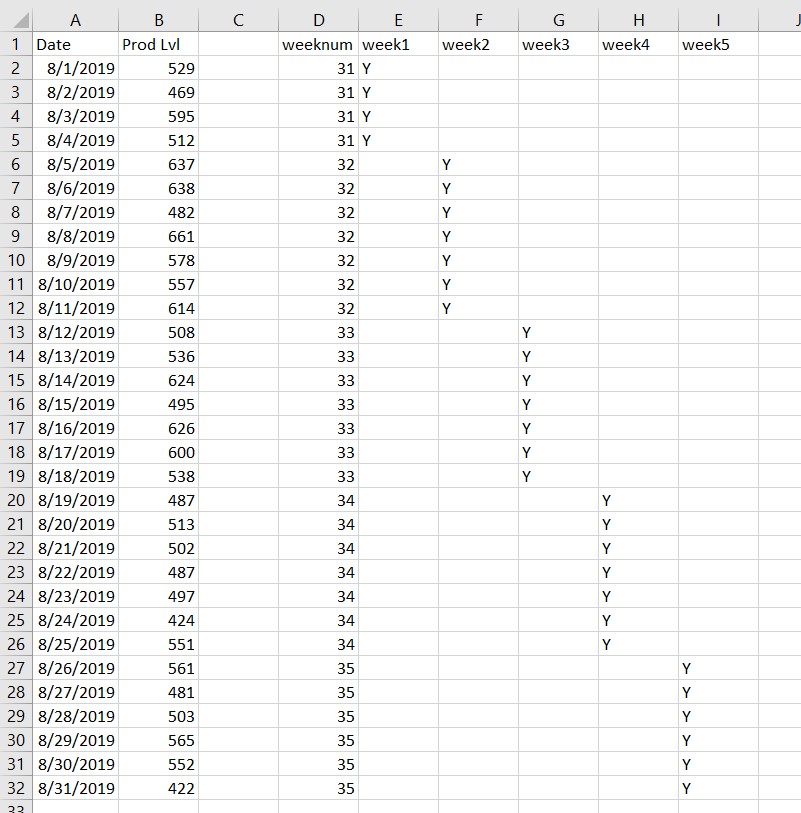
The first helper column is the week number. The formula for cell D2 is =WEEKNUM(A2,2). The WEEKNUM function determines the week number during the year for the date and the second argument sets which day of the week is the first day (2 sets the start of the week as Monday).
Then we can use the week1 through week5 columns (E through I) to calculate if that date is in the specific week, placing a “Y” in the cell if it is part of that week and leaving the cell blank if it is not. The formulas are similar in each column. As an example, the formula is cell F4 is =IF(D4=$D$2+1,”Y”,””). The formula checks if the week number for this day is one more than the week number for the first day of the month. If so, this date is in the second week of the month and the formula puts a “Y” in the cell, if not, it leaves the cell blank.
Defining dynamic named ranges for multiple charts
Similar to defining the dynamic named ranges above, we need to set up two named ranges for each chart, one for the category axis labels (the dates) and one for the data values (the production levels). To make it easier to use the named ranges when creating the charts, I suggest you use meaningful names, such as Week2X and Week2Values for the different named ranges.
In the formula example above, the changes would be:
- The reference array used in the INDEX function would expand to cover all the rows and columns, $A$2:$I$32.
- The array used in the MATCH and COUNTIF functions would only reference the cells for that week. For example, for week 2, the array would be $F2:$F32.
You can see that this method is flexible and can accommodate many different situations simply by changing a few parameters in the formula used to define the named ranges.
You would then use each pair of named ranges to create the five charts as described above and in this section of the referenced article.

Dave Paradi has over twenty-two years of experience delivering customized training workshops to help business professionals improve their presentations. He has written ten books and over 600 articles on the topic of effective presentations and his ideas have appeared in publications around the world. His focus is on helping corporate professionals visually communicate the messages in their data so they don’t overwhelm and confuse executives. Dave is one of fewer than ten people in North America recognized by Microsoft with the Most Valuable Professional Award for his contributions to the Excel, PowerPoint, and Teams communities. His articles and videos on virtual presenting have been viewed over 4.8 million times and liked over 17,000 times on YouTube.