What can you do if you want to create a chart but the values you have differ by an order of magnitude or more? If you use the standard column or bar graph, you risk the smaller values being virtually invisible because the chart is scaled to show the large values. In my customized workshops I share a visual for this situation that many have only seen in media publications because it is not a standard chart in Excel. For values that are different by orders of magnitude you can consider an area graph like this one that shows the results of a marketing campaign.

I refer to this as an area graph since the viewer is comparing the area of the shapes to each other. By using two dimensions instead of just one that a bar or column chart uses, it is easier to see the smaller values. Area graphs are not a standard chart in Excel or PowerPoint. I have offered in the past an Excel worksheet that will calculate the dimensions of the shapes you need to create in PowerPoint.
With PowerPoint in Office 365 now importing SVG images, we have a new option for creating area graphs. Today I want to introduce you to a relatively new tool for creating advanced charts that is created by Microsoft. I spend time searching for tools that will be helpful to business professionals who communicate data visually. Charticulator is one I found out about a while ago and have now figured out how it can be useful for area graphs.
Charticulator is a Microsoft Research web tool that allows you to create advanced graphs. Since it exports the graph as an SVG image, this allows you to import it into PowerPoint, break it apart, and format it exactly the way you want. Unlike many web charting tools, Charticulator keeps all data on your machine, not their servers, so it might work within your organization’s data privacy policy. Charticulator can create more advanced charts than area graphs and learning a simple use for it will start you exploring what else it can do.
To show you how to create three common area graph types using Charticulator, I’ve created a playlist of six videos to walk you through each step.
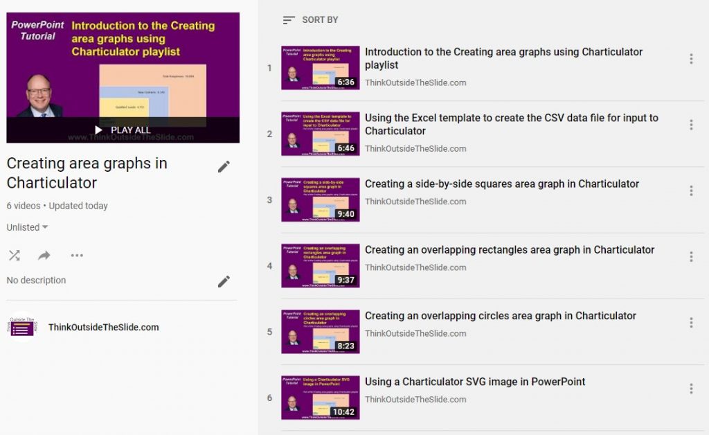
The playlist starts with an Introduction video that explains what an area graph is, why you would use one, and the videos in the rest of the playlist: a video on using the Excel template I’ve created that generates the CSV file for Charticulator, videos for creating the three common area graphs in Charticulator, and a video on using the SVG area graph in PowerPoint.
If you have to compare values that are different by orders of magnitude, check out this playlist of videos to create an area graph in Charticulator.

Dave Paradi has over twenty-two years of experience delivering customized training workshops to help business professionals improve their presentations. He has written ten books and over 600 articles on the topic of effective presentations and his ideas have appeared in publications around the world. His focus is on helping corporate professionals visually communicate the messages in their data so they don’t overwhelm and confuse executives. Dave is one of fewer than ten people in North America recognized by Microsoft with the Most Valuable Professional Award for his contributions to the Excel, PowerPoint, and Teams communities. His articles and videos on virtual presenting have been viewed over 4.8 million times and liked over 17,000 times on YouTube.