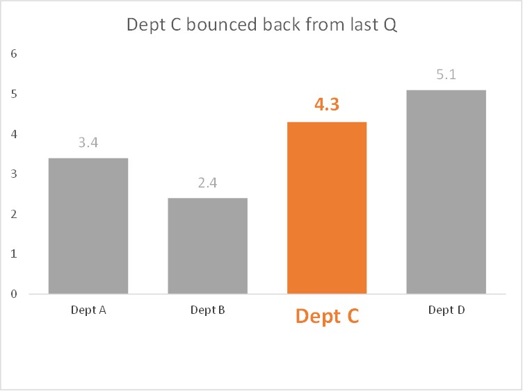
One of my most popular Excel Chart Tips videos is the one on conditional formatting of a column chart based on the values being categorized into ranges (video is here). Another option for conditional formatting is to visually focus the audience on one (or more) column based on a condition or a decision you make. Here is an example of such a column chart.
I created this chart worksheet using some of the same approaches I shared recently at the Excel Virtually Global conference. You can save a lot of time updating charts with new data and re-using charts when you develop chart worksheets that have intelligence built in.
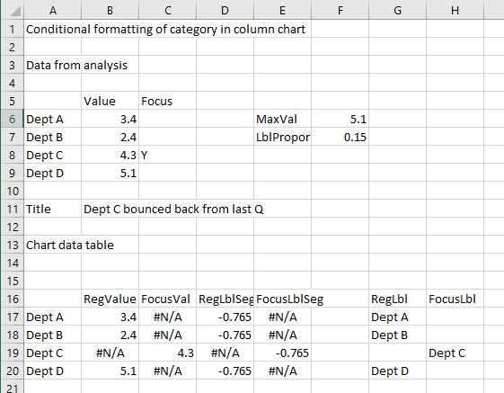
Here is the data from the analysis and the chart data table.
Here are some of the ideas and approaches.
Additional input or calculated values
The data from the analysis is just cells A5 to B9. We add values in order to create the chart we want. Cells C5 to C9 contain an indicator of whether this category is a focus category. This can be set manually or by using a formula. Cell B11 is a chart title we enter so that the chart has a meaningful headline. Cell F6 calculates the maximum value of the data so that the space needed for the category labels is big enough based on the data. Cell F7 is entered as a proportion of the maximum value. It is based on experience and experimentation.
Separate data series
I have taken the single set of values and split them into two data series for the chart. This is an important technique for charting because it allows each series to be formatted differently. The power comes in the formula used to split the values into the two series. For example, the formula in cell B17 is “=IF(C6=”Y”,NA(),B6)”. If the category is not one of focus (C6<>”Y”), the value is placed in the RegValue series and the FocusVal series contains the #N/A error value because that error value is not displayed in the chart. Similarly if the category is a focus category, the value goes in the FocusVal series and the #N/A goes in the RegValue series.
Invisible series to hold labels
The RegLblSeg and FocusLblSeg series (columns D and E) are created only to hold data labels and the values will not be seen in the chart. This is another important technique because it allows us to position visible elements, in this case the custom data labels described below, where we need them using an invisible element. Again they use the #N/A error value so that there is a value only in one of the two series for each category based on whether it is a focus category or not. The values are negative so that the data labels are positioned below the zero horizontal baseline where the chart category labels would usually be.
Custom data labels
The RegLbl and Focus Lbl series (columns G and H) are created so that we can use specific data labels in certain series. These labels will be used in the segments that were created to hold the labels. Cell B11 is used as a custom chart title so that when the message of the data changes, the headline of the chart does as well.
Each series formatted
Each data series is formatted so that only the data in that series is displayed using those colors or fonts. The series for the regular values have the muted grey for the fill color and data labels and have small custom data labels in the invisible label segments. The focus series use the bold orange for the fill color, data labels and custom data label (which is in an invisible segment), all of the text being larger than the regular series text so it stands out.
Don’t always use the defaults
I have removed or changed a number of the default settings for a column chart:
- The columns overlap 100% because there will only be one column in each direction for each category.
- There are no gridlines or legend because they clutter the chart.
- There are no horizontal axis labels because we are using our custom labels to replace them.
- The vertical axis uses a custom number format to remove the negative numbers so it looks like the chart starts at zero.
Excel charts can have a lot of flexibility built in to make updating and re-use much easier. You can learn more about Excel Chart Worksheet Templates in my two-course bundle and you can learn more about advanced Excel chart techniques in my Excel Chart Skills 501 course.
I created a video showing the techniques and approaches used to create this chart.

Dave Paradi has over twenty-two years of experience delivering customized training workshops to help business professionals improve their presentations. He has written ten books and over 600 articles on the topic of effective presentations and his ideas have appeared in publications around the world. His focus is on helping corporate professionals visually communicate the messages in their data so they don’t overwhelm and confuse executives. Dave is one of fewer than ten people in North America recognized by Microsoft with the Most Valuable Professional Award for his contributions to the Excel, PowerPoint, and Teams communities. His articles and videos on virtual presenting have been viewed over 4.8 million times and liked over 17,000 times on YouTube.