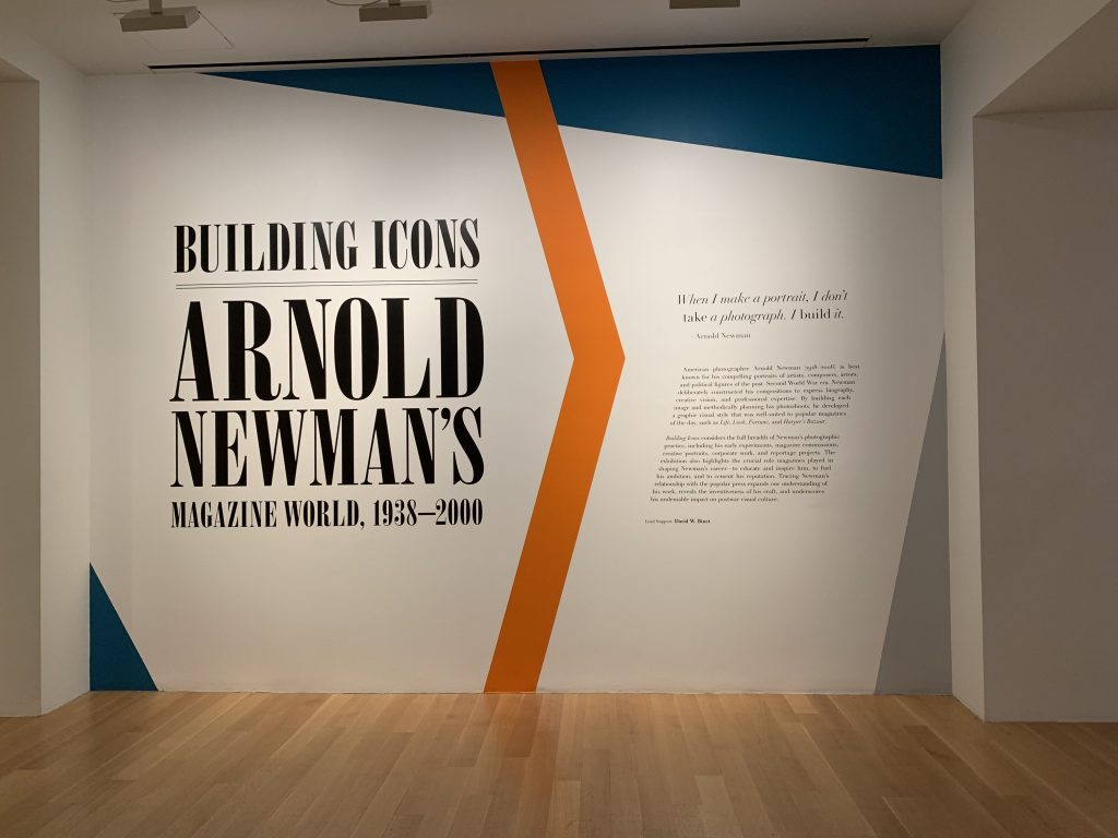
This past weekend we went to the Art Gallery of Ontario to see an exhibit of photos from renowned photographer Arthur Newman. His photos are well known because of his unique style of portraits that were commissioned by magazines from the 1940s to the 1980s. He carefully constructed the setting for each person based on the extensive research he did about them. The settings illustrated the work the person did and add so much to each portrait.
What I also realized was how carefully he cropped each photo. The exhibit included proof sheets where you can see the original photo he took and how he decided the portion he would use in the final published photo.
If you have seen his well-known photo of Igor Stravinksy it looks like this example from a book.
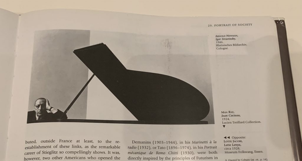
The lid of the piano is in the shape of a musical note and it is one of his best known photos.
What I didn’t know until I saw the exhibit is what the original photo looks like. Here’s the original photo.
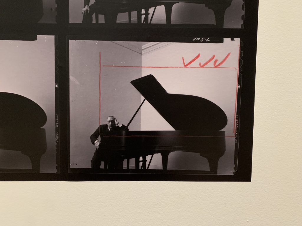
Notice how the original photo has so much more in it than the published photo. You can see his red pen lines indicating what portion of the photo he wanted to use to create the incredible photo that has been published hundreds of times.
So what can presenters learn from Arthur Newman? One key lesson is to not be afraid to crop an image to highlight the message you want to convey. Whether it is an image from the stock photo collection, a purchased image, or one you took yourself, be courageous and crop the photo so it has more impact.
Here’s an example of a stock image of a business person.

If we use it as PowerPoint inserts it on the slide, it is a good photo, but it could be so much more. Here is a cropped version of the photo.

See how the viewer’s eyes are no longer distracted by the buildings and scenery in the background. You focus on the person exclusively.
Don’t be afraid to crop images on your PowerPoint slides. Arthur Newman shows us how it can make our message so much more impactful.

Dave Paradi has over twenty-two years of experience delivering customized training workshops to help business professionals improve their presentations. He has written ten books and over 600 articles on the topic of effective presentations and his ideas have appeared in publications around the world. His focus is on helping corporate professionals visually communicate the messages in their data so they don’t overwhelm and confuse executives. Dave is one of fewer than ten people in North America recognized by Microsoft with the Most Valuable Professional Award for his contributions to the Excel, PowerPoint, and Teams communities. His articles and videos on virtual presenting have been viewed over 4.8 million times and liked over 17,000 times on YouTube.