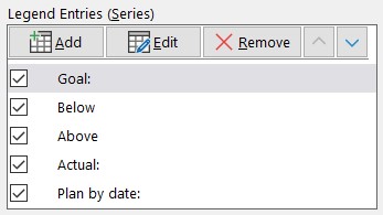
One of the common messages reported in financial or operational reports is progress towards a goal. It could be a spending goal, production goal, or any other important metric that is tracked. The decision makers want to see the goal, where we expected to be at this time, and actual progress. Instead of the typical table of numbers, why not consider an overlapping bar progress graph line this.
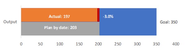
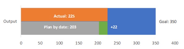
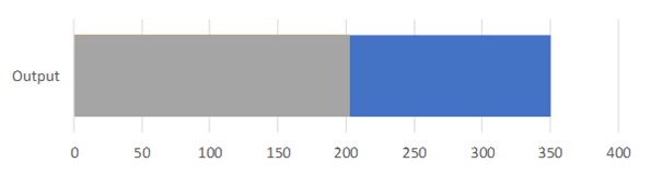
This graph indicates the goal, planned progress, and actual progress visually, as well as indicating how far behind or ahead of plan we are at this time. The comparison to plan can be shown in percentage or in actual values like this example shows.
Because this visual is so compact, it can be used to show progress on a number of related metrics on a single slide or used in a dashboard visual.
This visual can be created in Excel using a standard bar graph where all the elements are driven by the data table so it can automatically update when the data changes. The rest of this article explains the steps to create this visual.
General approach
This visual is created by using a bar graph with five data series that overlap each other. The bars will represent the goal, the actual progress, the planned progress, the amount below plan, and the amount above plan. The below and above bars will display only when that situation is indicated. The bars are arranged in certain layer order so that only certain portions of underlying bars appear.
Most of the labels shown are custom data labels created using text, values, and special characters in order to position the labels properly. These labels are used through the feature to add data labels from cells that was introduced in Excel 2013.
Data & Graph table setup
The data and graph data tables are similar whether the difference in values or percentage difference is shown. Here is the data for the graph showing difference in values.
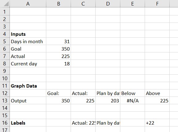
The data series names in cells B12 to D12 contain the text to be used for the goal, actual, and planned data labels. You can change this text if needed. Note that there is a colon after the text so that the data labels will format properly in the graph.
In this case planned progress is calculated proportionally based on the number of days in the month. You can easily use other methods of determining planned progress.
Formulas for cells in Graph data table
Here are the key formulas in the cells:
B13 and C13 simply refer to cells B6 and B7 from the Input table.
D13: =ROUND((B8/B5)*B6,0)
This formula calculates the planned progress by rounding the proportional progress towards the total goal based on the current day divided by the number of days in the month. If you have a different approach to calculating planned progress, that formula or result would be entered in this cell.
E13: =IF(C13<D13,D13,NA())
The bar representing the amount below plan is shown only if the actual progress is below the planned progress. The value is set to the planned progress value if this is the case and set to the #N/A error value if not. The #N/A error value results in no bar being shown and no data label being shown. The bar length is the entire planned value, not the difference between the actual and planned values because only the difference will be visible due to the layering of bars.
F13: =IF(C13>D13,C13,NA())
Similarly, the bar representing the amount above plan is shown only if the actual progress is above the planned progress. The value is set to the actual progress value if this is the case and set to the #N/A error value if not. The #N/A error value results in no bar being shown and no data label being shown. The bar length is the entire actual value, not the difference between the actual and planned values because only the difference will be visible due to the layering of bars.

This cell is the data label to be used for the actual bar. It is created using the CONCAT function because this function allows a text string to be built from text, numbers, and special characters. In this case the data series name is combined with the value. There are two New Line characters (CHAR(10)) added at the end so that the data label sits in the actual bar which shows only in the top half of the visual.

This cell is the data label to be used for the planned progress bar. It is created using the CONCAT function because this function allows a text string to be built from text, numbers, and special characters. In this case the data series name is combined with the value. There are two New Line characters (CHAR(10)) added before the text so that the data label sits in the planned bar which shows only in the bottom half of the visual.

This cell is the data label used to indicate the amount below plan. It is blank unless the actual value is below the planned value. It uses the CONCAT function to add two New Line characters after the value to position the difference in the top half of the visual.
If you want percentage differences, the formula is:

The TEXT function is used to format the percentage difference as a percentage with one decimal place.

This cell is the data label used to indicate the amount above plan. It is blank unless the actual value is above the planned value. It uses the CONCAT function to add two New Line characters before the value to position the difference in the lower half of the visual. It adds a “+” character before the value to indicate the difference is positive compared to the planned value.
If you want percentage differences, the formula is:

The TEXT function is used to format the percentage difference as a percentage with one decimal place.
Creating the overlapping bar graph
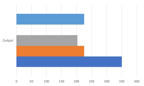
To create the overlapping bar graph, select cells A12:F13. On the Insert ribbon, insert a regular 2D bar chart. Excel will likely create a chart with five labels and bars because it mixed up which were the rows and columns. Click the Switch Row/Column button on the Chart Design ribbon to get a chart that looks like this.
Click on any bar and press Ctrl+1 to display the Format Data Series task pane on the screen. Change the Series Overlap to 100% and the Gap Width to 40%. Also remove the gridlines. You can resize the graph to not be as tall.
Click on the Select Data button on the Chart Design ribbon. In the Series list, use the up and down arrows to reorder the series. This is controlling which layer each bar is on. This is the order is as follows:
The graph will now look like this.
Making a bar appear to be half the height
With the bars fully overlapping, it is impossible to see the bars below unless they are longer. We can make a bar appear to be half the height by setting the fill color to be a gradient where one half is transparent and one half is a solid color.
Select the grey Planned bar to start. Press Ctrl+1 to open the Format Data Series task pane if it is not already open. Click on the Gradient fill radio button. In the Direction drop down menu, select the Linear Down option.
You will set four gradient stops. You may have to add or remove a stop using the buttons to the right of the stops visual. Stop 1 is at position 0%, color white and 100% transparency. The settings will look like this.
Stop 2 is at position 50%, color white and 100% transparency. Stops 1 and 2 define the transparent top half of the planned progress bar.
Stop 3 is at position 50%, color grey and 0% transparency. The settings will look like this.
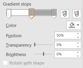
Stop 4 is at position 100%, color grey and 0% transparency. Stops 3 and 4 define the filled bottom half of the planned progress bar.
Follow these same steps to define the Above bar to have a transparent top half and a solid bottom half filled with a green color. You can use the selection drop down on the left side of the Chart Format ribbon to select the Above bar if it is not visible or difficult to click on.
Select the orange Actual bar next. You can use the selection drop down on the left side of the Chart Format ribbon to select the Actual bar if it is not visible or difficult to click on. Click on the Gradient fill radio button. In the Direction drop down menu, select the Linear Up option.
You will set four gradient stops, similar to above. You may have to add or remove a stop using the buttons to the right of the stops visual. Stop 1 is at position 0%, color white and 100% transparency. Stop 2 is at position 50%, color white and 100% transparency. Stops 1 and 2 define the transparent bottom half of the planned progress bar.
Stop 3 is at position 50%, color orange and 0% transparency. Stop 4 is at position 100%, color orange and 0% transparency. Stops 3 and 4 define the filled top half of the planned progress bar.
Follow these same steps to define the Below bar to have a transparent bottom half and a solid top half filled with a red color. You can use the selection drop down on the left side of the Chart Format ribbon to select the Below bar if it is not visible or difficult to click on.
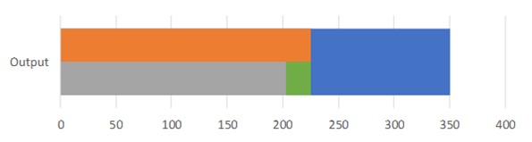
The graph will now look like this.
Adding data labels
We will first add the data label for the overall goal. Select the Goal bar and add a data label using the “+” skittle menus. Select the More Options to open the Format Data Labels task pane. In the Label Options section select the Series Name, the Value, and use the space character as the separator. The selections will look like this.
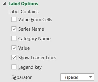
Select the Actual bar and add a data label using the “+” skittle menus. Select the More Options to open the Format Data Labels task pane. In the Label Options section select the Value From Cells option. It will ask you to select the cells you would like to use as the label. Select cell C16 and click OK in the dialog box. Uncheck the Value and use the Center label position. On the Home ribbon change the label font color to white and make the font bold.
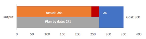
Use this same process to add data labels for the Planned bar from cell D16, the Below bar from cell E16, and the Above bar from cell F16. The chart is now complete and will look like this.
Graph updates automatically
This visual will now update automatically as the data changes. For example, if in six days the actual output is 245 units, the graph will now show that we are behind the planned output.
Consider this compact overlapping bar progress graph when you want to have an automatically updating visual to show actual and planned progress towards a goal.

Dave Paradi has over twenty-two years of experience delivering customized training workshops to help business professionals improve their presentations. He has written ten books and over 600 articles on the topic of effective presentations and his ideas have appeared in publications around the world. His focus is on helping corporate professionals visually communicate the messages in their data so they don’t overwhelm and confuse executives. Dave is one of fewer than ten people in North America recognized by Microsoft with the Most Valuable Professional Award for his contributions to the Excel, PowerPoint, and Teams communities. His articles and videos on virtual presenting have been viewed over 4.8 million times and liked over 17,000 times on YouTube.