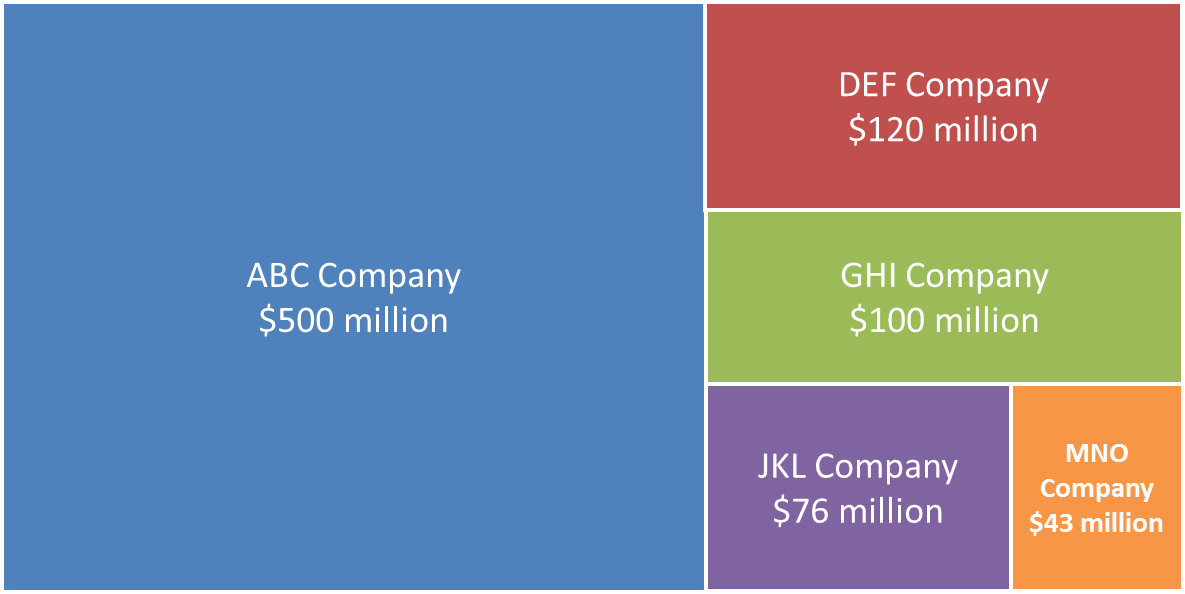
At the Presentation Summit in September, Nolan Haims showed a diagram I had seen before, but did not know the proper name for: a treemap. A treemap is a type of visual that allows you to visually compare the size of different measured values using proportionally shaped rectangles that are arranged into an overall rectangle. Here is a link to an article that contains more on the background of this type of visual. Here is an example of a treemap.
The challenge with this visual, like many other diagrams that use proportional shapes, is that you need to do somewhat complex calculations in order to get the shapes exactly the right size. Nolan shared that there are some online tools that can create these types of diagrams, but the tools produce an image that you can’t edit in PowerPoint. I knew that there must be a way that presenters everywhere could quickly and easily create these diagrams without having to figure out the calculations themselves.
After a few hours of work, I created a calculator that allows you to input your values, and the calculations are done for you. The calculator is on my site at www.SimpleTreemapCalculator.com. You enter the height and width of the overall area of your slide that you want the treemap to occupy (in inches or centimetres). Then you enter the values you want to represent within the treemap. You need to enter at least four values in order from largest to smallest. In the Results section of the calculator, you will see exact measurements for each rectangle that makes up the treemap. You can then use the entry fields in the Size group for the object to enter the height and width of each rectangle shown in the Results table.
To make the calculator work, I had to make some assumptions about how the rectangles would be arranged. In the treemap created by the calculator, the rectangles are always arranged starting with the largest rectangle on the left side of the area for the treemap. The next rectangles then fill in the remaining area from the top to the bottom. The final two rectangles split the last space left in the overall area used for the treemap. You can see this pattern in the example above.
When would you use a treemap diagram? I think it is a good option to replace a pie chart where one of the wedges is about 50% or more. Instead of the typical pie chart of wedges, you can input the values into the Simple Treemap Calculator and create a treemap diagram. Since each rectangle is a separate shape, it is easy to build each rectangle one by one with animation as you speak to that value.
Now that the calculations are easier, you can start to use treemap diagrams in your presentations.

Dave Paradi has over twenty-two years of experience delivering customized training workshops to help business professionals improve their presentations. He has written ten books and over 600 articles on the topic of effective presentations and his ideas have appeared in publications around the world. His focus is on helping corporate professionals visually communicate the messages in their data so they don’t overwhelm and confuse executives. Dave is one of fewer than ten people in North America recognized by Microsoft with the Most Valuable Professional Award for his contributions to the Excel, PowerPoint, and Teams communities. His articles and videos on virtual presenting have been viewed over 4.8 million times and liked over 17,000 times on YouTube.