The “last mile” is a term that refers to delivering service all the way to the customer’s home, not just close by. It has been a significant challenge for companies like Amazon who deliver packages to people’s homes and for providers of high-speed internet.
It is relatively easy to get a truckload of packages to a neighborhood depot or to run high-speed fiber based internet service to a local library or community center. In both cases, the end customer can go a relatively short distance and pick up the package or use the high-speed service in the library or community center. But most people won’t do this because it is not convenient. There are limited hours that the location is open, they have to find transportation to get to the location, and it is a hassle to deal with the weather sometimes.
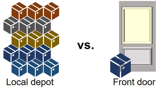
Instead, people want service at their door. They want the package they ordered, such as a book, electronics, or a kitchen item, delivered to their front door. People want high-speed internet in their home so they can stream a show, play a game with friends, or video chat with family across the globe. People’s expectations of delivery of whatever they want directly to their door has increased with the popularity of Amazon and meal delivery services.
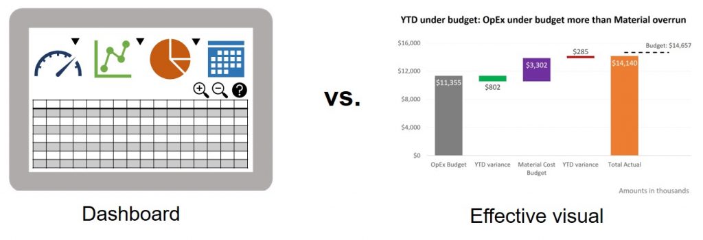
It’s the same with data analysis. Too often I see business professionals get the analysis close to the front door, but not all the way there. “Close to the front door” in data analysis could be a dashboard where the executive has to log on, figure out how to use it, and manipulate the dashboard to figure out the answer they need. “Close to the front door” can also be a spreadsheet in a presentation or report where the executive has to interpret the numbers and do some math to figure out the answer they need.
Just like people won’t make the effort to come to the local depot to get a package or go to the library to use the internet, executives won’t do the work to figure out the answers they need from a dashboard or spreadsheet. They want the answer they need delivered to them in an easy to understand format.
Business professionals need to take their data analysis the last mile. The expectation has been set by all the other experiences people have. The last mile in data analysis is understanding the needs of the audience, determining the message that specific audience needs to hear from the work you’ve done, writing a headline that summarizes the message, and selecting a visual that communicates the message clearly to the audience. Just like every package is different and every internet session is different, the output we deliver from our analysis will be different for each audience.
Typically taking data analysis the last mile is delivering a formatted visual via email, Teams, Slack, or a PowerPoint presentation. It gives the executive the answer they need, in a format they can easily understand, delivered directly to their device or in person.
It is the skills for this last mile that are often missing from data analysis training. So much is focused on consolidating the data from different sources, cleaning the data, and performing analysis on large datasets. All of these are necessary, but they only get to the start of the last mile. Taking the analysis the last mile to deliver the output that the audience needs requires skills in understanding audience needs, determining the key messages from the analysis, and selecting the right visual to communicate the message.
To be an effective communicator of data analysis, make sure you learn the skills needed for the “last mile”. My focus is on teaching business professionals these skills through customized workshops. I share a structured approach to selecting the right visual for the common messages from data and I demonstrate the techniques in Excel to create these visuals. You can check out my in-house workshops or my online courses.

Dave Paradi has over twenty-two years of experience delivering customized training workshops to help business professionals improve their presentations. He has written ten books and over 600 articles on the topic of effective presentations and his ideas have appeared in publications around the world. His focus is on helping corporate professionals visually communicate the messages in their data so they don’t overwhelm and confuse executives. Dave is one of fewer than ten people in North America recognized by Microsoft with the Most Valuable Professional Award for his contributions to the Excel, PowerPoint, and Teams communities. His articles and videos on virtual presenting have been viewed over 4.8 million times and liked over 17,000 times on YouTube.