In a previous article I talked about giving context first for complex diagrams by showing the overall view before zooming in to look at the details. The same approach can apply to a column graph where the values don’t differ by much.
Too often I see column graphs where the vertical axis does not start at zero. Often this is not a deliberate choice by the presenter because by default Excel and PowerPoint scale the axis to make the column differences easier to see. The problem is that a non-zero based axis makes the comparison of the column heights misleading. I discussed this in more detail in an earlier article.
I think presenters can apply the idea of giving context first when presenting a column graph that has similar values. First, show the graph that has the vertical axis starting at zero. The columns will all be similar heights. This gives the audience the context that on a relative basis, the values are close. Then, show a graph where the scale of the vertical axis is adjusted so it is easier to see the difference in the column heights. The audience now has a zoomed in view so they can see the differences that are important to the message.
In the previous article where I talked about zooming in on a diagram, I showed the use of a relatively new feature in PowerPoint called Morph that makes zooming in easy for images and diagrams. Unfortunately, Morph is not available for graphs. While working on the slide makeovers for an upcoming session I discovered a method that works well for column graphs when we want to zoom in on the columns to show the difference up close.
Here’s a short video of how it looks in PowerPoint when you move from the zero based axis graph to the zoomed in graph (if the video image below does not play, click here instead to see the transition between the two slides).
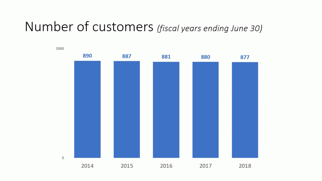
Here’s the method I used to create the example above. On slide 1, create the column graph with a zero based axis. Notice that I used a minimalist axis so that the viewer knows it is based at zero. It is important to have at least the minimalist axis visible because the viewer will see the axis change in the zoomed in view. Make sure that the graph is formatted the way you want with colors, data labels, etc.
Copy slide 1 to create slide 2. On slide 2, adjust the minimum and maximum values of the vertical axis to make the difference in the column heights more apparent. I also suggest changing the font of the vertical axis labels so they stand out more as an indication to the viewer that something has changed (I made them bold and italic in the example above).
The final step is to add a transition to slide 2 so it makes it look like the graph in slide 1 is transforming into the graph on slide 2. I found that the Wipe transition is the best effect to choose. Set the direction to be from the top and set the duration to be two seconds. The effect is that it looks like the columns on slide 1 are moving down to create the columns on slide 2. I use the two second duration to make sure the viewer has enough time to see the movement.
If you have a column graph where the relative values do not show much difference but you want to focus on the differences to make a point to the audience, consider using this transition technique to give context first and then make it look like you are zooming in on the columns.

Dave Paradi has over twenty-two years of experience delivering customized training workshops to help business professionals improve their presentations. He has written ten books and over 600 articles on the topic of effective presentations and his ideas have appeared in publications around the world. His focus is on helping corporate professionals visually communicate the messages in their data so they don’t overwhelm and confuse executives. Dave is one of fewer than ten people in North America recognized by Microsoft with the Most Valuable Professional Award for his contributions to the Excel, PowerPoint, and Teams communities. His articles and videos on virtual presenting have been viewed over 4.8 million times and liked over 17,000 times on YouTube.