A common message in financial, project update, and operations presentations is to explain the total variance in expenses to the budget by looking at the variance in each expense line item. The common approach is to show the spreadsheet of numbers extracted from the accounting system. My latest slide makeover shows how you can visually show the variances in each item as well as the overall variance using a “steps to a total” graph.
The original slide is the typical table of numbers we copy from a spreadsheet.
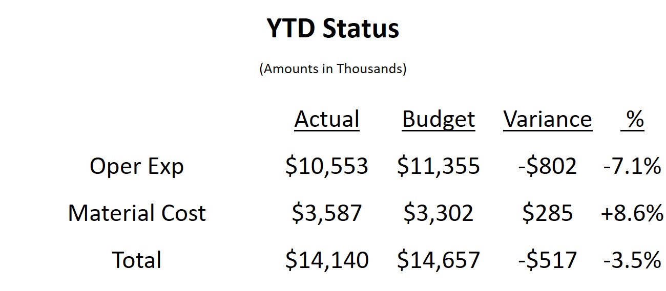
Like many tables of numbers, this slide shows all the math, but isn’t easy for the audience to understand. If you want the audience to understand how each element, budget and variance for the expense areas, contributes to the totals, the audience is forced to study the numbers. The risk in asking the audience to interpret numbers is that they may not come to the same conclusion you wanted them to.
In the makeover slide I visually present each element.
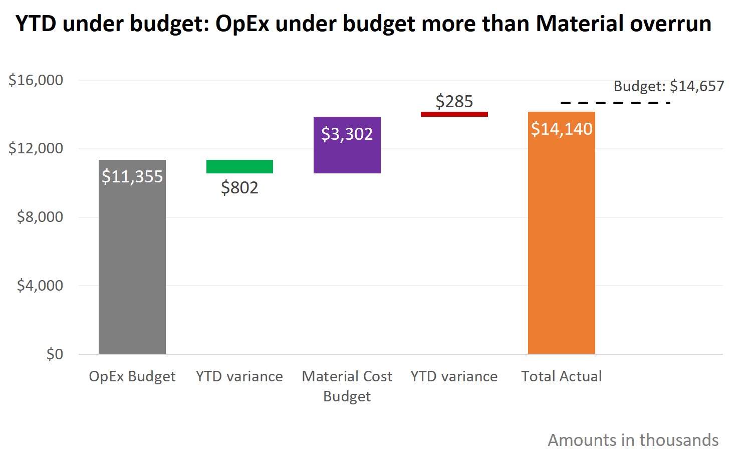
The graph I am using is one I refer to as a “steps to a total” graph. It is created using a stacked column graph with an invisible segment that makes the segments “float” in mid air. Using invisible elements to position visible elements is an expert-level technique that can be used in many different situations.
Labels in graphs are important to help the audience understand the visual. Research by Prof. John Sweller suggests that incorporating explanatory text into the graph improves comprehension. The data labels for each segment, where they are positioned, and the labeling of the total budget dashed line are all elements that I’ve included to help the audience interpret the graph.
In the full video below you will also learn how the dashed line is created as part of the graph and my suggestions on how I would use animation to present the graph in a way that walks the audience through the story I want them to understand.
When you want to show how budget and variance values in each area add up to the totals, consider using a steps to a total graph to make the message visual and easier to understand.

Dave Paradi has over twenty-two years of experience delivering customized training workshops to help business professionals improve their presentations. He has written ten books and over 600 articles on the topic of effective presentations and his ideas have appeared in publications around the world. His focus is on helping corporate professionals visually communicate the messages in their data so they don’t overwhelm and confuse executives. Dave is one of fewer than ten people in North America recognized by Microsoft with the Most Valuable Professional Award for his contributions to the Excel, PowerPoint, and Teams communities. His articles and videos on virtual presenting have been viewed over 4.8 million times and liked over 17,000 times on YouTube.