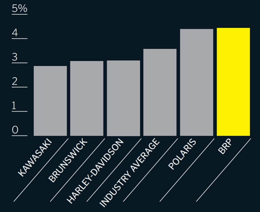
The latest FinancialViz makeover video I posted illustrates how to create an effective visual when dealing with two situations: first, values are compared to an industry average, and second, the company names are long. The original visual was published in the June 2018 issue of the Globe and Mail Report on Business magazine. This is the original visual.
One thing I like about this visual is the use of a color focus column. When presenters use a bold color to direct their audience’s attention, it helps the audience focus on the one column that is most important to the message.
There are two significant issues I have with the visual though. First, the company names are angled and in all capitals. Angled text is hard to read. This is not often the choice of the presenter because by default, Excel and PowerPoint angle the column category labels when they are too long. The company names are also in all capitals, which is harder to read than mixed case text.
The second issue is that part of the message is how the different industry participants compare to the industry average. That message is lost because the industry average is one of the columns and it blends in with the other columns for the other companies. If the audience does find the industry average column, they now have to do the work to visually compare it to each company’s column.
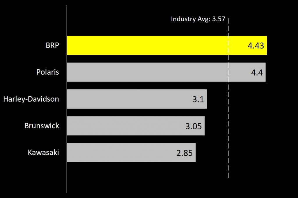
In the makeover I focused on making the comparison to the average easier and making the text easier to read. Here is the graph I created.
I used a bar chart because it allows longer category labels, the company names in this case, to be easily read. I also changed the company names to mixed case to make them easier to read. A bar chart works better than a column chart in two situations. First, when your message is ranking values largest to smallest, a bar chart works well because it is easy for the audience to see where the most important bar ranks in the graph. Second, if you have long category labels, as we have here, a bar chart works well because it allows the audience to easily read the text.
I kept the color focus on the most important bar. In this situation the top bar is the focus. In other situations the focus may be on a bar in the middle or bottom of the graph. Using color allows the audience to quickly see where the value falls in the ranking of the values.
I also added a dashed line for the industry average. By using a dashed line for a standard you want the audience to compare the values to, you make it easier for the audience to see whether the values are above or below that standard. Here, the dashed line clearly divides the industry participants into two groups. The top two companies are well above the average and the remaining three companies are well below the average. In the full makeover video I discuss how I added the dashed line so it is part of the graph. By making it part of the graph, it will always maintain its correct position if the graph is moved or resized. It can also update the position and label when the average changes. I always suggest building graphs in a way that they update automatically when values change to minimize updating time in the future.
When you are comparing values to an industry average, use a dashed line in the graph and when you have long category labels, choose a bar chart instead of a column graph so the labels are easier to read.

Dave Paradi has over twenty-two years of experience delivering customized training workshops to help business professionals improve their presentations. He has written ten books and over 600 articles on the topic of effective presentations and his ideas have appeared in publications around the world. His focus is on helping corporate professionals visually communicate the messages in their data so they don’t overwhelm and confuse executives. Dave is one of fewer than ten people in North America recognized by Microsoft with the Most Valuable Professional Award for his contributions to the Excel, PowerPoint, and Teams communities. His articles and videos on virtual presenting have been viewed over 4.8 million times and liked over 17,000 times on YouTube.


