In the next three months I will be speaking at five conferences for financial professionals (you can see the locations and details here). A common concern of accountants or finance professionals is how to present financial statements.
These professionals struggle with the usual approach of copying the entire statement onto a slide. They typically get two reactions from executives when that slide goes up: first, a look of confusion and frustration as the executive is overwhelmed with the all the numbers. Second, a series of questions on insignificant parts of the statement which wastes time and distracts from the important numbers that the executives should be focusing on. If you present any information by copying a spreadsheet on to a slide, you will get a similar reaction.
The question they have is how can these statements, the income or profit and loss statement, the balance sheet, and the cash flow statement, be more effectively presented? My best answer: Don’t present the statements at all. Before you dismiss this suggestion, hear me out. I don’t think the statements are what the executives actually need. Yes, you have to distribute them because it is a regulatory and audit requirement.
What the executives need to hear is what is behind the numbers on each statement. They need to see visuals that explain the key issues your analysis has uncovered and make decisions to keep the organization moving towards its goals.
I’ve written three articles, one for each of these key statements, that outlines what the executives are looking for and examples of visuals that can effectively communicate the key messages. Here are three examples of visuals that can communicate a message more effectively than a statement or spreadsheet.
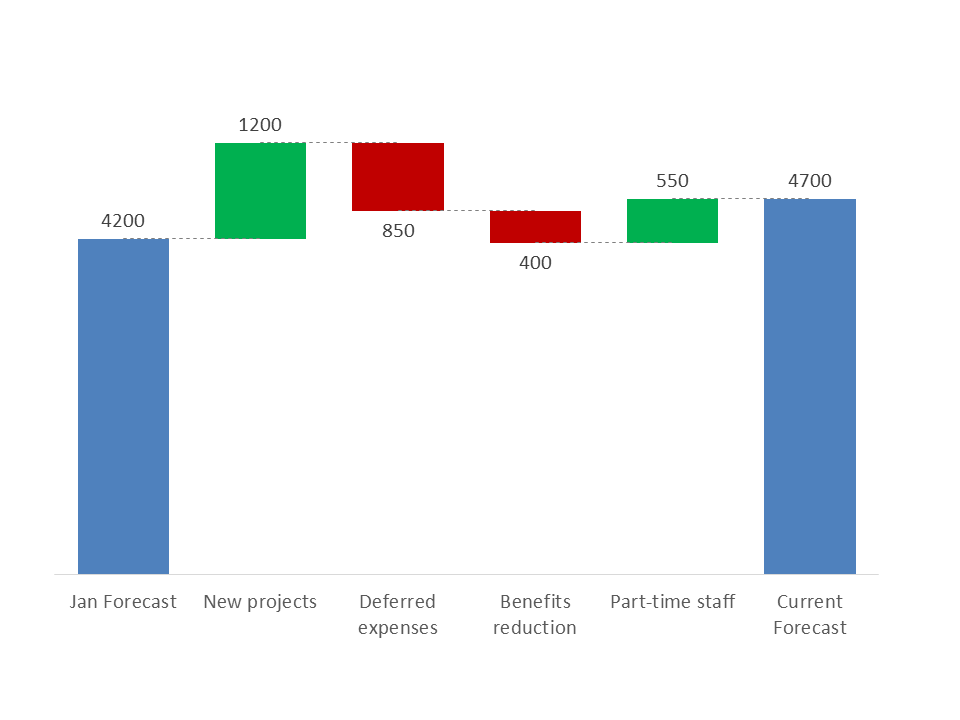
Example #1: If you want to explain the components that make up the difference between a previous forecast amount and the current forecast, use a waterfall chart like this.
Example #2: If you want to show which offices reached the goal for number of contracts signed in the last quarter, use a dashed line on a column graph like this.
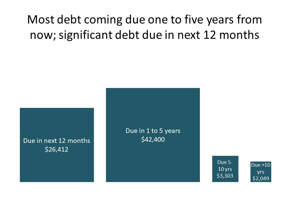
Example #3: If you want to compare values that are different by an order of magnitude or larger, consider a proportional object visual like this.
The articles give many more visual examples you can consider when presenting financial statements or information to executives. Here are links to the three articles:
Presenting an Income or Profit & Loss Statement
Presenting a Balance Sheet
Presenting a Cash Flow Statement
If you will be attending one of the conferences I will be speaking at, drop me a line so we can connect at the event.

Dave Paradi has over twenty-two years of experience delivering customized training workshops to help business professionals improve their presentations. He has written ten books and over 600 articles on the topic of effective presentations and his ideas have appeared in publications around the world. His focus is on helping corporate professionals visually communicate the messages in their data so they don’t overwhelm and confuse executives. Dave is one of fewer than ten people in North America recognized by Microsoft with the Most Valuable Professional Award for his contributions to the Excel, PowerPoint, and Teams communities. His articles and videos on virtual presenting have been viewed over 4.8 million times and liked over 17,000 times on YouTube.