The most common visuals used when showing one segment compared to the whole are a pie graph or donut graph. Everyone is familiar with them and they work well. Another visual you can consider when the message is about individual people or objects is a group of items or ISOTYPE style visual. Here is an example from a past customized workshop.
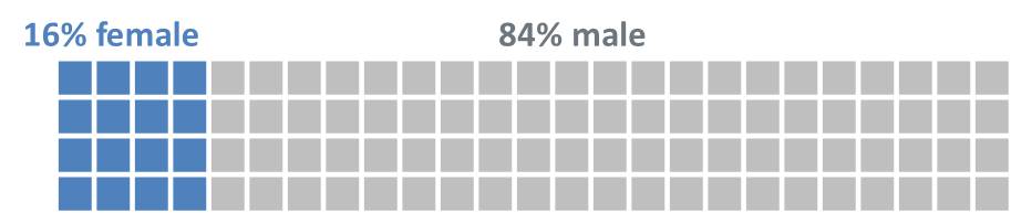
In this type of proportion visual, shapes or icons are used to represent the focus segment and the whole. A common way to create this visual if you are using squares is to use a table. In the example above, the borders are set to white and the shading color creates the distinction between the focus group and the whole.
You can also create this type of visual using characters in a text box. This can allow you to easily include a proportion visual in a block of text or allow you to build a visual one group at a time through animation (which tables do not allow). This type of visual requires using characters that are inserted using the Insert – Symbol method for inserting special characters.
The Wingdings font contains some characters that can be helpful. Character code 108 is a filled circle and code 110 is a filled square. Insert as many characters as you need to show the whole amount (I usually insert one, then copy and paste to create the rest). Since these are characters, you can change the font color to distinguish the two parts. You can use these characters to create this type of visual showing 24% using 12 colored squares out of 50 total squares.

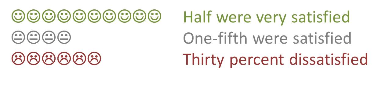
The Wingdings font also contains happy, neutral, and sad face characters (codes 74, 75, and 76 respectively) that can be used to show customer satisfaction results in a new way. By placing them in a text box, you can build each row one by one using the normal text box animation effects by paragraph. Here is an example where text is positioned beside the characters.
You can explore characters in other fonts to see what could work as well. In the Arial font, hex character code 2588 is a full rectangle, code 258C is a left half rectangle, and code 2590 is a right half rectangle. These are full height characters and can be used with or without spaces between to create a visual where you can show one half of a character as a different color. Here is an example using these characters to show 45%.

When your message is how one segment compares to the whole for individual items or people, consider whether a proportion visual using some of the special characters may give you additional options or a new look compared to a table or the traditional pie or donut graphs.

Dave Paradi has over twenty-two years of experience delivering customized training workshops to help business professionals improve their presentations. He has written ten books and over 600 articles on the topic of effective presentations and his ideas have appeared in publications around the world. His focus is on helping corporate professionals visually communicate the messages in their data so they don’t overwhelm and confuse executives. Dave is one of fewer than ten people in North America recognized by Microsoft with the Most Valuable Professional Award for his contributions to the Excel, PowerPoint, and Teams communities. His articles and videos on virtual presenting have been viewed over 4.8 million times and liked over 17,000 times on YouTube.