When a column or bar chart has to be small so that other content can fit on the slide, the default legend can cause a challenge. The color chips used in the legend become so small that it may be hard for the audience to see which color represents which data series. This gets even harder when there are colors that are similar, like the three shades of green I saw used in a legend recently.
Not only may the legend be hard to see, but it also takes space away from the graph area, making the graph smaller than it could be. Here is what the default legend looks like on a small column graph.
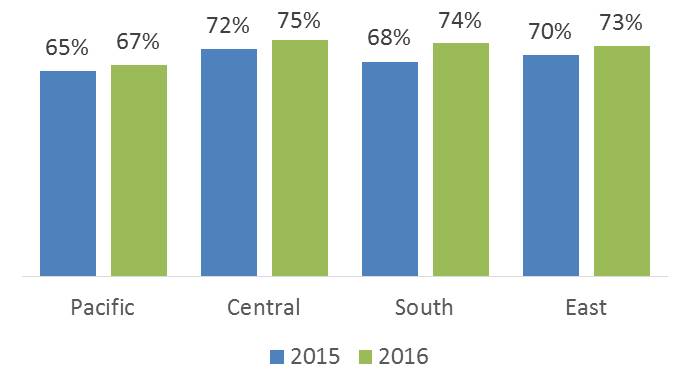
What can you do instead? Create your own legend that combines the color and the series text. Create a small rectangle for each data series. Set the fill color to match the fill color of the columns or bars for that data series. Add text to the rectangle for the data series name. Here’s what this would look like for the graph above.

Not only is it easier for the audience to match the data series name with the color, it allows the graph to be larger because part of the graph area is not taken up by the legend.
When you have short data series names like the above example, you may find it hard to fit the text inside a small rectangle. It looks like the text should fit, but PowerPoint splits the text up because it says there is not enough room for the text.
The issue is with one of the defaults for all shapes. Regardless of the size of the shape, PowerPoint sets the left and right inside text margins to 0.1 inches. If your shape is small, 0.45 inches wide like the rectangles in the example above, this means that margins take up over 40% of the width of the shape. It is no wonder that not much text can fit into the remaining space.
If the text is center aligned in the shape, you can set the left and right text margins to zero and the text will fit in the small rectangle.

This issue with the legend is more apparent in small column or bar charts, but affects all of these types of charts. When using column or bar charts on your slides, create your own legend instead of using the default legend. It will make the graph larger and make it easier for the audience to understand.

Dave Paradi has over twenty-two years of experience delivering customized training workshops to help business professionals improve their presentations. He has written ten books and over 600 articles on the topic of effective presentations and his ideas have appeared in publications around the world. His focus is on helping corporate professionals visually communicate the messages in their data so they don’t overwhelm and confuse executives. Dave is one of fewer than ten people in North America recognized by Microsoft with the Most Valuable Professional Award for his contributions to the Excel, PowerPoint, and Teams communities. His articles and videos on virtual presenting have been viewed over 4.8 million times and liked over 17,000 times on YouTube.