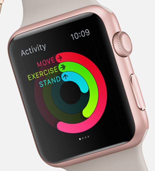
Many data visualization experts like to rage against pie and donut charts. They make valid points about the mis-use of these charts by some presenters. But as I explained in my book Select Effective Visuals, pie and donut charts can be useful for showing how one segment compares to the total. Donut charts, in particular multiple series donut charts, have seen renewed interest due to the Apple Watch. Here is one of the product images from the Apple website.
What Apple had to do in order to fit information on a small screen, is look at ways to put multiple measurements in one graph. The above chart shows how much progress has been made towards three fitness goals for the day. Each band shows how close the person has come to 100% of their goal.
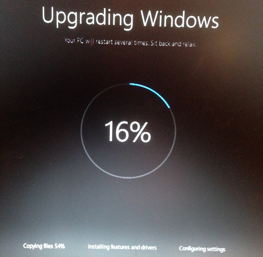
Donut charts in general are now more common as we see them used for many indications of progress to 100% of a task being complete. In the Chrome browser, if you download a file, you see a donut chart grow from 0 to 100% to indicate progress. When you load a video on a number of sites, a donut chart is used to indicate how close you are to loading the entire video. Even Microsoft uses it as shown in this image I took when recently upgrading a laptop to Windows 10.
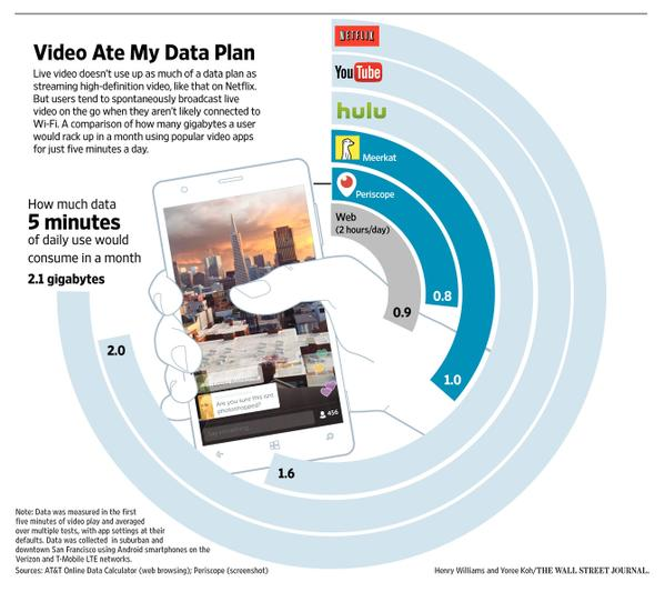
And just this past week I saw the Wall Street Journal use a multi-series donut chart.
I don’t think this use is appropriate because it isn’t measuring progress towards 100%, just comparing values. A bar chart would have been better in my opinion. But its use provides further proof that this type of visual is becoming more popular.
I was asked how to create these visuals earlier in the year during one of my customized workshops in California shortly after the Apple Watch came out. It is actually not that hard to do in PowerPoint. Unlike a pie chart, that only allows one data series, a donut chart allows multiple series, which creates the concentric rings that you see in the examples. When doing this, I suggest you set the outline of each series to the background color to give visual separation of the rings. I also suggest you consider making the portion of the donut that completes the ring to 100% a lighter shade of the color, perhaps 50% transparent to make it even lighter.
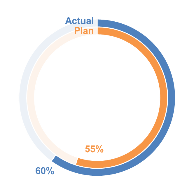
You will want to set the donut hole size to larger than the default, probably closer to 80% or more to get a thinner band. If you want to add labels, you can use the data label function of PowerPoint to add the percentage to the graph, you just may have to manually position the labels depending on where PowerPoint decides to add them. You can also add text box labels like the Apple Watch does to indicate what each ring represents. Here is an example created in PowerPoint.
When would I consider using this type of a visual? Only when I wanted to compare the progress towards 100% on related measurements. The fitness example suggests tracking progress towards 100% of the sales goal in each region may work. Also tracking planned progress towards a goal vs. actual progress may work.
Is this visual for everyone or every situation? Of course not. But I think as presenters we need to be aware of what visuals our audiences are seeing more frequently, like donut charts, and be prepared to consider when that visual might be appropriate to include in our presentation.

Dave Paradi has over twenty-two years of experience delivering customized training workshops to help business professionals improve their presentations. He has written ten books and over 600 articles on the topic of effective presentations and his ideas have appeared in publications around the world. His focus is on helping corporate professionals visually communicate the messages in their data so they don’t overwhelm and confuse executives. Dave is one of fewer than ten people in North America recognized by Microsoft with the Most Valuable Professional Award for his contributions to the Excel, PowerPoint, and Teams communities. His articles and videos on virtual presenting have been viewed over 4.8 million times and liked over 17,000 times on YouTube.


