Noted data visualization specialist Stephen Few and many others argue that pie charts are often misused (Stephen’s argument is here). I struggled with their arguments until recently when a client example made this all much clearer. As often happens recently, I found myself going back to the starting point of selecting any visual: what is the message? Today I want to share how I gained clarity on the correct use of pie charts.
The issue, as I said, goes back to what message we are trying to communicate. Too often, a pie chart looks like this.
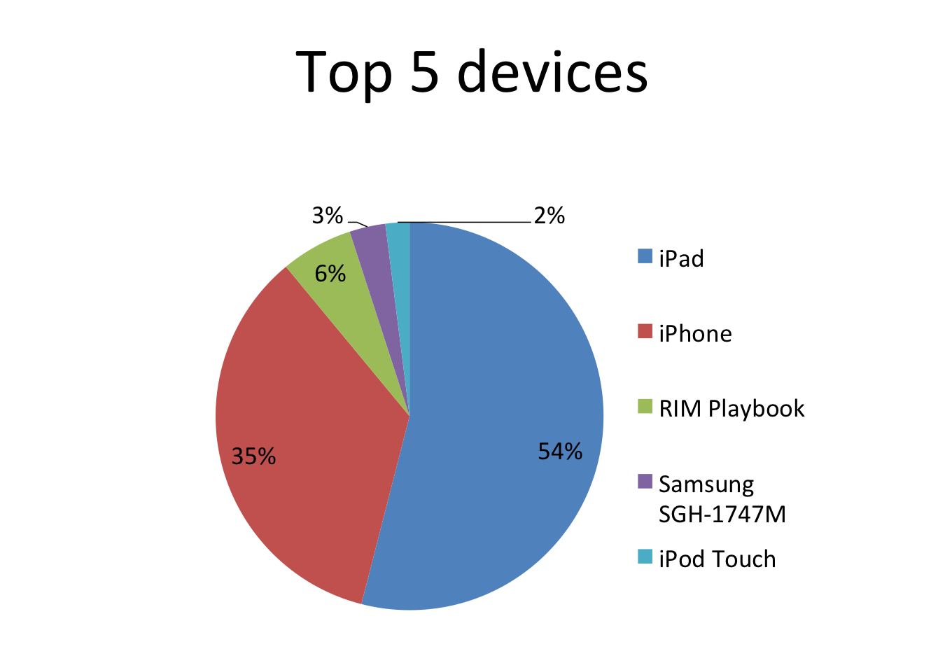
What is the message that the presenter is communicating? It is a comparison of the top five most common mobile devices visiting their website. We want the viewer to see on which devices we should make sure our site functions properly. The message category here is a comparison of values to each other. And this is where the selection of a pie chart fails.
A pie chart should be used when the message is a comparison of one segment to a whole or total. It is very hard to use if you want to compare segments to each other because it is difficult for people to easily discern differences in the size of wedges. As kids, we argued frequently over which was the bigger piece of pizza or pie, so most of us have experienced this first hand.
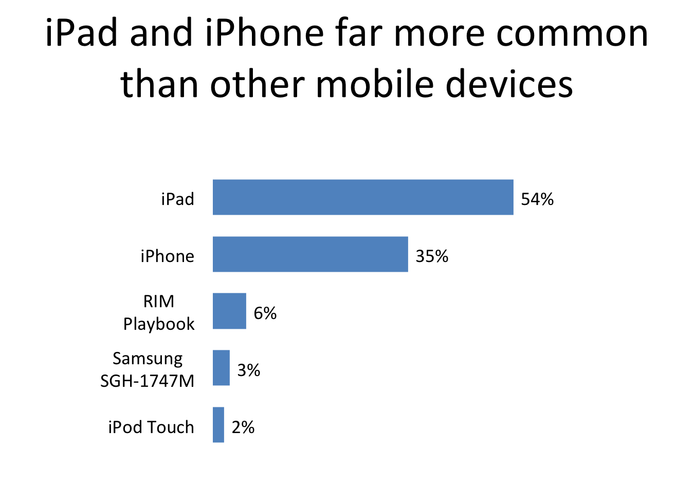
If the message is to compare values to each other, one of the good choices is a bar chart. Here is the visual I created instead of the original above.
Some commentators say that pie charts should never be used, but I disagree. A pie chart is useful for communicating how one segment compares to the total or whole. Let me show you an example of a pie chart used properly.
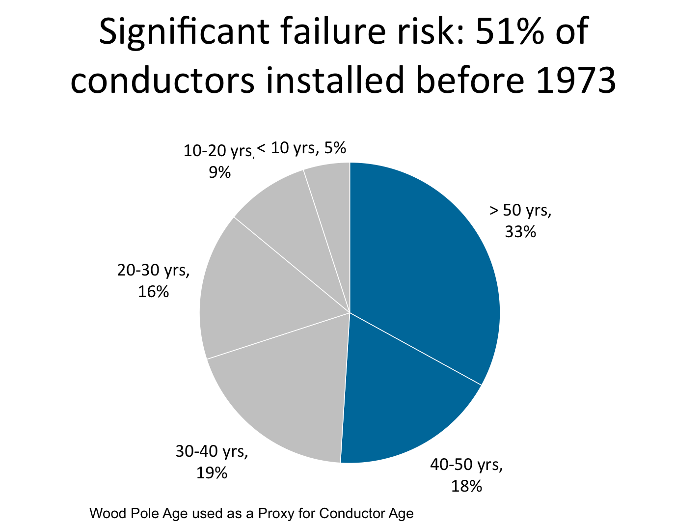
In this example, we needed the audience to see that the conductors at highest risk of failure, those over 40 years old, was over half the total. This is a clear risk that the organization needs to address. I used this example to show that you can have more than one segment in a pie chart, but there should be only two groupings. The groupings or segments should be indicated by two colors, a muted color for the less important segments, and a bold color for the important segments.
When selecting any visual, my approach is to start first with the message you are communicating. Once you clearly state the message, you can then select a visual that illustrates that message. I use six categories of messages to make the selection of a visual easier, as I share in this SlideShare deck. Before you use a pie chart, check that the message you are communicating is one that a pie chart illustrates.

Dave Paradi has over twenty-two years of experience delivering customized training workshops to help business professionals improve their presentations. He has written ten books and over 600 articles on the topic of effective presentations and his ideas have appeared in publications around the world. His focus is on helping corporate professionals visually communicate the messages in their data so they don’t overwhelm and confuse executives. Dave is one of fewer than ten people in North America recognized by Microsoft with the Most Valuable Professional Award for his contributions to the Excel, PowerPoint, and Teams communities. His articles and videos on virtual presenting have been viewed over 4.8 million times and liked over 17,000 times on YouTube.