On a recent AFP webinar discussing what CEOs and Boards are expecting from the Finance department during these turbulent times, cash flow forecasting was clearly the biggest request. It was clear that finance teams are having to generate multiple future scenarios based on various assumptions. These forecasts get updated daily, if not more frequently.
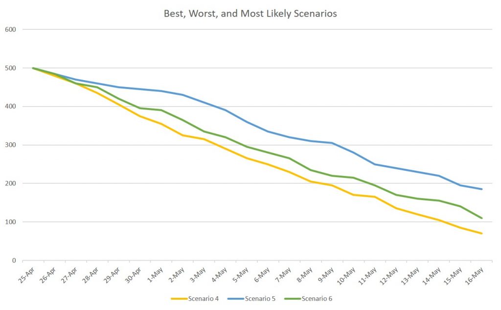
When presenting to the Board, do you show all the forecasts? I would suggest you don’t overwhelm them with that amount of data. Select the key scenarios that they need to understand in order to make decisions. Perhaps you will select a best case, worst case, and most likely scenario.
Showing a line graph of cash on hand could be a good way for the Board to quickly grasp the different scenarios. Since the scenarios change every day, the ones you want to present may change as well, as certain scenarios may no longer be one of the three that the Board should see.
Fortunately there is a quick and easy way to select the lines you want to show in a graph in PowerPoint (the graph can be copied in from Excel or created in PowerPoint). Here is an example of a graph with eight scenarios for future cash flow.

If we want to select the three that the Board should focus on, we can use the chart filter skittle to the right of the chart when it is selected.

When you click on the skittle, you get a dialog pane that allows you to select the data series you want shown in the graph. Here, scenarios 4, 5, and 6 are the three we want to show. We can uncheck the Select All checkbox and then check the boxes for the three scenarios we want to show. When we are done, we click the Apply button (learn more about all the filter options in this video).

Now the graph shows just the three scenarios we want to discuss. This is much easier than creating a new graph from scratch with just those three data series.

If the graph is linked to the data in an Excel workbook (video on two methods for linking Excel graphs to a PowerPoint slide), the graph on the slide can be updated when the Excel data changes. Then you can use the filter to choose different scenarios to present. This can save you a lot of time when updates are required frequently.
If you present financial data, use this graph data series filter technique to select from multiple forecasts or scenarios when presenting. If you are interested in more ideas for selecting visuals for financial dashboards and reports, register for my free APQC webinar on May 28. If your team is ready to learn how to create effective financial visuals in a session customized to your needs and data, check out my live virtual sessions at www.FinancialViz.com.

Dave Paradi has over twenty-two years of experience delivering customized training workshops to help business professionals improve their presentations. He has written ten books and over 600 articles on the topic of effective presentations and his ideas have appeared in publications around the world. His focus is on helping corporate professionals visually communicate the messages in their data so they don’t overwhelm and confuse executives. Dave is one of fewer than ten people in North America recognized by Microsoft with the Most Valuable Professional Award for his contributions to the Excel, PowerPoint, and Teams communities. His articles and videos on virtual presenting have been viewed over 4.8 million times and liked over 17,000 times on YouTube.
